We may earn revenue from the products available on this page and participate in affiliate programs.
Cynthia Zamaria is a self-described hopeless romantic. So naturally, when the interior and floral designer happened upon an 1857 Georgian home in Ontario’s Port Dover, where her husband, Graham, had gone to school, it didn’t matter that it had sat abandoned for three years. What was important was that it had a fascinating past (as the property of a general and gentry before Canada was even a country), a separate coach house (which Zamaria could use as a studio), a belvedere that overlooked the lake, and plenty of room for a future cutting garden.
“The house really chose us,” says Zamaria, who believes that all buildings have a soul. “Graham and I have always been attracted to forgotten, character homes in need of love. Places we could transform, bring back to glory, and make happy again.” The couple had tackled a few fixer-upper projects in the past, but one on this scale, with this provenance, was different. “She’d had her share of bad ’80s hairdos,” says Zamaria of the dark and dated interior. “She needed an intervention of light and warmth.”

The couple spent many days and nights sitting on the floor, looking at the walls, and walking around the empty building to better understand how to make it welcoming for their family—kids Ben (20), Ruby (18), and Theo (14) and a black Lab named George—while still preserving its history. “We loved the potential of what she could be and how she could become a beautiful backdrop for our lives,” says Zamaria.


What followed was an intensive gut renovation that brought the structure down to the studs. The roof, electrical, heating, and plumbing were all replaced; the engineered floors were ripped up to uncover original pine planks; and layers of dusty window coverings were taken down to let the sunlight in. “Our goal was to peel back the layers to reveal the period craftsmanship,” explains Zamaria.

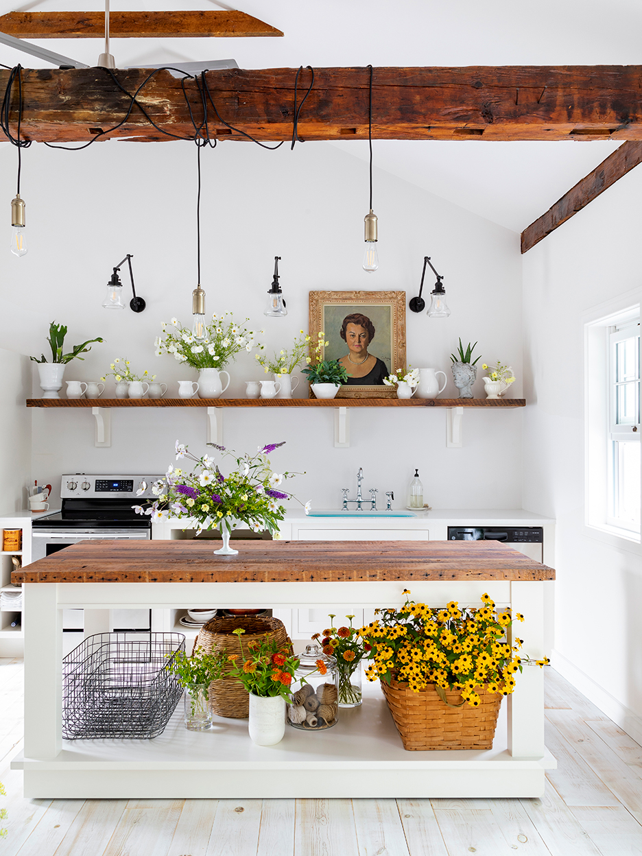
One day, while Zamaria was watching a contractor cut an opening for a window in the kitchen, the plaster flaked off enough to reveal a brick facade. “I looked over at him and he knew right away what I was thinking,” she remembers. Instead of patching it, she had the entire wall exposed to serve as the backdrop for open shelving. Inspired by English sculleries, she designed simple inset Shaker-style fronts for the lower cabinets with a 6-inch gap for displaying everyday dinnerware.
Splurging on heated floors meant that they could take out the large radiators, leaving more room for cupboards, while opting for high-quality (and heritage-approved) wood windows lowered the electricity bill. But Zamaria’s pride and joy is the spacious island, the main gathering spot for family-style feasts and impromptu parties. “I may have used it as a dance floor once,” she says, laughing. The couple debated a long time whether to varnish the maple butcher block top or leave it raw. In the end, they simply treated it with beeswax, which allows the material to develop a beautiful timeworn patina. Smooth quartz countertops, raw brass fixtures, and chef-quality appliances finish the space.

Graham’s stroke of genius happened in the belvedere, with its sweeping 360-degree views: “He said, ‘It’s the cherry on top of the house, so let’s make it fabulous and paint it pink, but not a timid pink,’” remembers Zamaria. They picked a shade that resembled melted strawberry ice cream for the walls and paired it with a gold ceiling.

Outside, the overhaul continued. The couple took the exterior from a “blah” tan color to a warm white and stripped back overgrown shrubs and rotted trees that hugged the house like an ugly sweater. “We just left a field of lush green grass to frame it,” says Zamaria. Her biggest project to date has been planning the cutting garden according to sun requirements and the rhythm of each varietal’s bloom time. “Slow flowers are like the craft beer of the floral industry,” she says.

A potting shed houses all of Zamaria’s supplies, as well as a long workbench with a sink for filling vases and a separate tap for filling large buckets. “As a bonus, we had a bank of windows put in to help with light and airflow and to offer a view over the lake,” she says.
The coach house became a guest retreat–meets–studio flex space where Zamaria hosts floral workshops. “We were just going to clean it up and replace some old drywall, and then we realized that above the dropped ceiling were magnificent original beams,” she says. Needless to say, they opened up the roof to reveal the rafters: “We simply oiled them and left a bunch of the original nails and markings intact. They add incredible height and texture.”


While the main house features airy, all-white bathrooms, the couple changed course for the coach house bath after coming across a large emerald green tile. “It’s a classic color that will stand the test of time, but it has a bit of sass to it,” explains Zamaria. “I imagine it would have looked de rigueur in a 1920s train station washroom.
The building’s large terrace, which overlooks the lake, is her favorite place to watch the sunset. “It’s a creative haven,” says Zamaria. “I’m surrounded by my flowers and it feels very intimate and calm. When we open the doors, we hear the birds and feel the breeze.”
Introducing Domino’s new podcast, Design Time, where we explore spaces with meaning. Each week, join editor-in-chief Jessica Romm Perez along with talented creatives and designers from our community to explore how to create a home that tells your story. Listen now and subscribe for new episodes every Thursday.
