We may earn revenue from the products available on this page and participate in affiliate programs.
After five years of living with a less than ideal storage room, Rosie Birkett had had enough. “I was using it to store my ingredients, but you couldn’t call it a pantry—more of a ramshackle little space with crappy narrow shelves. Everything ended up piled on top of one another, and things got lost in the mess,” she explains. A change was in order, so the London-based author of The Joyful Home Cook tapped designer Ben Wheeler and got to planning.
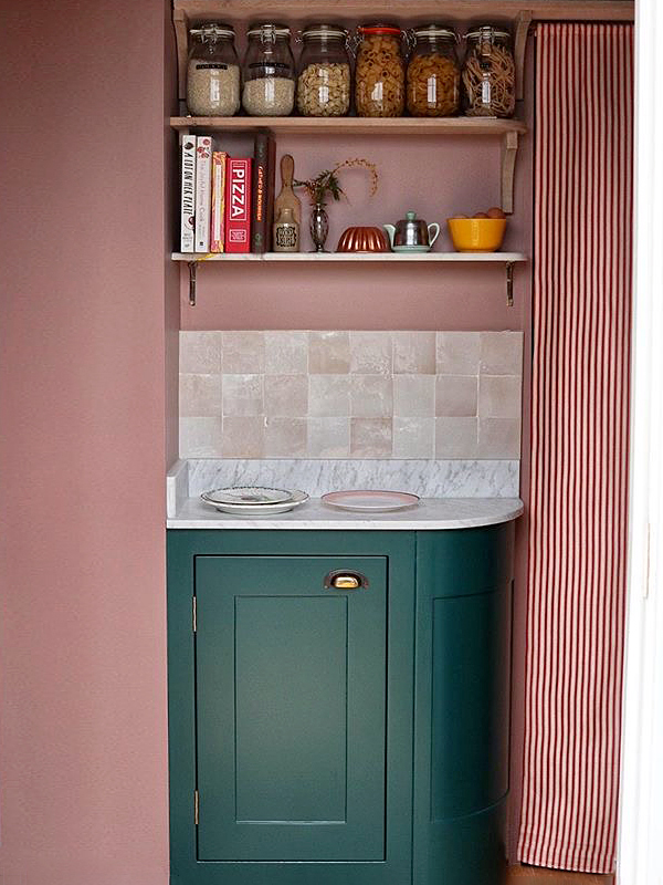
The space had to double as a studio, where she could shoot imagery of her dishes, and Birkett wanted it to feel like an extension of the nearby kitchen, which she recently painted an emerald hue. Extra counter space would also be a plus, as it meant more room for prepping, and she requested a cool area to store doughs and cheeses and roll out pastries. “It makes my job easier and more joyful,” she says.
On the decor side, the goal was to bring a slice of rustic Italian farmhouse living into the modern new-build home. Birkett chose marble rather than man-made quartz and added a small zellige tile backsplash—in a tiny space, why not go all out with dream materials? “I’m so thrilled with the little room,” says Birkett. “I can now find ingredients so easily and see what I have, meaning there’s less duplication. It’s my favorite part of the kitchen.” We chatted with the food writer to see how the whole thing came together.

Dream Up Your Own Color
Turning the pantry into something of a jewel box, Birkett knew she wanted a pink hue from the get-go; after hours scouring Instagram and Pinterest, she landed on Farrow & Ball’s Sulking Room Pink. “I love the duskiness of that one,” she says.
Picking the green was a slightly more involved process: Wheeler suggested the rich tone, and, inspired by her aunt’s Georgian-style home that also had a pink, green, and wood kitchen, Birkett quickly got on board. When she couldn’t find the exact tint she wanted, she mixed it herself from samples, then brought the custom shade to her local spray-painting store to get it color-matched. The high-contrast finale is well worth the extra legwork.
Get Creative With an Awkward Space
The main reason Birkett had left the room undone for so many years was because of the unique challenge the layout posed: It came with tight corners and boxed-in pipes and beams. “In the end it was a blessing,” she says. “We got to be more creative, and the result is something really unique.” She and Wheeler went with wraparound shelving to max out the storage potential, and built in a curved-edge storage unit to accommodate a little nook.
As for the pretty striped curtain, it’s more than decorative—it hides an unsightly washing machine and ironing board area that Birkett has nicknamed the bat cave. She picked the deep red to clash with the nearby pink. “My lovely friend Laura Jackson suggested it to cover up the room,” she says. “I found this gorgeous fabric on Etsy and sewed it myself using a friend’s sewing machine.”
Forget Fancy Storage Solutions
The bulk of the containers you see here are either from IKEA, a British catering company called Nisbets, or ice cream tubs (yes, really). Birkett bought a label maker and meticulously sorted through all her ingredients—first, spreading them out on the floor; then putting them all into their rightful homes. “It’s time-consuming but life-affirming,” she jokes. Her biggest tip? Keep lists of things as you run out so you know when it’s time to top them up. “This allows you to buy in bulk, save money, and cut down on plastic, too,” she adds. You don’t need expensive equipment to get your most organized pantry ever; all it takes is some imagination. And a label maker.
It’s hammer time: Follow @reno_notebook for easy rental updates, clever DIYs, and tips to nail your next project.


