We may earn revenue from the products available on this page and participate in affiliate programs.
What do Dakota Johnson, Emma Roberts, Leonardo DiCaprio, Kate Hudson, and Tobey Maguire all have in common (other than their top-notch acting skills)? Their interior designer. All five stars have turned to Pierce & Ward to give their homes an Old Hollywood, lived-in feel. Since 2012, Louisa Pierce and Emily Ward, the design duo behind the firm, have created spaces that tell a story: moody living rooms with worn-out leather club chairs and crackling fires; large kitchens with beat-up butcher block counters and antique brass knobs; libraries filled with old books and Persian rugs. It’s no wonder the people who play some of our favorite movie characters want to work with them. In their book, A Tale of Interiors, Pierce and Ward share the renovation secrets that make their spaces feel cozy and a little bit magical—and most of them are surprisingly simple.
Embrace “Ugly” Hues

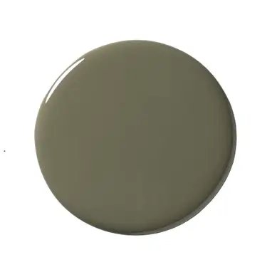
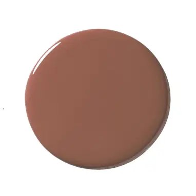
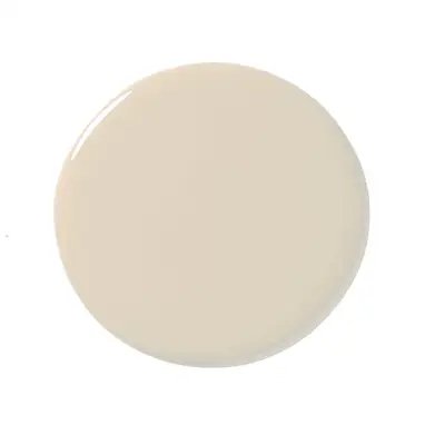
Shades of beige and brown are rarely the go-to paint colors of choice, but Pierce and Ward, who coined the term ugly colors, say every house needs a dose of muddy tones. “We don’t want rooms to be too pretty and perfect. When you have those filler hues like pea green, puke-y mustard, and baby vomit, it somehow makes it better,” says Ward, laughing. They offset these underappreciated shades with beloved classics such as blush pinks and butter yellows.
Pierce & Ward’s Go-To “Ugly” Colors
Pierce & Ward’s Go-To Pretty Colors
Use Inexpensive Tile in Unconventional Ways

Despite having an A-list clientele, Pierce and Ward are both partial to classic, budget-friendly materials like subway tile. “You can do interesting things with grout colors and cover an entire kitchen with it,” says Pierce. They play with format, too. In one renovation, they picked a $5.99-per-square-foot black and white hex tile and laid it out in a floral pattern from floor to ceiling, even covering the range hood in the motif. When the budget allows, the designers also love clay tile for its organic feel and light-bouncing capacity.
Restore 3 in. x 6 in. Ceramic Bright White Subway Tile ($1.20 per square foot), Home Depot
Shop NowMetro Hex Matte White with Black Dot 10-1/4 in. x 11-7/8 in. Porcelain Mosaic ($9.36 per square foot), Home Depot
Shop NowWork With the Cabinets You Have

Dakota Johnson could probably afford any kitchen she dreamed up, but in her mid-century California home, Pierce and Ward chose to restore the original 1940s metal cabinetry and spray-paint it in Benjamin Moore’s Alligator Alley. “The house was built by Carl Maston, a really well-known architect in L.A. who was quite ahead of his time,” explains Ward. “We wanted to stick with what was there because it was already so good to begin with.”
So it makes sense that when installing brand-new butcher blocks or cupboards—their preferred style is a simple Shaker panel—they look for imperfections. “We always tell our cabinetmaker, ‘Don’t make it too perfect,’” says Pierce. “Even if a cabinet is a little crooked, it’s okay.” The designers also place a lot of importance on vintage hardware, which they often source on Etsy. “I just want to find the right brass that’s not too shiny,” says Ward, who always looks for an antiqued finish. “It makes a new house feel so much older.”
Find Inspiration in What’s Already There

For Johnson’s main bathroom, the design duo worked with what they had when choosing a dominant material. “The downstairs level had concrete floors, and the upstairs had old hardwood that needed to go,” explains Pierce. They brought the cement scheme to the upper floor and covered the space from floor to ceiling. Earthy burl-wood mirrors and peachy roman shades soften the harsh surface. “The house was surrounded by trees, and so the setting also came into play,” adds Ward. “What’s outside is really important when choosing a surface or palette.”
Don’t Shy Away From Wallpaper All Over

No stranger to a good floral wallpaper, Pierce and Ward often turn to wall coverings to add texture to a room, but they warn there is a right way and a wrong way to do it. “We love sourcing vintage wallpaper because we try to avoid using the hottest patterns,” says Pierce, who also notes that metallic surfaces are a big no-no. When it comes to application, the designers like to cover everything (sometimes even the ceiling) in the most inexpensive option rather than going the high-end route and doing only a feature wall. And for a custom touch, match a shade to use on the moldings and trims: “It gives its own little story.”


