We may earn revenue from the products available on this page and participate in affiliate programs.

Round windows have become a covetable architectural feature, with some people comparing them to works of art, prizing their telescopic quality (even from far away, what is on the other side feels zoomed in). But when designer Susannah Holmberg walked into her client’s Park City, Utah, home and saw the existing round windows, she couldn’t help but laugh. “They were hysterical before we redid them,” she recalls. The place was very ’90s, almost in a way that was cool again, but it was missing the mark. “They were round but framed in very nautical-looking, yellow wood trim, and the previous owners had used what looked like pantyhose material to make shades,” she adds. The fact that the kitchen island was a circle, topped with sad black countertops, and all the walls were a “bad” pink didn’t help much. “Cheers to my clients, because not a lot of people could see the potential,” continues Holmberg. “It was pretty weird.”
The homeowners, a Chicago-based family of four, had purchased the property as a second vacation home for ski trips, so they wanted the space to feel more like a sanctuary from the slopes, less like a boat. But Holmberg didn’t ditch the home’s swooping silhouettes. Instead she peeled back the layers and simplified it all by taking the drywall right up to the edge and painting the trim, turning its wonkiest trait into a favorite.


In the process of bringing the interior up-to-date, the clients didn’t want the home to look like every other ski lodge-like retreat in the area. “We didn’t want the Pendleton-blankets-and-sheepskins-everywhere kind of thing,” notes the designer.

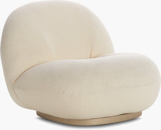
Keeping some of the wood ceiling beams and stonework delivered enough of that mountain feeling, while all the other pieces in the space are soft and refined. In the living room, low, chunky furniture (the slipper chair is Gubi; the floor lamp is from Ferm Living) and a shaggy rug offer places to lounge after a long day on the slopes and trails. “Sometimes a second home gets used a little more because you’re not working and going to school,” Holmberg points out. Comfort was key.


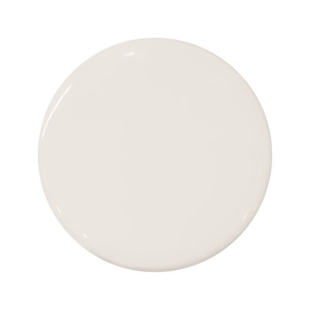
Engineered white oak floorboards now run throughout the space, replacing the old dark hardwood and mismatched carpeting. Another curved moment Holmberg kept was the twisting staircase. The structure’s oak rail and cap got a fresh coat of cream paint to make it look less rustic (a big win for the budget). “We couldn’t overhaul everything,” the designer notes.

The same thing was true for the bathroom, where a curved shower wall posed an interesting challenge: It was originally covered in red tile and glass bricks. Holmberg decided to keep the architectural addition but swapped the finishes out for a delicate, chalky tile. “I knew we needed something small,” she says of going with the Stone Source option. That way, it could easily wrap around the partition. “It’s one of my favorite moments in the whole house,” she says. “Each sheet is uneven on the top and the bottom, so that there’s no kind of grid pattern.”


Holmberg didn’t want the windows and shower wall to feel random, so she carried the shape into the kitchen in the form of a softly curved island with stained oakwood slats, complete with a dark butcher block countertop. The rich burgundy-plum lower cabinets came into play because of the natural formations outside. “The whole driveway is cut out of red rock,” says the designer. “The entire house has a backdrop of this pink-salmon color, so we wanted to do something that complemented that.”


Because the house sits on a fairly private lot, coming up with window treatments wasn’t a priority in a lot of the rooms. But in the main bedroom, where large sliding doors and, yes, another round window flood the space with light, it was crucial to offer the option to darken the area—especially early in the morning.
“How do you do that?” Holmberg initially asked herself. “We didn’t want to put a square roman shade over the window.” Her solution: Task Park City Blind and Design with mounting floor-to-ceiling curtains that wrap all the way around and block the glass. There, the cool quirk is optional.


