We may earn revenue from the products available on this page and participate in affiliate programs.
Jessica Helgerson didn’t plan on becoming an interior designer—it all happened haphazardly. When she was in college, she stumbled upon an info session about UC Santa Barbara’s design program, signed up for an evening class, and was pretty much hooked. Fast-forward 20 years later, and she has her own firm that specializes in renovating historic homes. Some people might consider revamping older spaces a logistical nightmare, but Helgerson welcomes the challenge.

“You have to work on them until the floor plan makes sense,” she explains. “It feels almost like erasing: The right plan is underneath there—you just have to get to it.”
Given that she’s worked on nearly 100 old houses throughout her career, we’re cool with calling her a certified expert on the matter. We chatted with Helgerson about how she approaches these delicate projects and why creativity is sometimes overrated:
Take Your Cues From What’s Already There


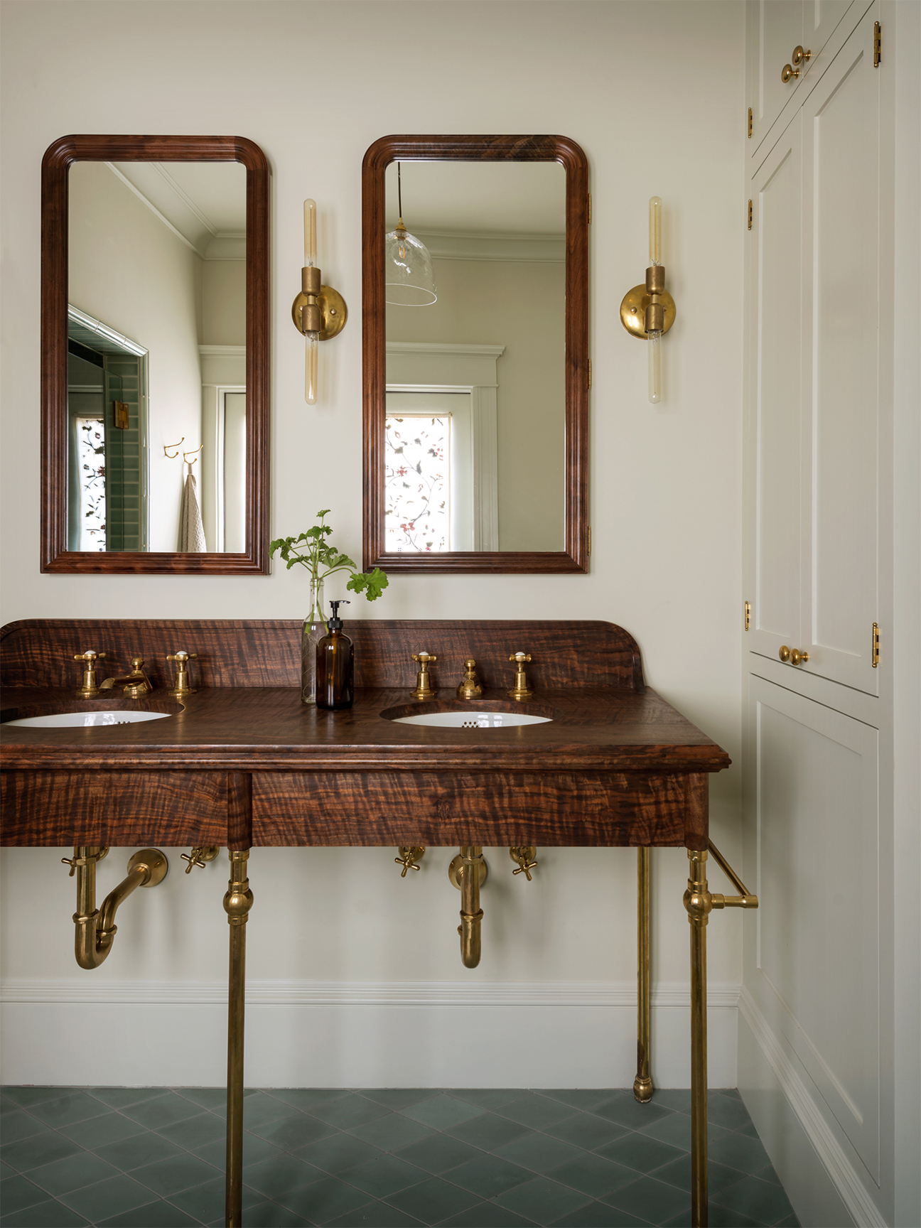
Instead of trying to impose a brand-new look, she pays attention to the era the property is from: What materials were used, what details are prominent, and what other work the architect is known for. For Helgerson, the house itself is the best mood board because it effectively outlines the pieces and finishes that work in the space. “If you’re working on a mid-century house, that immediately limits the material palette that makes sense for a house of that time,” she says. “In a way, the constraints of an older house are gifts.”
Then she layers modern, playful moments through decor. “We’re not building period sets, after all,” adds the designer.
It’s All in the Structure
“You can’t decorate your way out of bad architecture,” says Helgerson. The first thing she does before tackling any project is look at floor plans and figure out what can stay and what needs to be rejiggered so the layout flows. If she does have to rework anything, she sticks to one golden rule: Avoid angles at all costs. “They started angling walls in the ’60s to be kind of funky, but then you wind up with all of these rooms that are hard to furnish,” she says.
Don’t Splash Out on the Temporary Stuff
Helgerson always splurges on renovation materials and tightens the budget on decor. “I’m a total thrift store junkie,” she says. “I love old things, and I find them to often be made better than new items—and way cheaper, too.” She keeps a running list in her bag of all the pieces she might need for a client, including the correct sizing, just in case she stumbles upon an estate sale or vintage market. Her latest score? An antique delft tile mantel she sourced in Montreal. Major win.

Hunt for Decorative Clues


You don’t have to restore an old Victorian to its exact former glory (we have dishwashers now, not iceboxes), but Helgerson recommends including some references to the original space to stay true to its character: “First, look at the house itself. Are there nice details, and how can you repeat them? Is there a cute cutout on the doors or an interesting base accent?”
Stay Away From Trends
Her number-one tip for first-time renovators: “Don’t try to be too creative!” says Helgerson. Save the bright colors and plush textiles for accent pieces (like pillows and chairs), but keep anything that’s permanent on the simple side. That doesn’t mean your project will end up looking like a stark-white box. For proof, take a peek at Helgerson’s portfolio, which is filled with sculptural lighting and rich hues. It all comes down to her design philosophy: “Just do the right thing for the house.”
