We may earn revenue from the products available on this page and participate in affiliate programs.
Kaitlin Thomas of Nine Dot Design was expecting the usual back-and-forth with the Los Angeles couple who had hired her to rethink their home’s first floor. But that never happened. The newlyweds, a screenwriter and a literary agent, hadn’t quite found their style yet. They were eager to hear her suggestions—like the one to tear down and replace the hulking stone-front fireplace in their living room. Below, Thomas details how she guided them to make the narrow space work.
The Bright Side

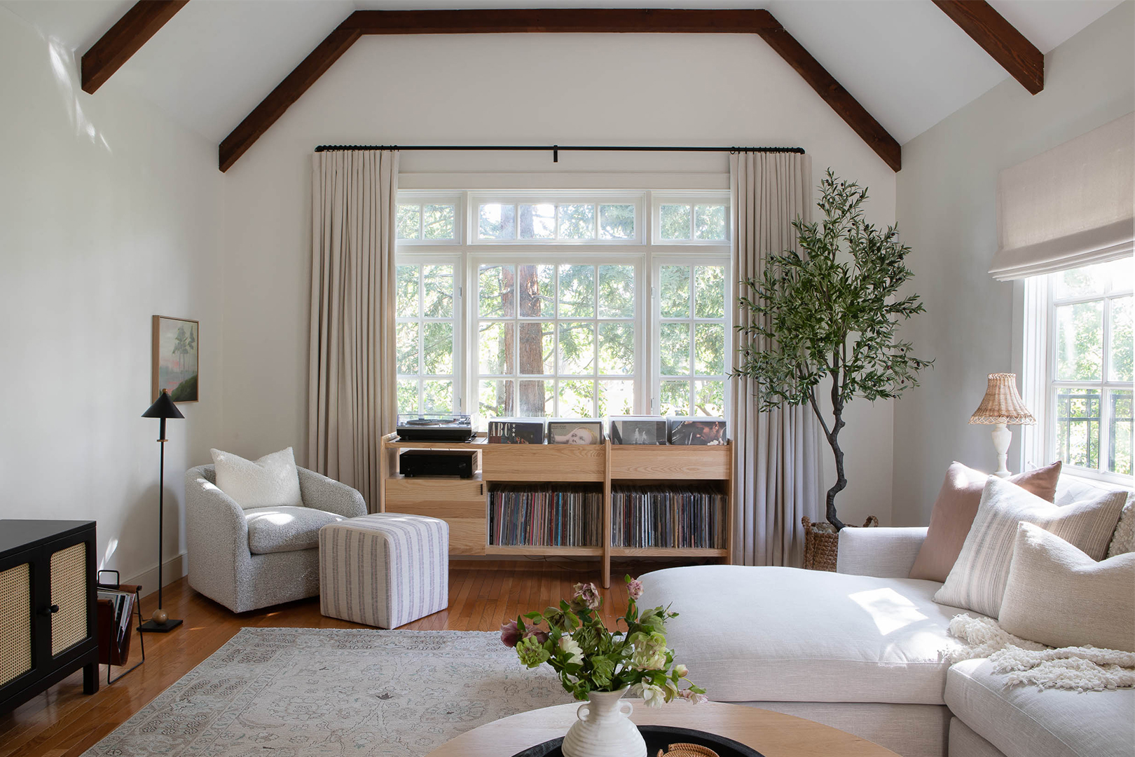
Scattered around the living space were the remnants of a bachelor pad: shelves piled with vintage records, curtain-less windows, and so many different shades of dark wood. Simply removing all that furniture lightened things up considerably. To brighten the room even further, Thomas brought in almost exclusively soothing neutrals, from a tone-on-tone gray rug to white bouclé armchairs. The ceiling beams, however, retained their natural finish for some contrast.
Break It Up


“The area was so long, so the goal was to create zones,” Thomas explains. Those sections—one by the windows for reading and listening to records, another for bingeing movies on the plush sectional, and the last for the fireplace and open shelves—visually break the narrow space into thirds. The single rug acts as the differentiator; where it ends on either side, the other segments begin.
Between a Rock and a Fireplace
The couple had originally planned on leaving the stone fireplace as is—until the room was nearly finished and they saw how much of an eyesore it still was. “So we tore it all out,” Thomas says with a laugh. “We had to replace the firebox anyway to make it functional.” One more demo day in the grand scheme of the project was nothing.
Not wanting to completely abandon the original architecture, Thomas followed the lines of the existing chimney for the new plaster front. The smooth white finish is purposefully more of an accent than a focal point, but it still offers warmth on L.A.’s one cold day a year.
Coming of Sage


Although she painted the rest of the first floor in her signature, Chantilly Lace by Benjamin Moore (it’s the perfect warm white without leaning yellow), Thomas gave the dining room a sage refresh. “The space needed some depth and separation from the rest of the house,” she explains. It came down to gut instinct (the other swatches didn’t even get a second glance), but also for the feeling of intimacy it underlined in the already low-light space. Now the couple has a cozy place to discuss their Oscar front-runners.


