We may earn revenue from the products available on this page and participate in affiliate programs.

Childlike but not childish—that was the aesthetic one family wanted for their 4-year-old daughter’s reimagined bedroom, a big yet bland top-floor space in their West London townhome. So Natalie Tredgett did what any maximalism-loving interior designer would do: She doubled down on an eclectic mix of brightly hued patterns that would disarm even the most ardent minimalist. “Children’s bedrooms are a real chance to use color in abundance,” she explains. “There is a feeling that because children’s belongings are often so bright, the rest should stay neutral, but by adding more tones to the walls, floors, and ceiling, it actually calms the room down.”

Enter Cole & Son’s Hummingbirds wallpaper, a print loved by the family for its old-world charm yet sophisticated feel. Tredgett paired it with a graphic gingham carpet from Karastan “to give energy to the room,” she says. “I find that if you have very organic and soft, round shapes, it’s lovely to put something geometric next to it—that clash creates great tension.” The embrace of contrasting motifs has also helped the room withstand inevitable wear and tear over time. “The wallpaper and carpet have taken a good beating, whether that’s scratches or nicks, and it’s all absorbed by the patterns,” she adds.
From there, functionality became the dominant design force. Knowing how fickle little ones can be, Tredgett employed a few tricks to ensure the room offers versatility should her youngest client decide to get creative with the layout down the line. Instead of committing to a headboard, she used a vintage framed print to mark the bed (turns out Tredgett’s hunch was right—the bed has since moved locations several times). She also made a gallery wall, with colorful photocopies of vintage magazine covers placed in affordable IKEA frames that can be swapped out over time.

For easy bed making, Tredgett chose a machine washable cotton coverlet from Peacock Alley rather than a bulky comforter. “I like the idea of a lovely, complicated bed, but if you want to encourage children to make it themselves, or you want to do it in seconds flat, then a coverlet is the answer” she says. A vintage cotton sari layered over it adds another pop of color, while a timeless blue ticking-stripe skirt hides the divan base; the fabric is repeated in the soft blinds. “It feels grown-up,” explains Tredgett of the choice. “Whatever we spent more of the budget on, we wanted to ensure it would stand the test of time.”

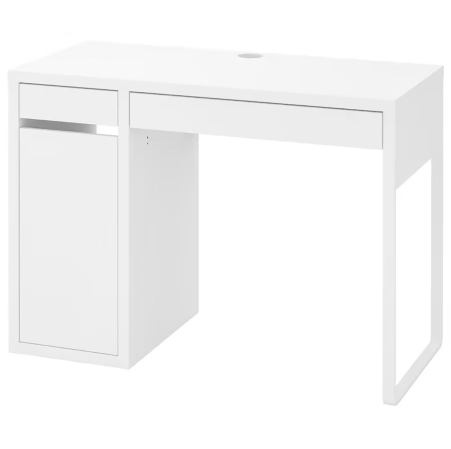
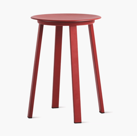
One feature deemed less worthy of an investment: the radiators. Rather than overhaul them, Tredgett muted their effect by painting the facades the same minty hue as the wallpaper. The desk was another budget bolster. Though it looks like a cult design piece, it’s in fact an IKEA find enhanced with neon pink paint. To offset its contemporary lines, she found a vintage red stool and a flower-shaped metal lamp. “Lighting is like jewelry—it’s such a great accessory,” she says. And on the subject of embellishments, Tredgett has officially given the green light to just keep adding them.


