We may earn revenue from the products available on this page and participate in affiliate programs.

by Essie
A sheer, blush pink shade.

If you’re privy to the classic pinky-nude hues, you like to keep things fresh, neutral, and a little traditional. You fall hard for crisp, no-frills linen bedding, hardwood floors, and neatly-framed art.

by OPI
A dark and moody purple so deep, it’s almost black.

In your eyes, almost-black nail polish is basically a neutral, albeit a nontraditional one. Your interior reflects that attitude. Neutral walls, simplistic art, and clean-lined, and contemporary furniture are your go-to design elements.

by Chanel
A bright, candy apple shade of red.

While bright red is arguably the most classic color in your nail polish repertoire, it takes a special person to do it well. Your decor style is an eclectic mix of traditional pieces, woven together with a cohesive, bold color palette.

Soft Focus
by Habit
An airy periwinkle blue.

Your interior, much like this soft purple-blue shade, expresses your undeniable joie de vivre. You fill your space with a diverse mix of treasures, like original artwork, bold-printed upholstery, and tiny objets picked up on worldwide travels.

by Essie
A versatile but rich pinky-plum color.

You’re not afraid to go dark–even if that means painting your walls black. To brighten up the space, you add bright pops of Ikat or chevron and a primary-colored statement rug. And of course, you’ve got an affinity for animal print, which you consider a versatile neutral.

by Deborah Lippman
A classic shade of coral.

You design on the bright, preppy side, gravitating toward pops of green and pink, goldleaf furniture, brass hardware, and lots Chinoiserie-inspired accessories. You keep walls and flooring neutral so your curation of bright artwork and objects stand out.

by RGB
A misty green with a hint of gray.

Pairing this gray-green with clothing is tough, but you’ve got the eye for it. Similarly, your decor is a mix of subtle yet funky color matchups. Take one look at a dusty blush pink wall, and you’d pair it with deep gray, ochre, and a touch of that green shade.

by Jin Soon
A graphic gloss of black and silver glitter.

You’ve not only toyed with pattern play–you’ve mastered it! Your home is full of graphic prints on the walls, furniture, floor… maybe even the ceiling.

by OPI
A quintessential shade of taupe.

When it comes to a color palette, you like to play it safe and keep things grounded. But when it comes to lines and shapes, you’re not afraid to make a stylish statement.

by Tenoverten
A deep navy hue.

Your aesthetic calls for a touch of the unexpected. Your furniture collection hails from several design periods, covered in a funky mix of floral, solid, and striped upholstery. Together, your pieces create an edgy yet cohesive space, marked by a wide color palette that’s thoughtfully blended with an even hand.

by Butter
A soft but warm grey shade.
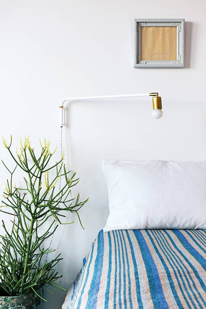
You’re all about neutral, streamlined simplicity. Your space isn’t crowded with an abundance of art of accessories but rather, just the basics. You’re drawn to subtle statement-makers, like this contemporary swing-arm lamp, while traditional prints and greenery add a touch of character.
