We may earn revenue from the products available on this page and participate in affiliate programs.
The first time Atlanta-based designer Dana Lynch toured her Clarkesville, Georgia, cabin, she was able to look past the burgundy-orange logs, clunky chinking, and unavoidable “ax murderer movie” vibes. She turned to her husband and said, “We need a bleep load of black paint on the outside and a bleep load of white paint on the inside.” But what began as a cosmetics-based renovation quickly escalated into a seven-month-long overhaul that involved moving walls downstairs, installing an HVAC, and popping the roof off so they could add dormers upstairs. Only then could they really unplug. “I was thrilled,” says Lynch. “I actually lied to the kids for the first little bit, saying there was no WiFi.”
Lynch landed on a Scandinavian-inspired aesthetic that fueled restfulness, but she still snuck in nods to classic cabin life in the form of antler hooks. The minimal approach called for the perfect shade of paint. Departing from her go-to Shoji White, which the designer says can read as yellow in a dark space, she opted for Sherwin-Williams’s Origami White. “The kids lost their minds,” she says with a laugh. “It went from sketchy and scary to ‘Here’s my toothbrush; I’m moving in.’”

While Lynch and her husband decided to scrap the existing claw-foot tubs (they’re impractical for teenagers who want to get in and out of the bathroom fast), there was one detail they couldn’t get rid of: the structural fireplace wall smack-dab in between the kitchen and living room. “It was going to cost $40,000 just to remove it, and that’s not including reroofing,” she says. The divide dictated everything. Lynch made the most of the living space by bumping out the perpendicular wall 3 feet and splurging on a mohair-covered sofa.


The setup turned the kitchen reno into a giant puzzle. Lynch couldn’t move the fireplace, but she also didn’t want to relocate the door or window either, leaving her to work with a long but tight galley-like layout. The only spot for the fridge was at the far end of the peninsula, but she knew that would mean hungry teens trying to scoot behind her while she’s cooking. Her fix: A separate wet-slash-coffee-slash-snack bar across the room. “It was intended to keep everyone out of the kitchen,” she jokes.


“I always wanted the house to be about people and food,” says Lynch. The banquette was nonnegotiable, but squeezing it underneath the staircase was a mathematical nightmare. “If you can’t get an adult to sit underneath there, you can’t get a 60-inch-wide table, which means you can’t invite eight people over, which means why are we having this cabin?” she says. After working with the contractor to come up with a new stairwell configuration that offered headroom, one of her younger designers helped perfect the shape of the bench cushion “so that you could totally sit there all day, looking straight out the window,” she explains.


Replacing the old 6-by-6-foot-something slider that leads to the back porch with a version that spanned almost the whole width of the wall was a no-brainer: “Even on a beautiful, sunny day you couldn’t see your hand in front of your face,” recalls Lynch. The iron and glass opening floods the space with natural light, which is important because there are few overhead fixtures. Lynch was only willing to play the oversize pendant card once.


All three of the bathrooms feature micro-pebble floor tiles that look like terrazzo (you can barely see the grout lines). “I’m a tub girl,” says Lynch of squeezing a fresh soaking spot into the downstairs en suite. But while her space is meant for lingering, upstairs where the kiddos get ready, she focused on getting people in and out, so she put the vanity in the hallway and separated everything else with two doors. “You can have someone using the toilet, someone taking a shower, and someone brushing their teeth all at the same time,” she explains.


The bedrooms have little room for nonessential furniture, so Lynch bought frames with built-in drawers and mounted half-moon–shaped shelves in lieu of traditional nightstands. “It’s a log cabin, so I can just screw whatever I want into the walls and not have to worry about anchors,” she points out.


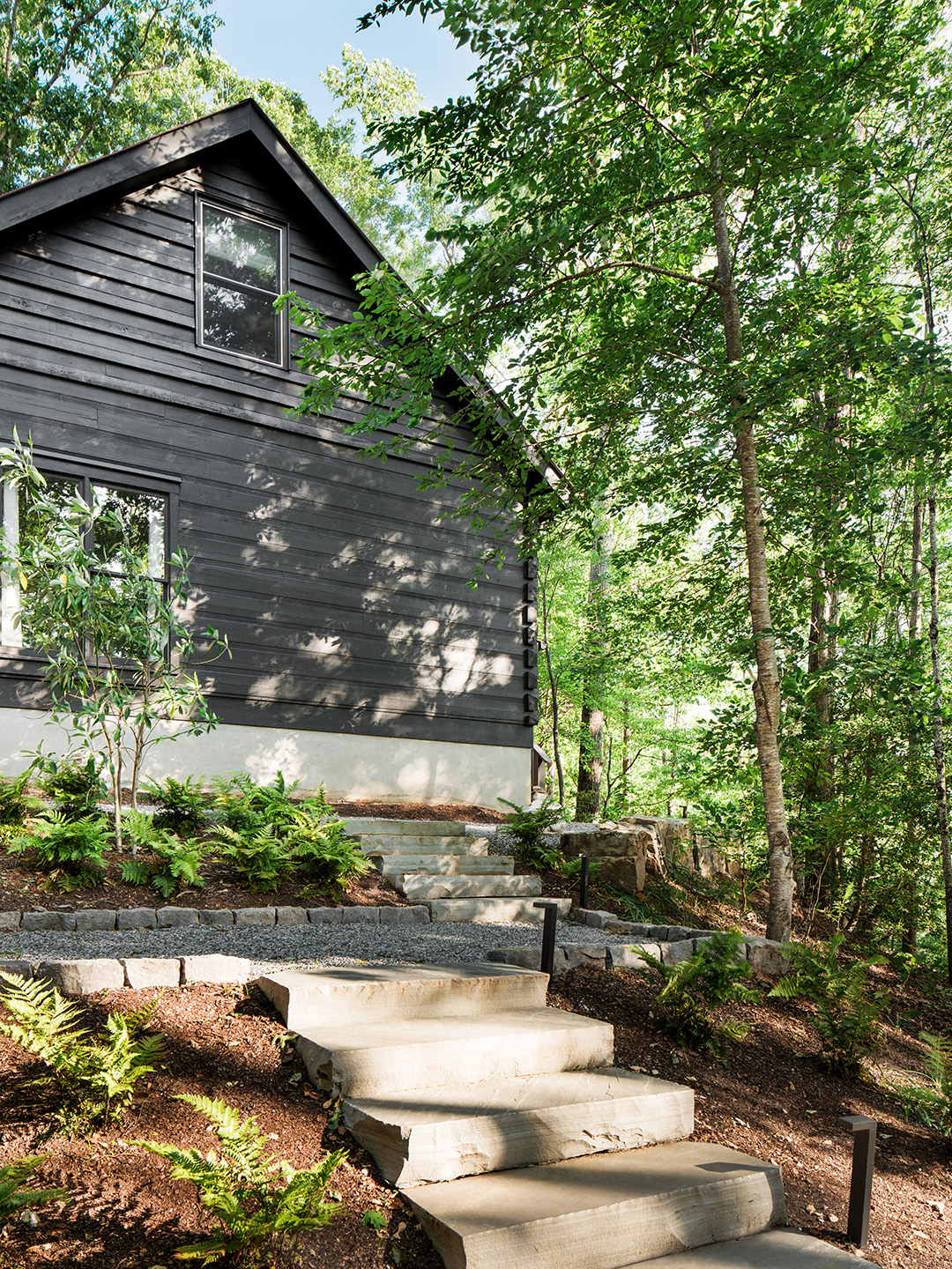
Repainting the facade called for a blend of three Benjamin Moore swatches: 50 percent Black, 25 percent Dragon’s Breath, and 25 percent Spanish Moss. “I’m not going to paint a log cabin navy blue,” says Lynch. “If you want to make a space like this feel updated and young and fresh, it has to be superdark.”


Laid-back seating really makes the cabin livable these days. Lynch’s daughter is a fan of the four-post hammock in the yard (“She’ll take every blanket and every pillow in the house, lay out there, and Instagram the heck out of it,” says the designer with a laugh). In an effort not to block the new view she created with the steel and glass doors, Lynch opted for beanbags on the porch—a controversial decision, at least at first. “Everyone fought me on it. And now everybody fights over them,” she says.
Photography by Robert Peterson; Styling by Courtney Favini
