We may earn revenue from the products available on this page and participate in affiliate programs.
We all know the age-old warning to never mix business and pleasure, but when vintage seller Melissa Cattaneo Fontaine was faced with “a sprawling house I had no idea what to do with”—aka her family’s new Colonial in the suburbs of Atlanta—she threw caution to the wind. Tapping Misfit House designer Monica Stewart, one of her best friends, was a no-brainer. What started as a consultation to bounce ideas around sparked a plan for almost every room. “I had all of this antique furniture from my husband’s family,” recalls Fontaine. The place needed Stewart’s knack for marrying Fontaine’s love of Southern, traditional elements (think: four-poster beds and formal sitting rooms) with modern touches (no matching throw pillows in sight).

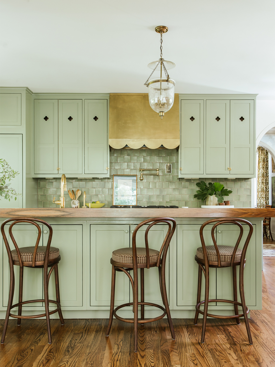
Fontaine granted Stewart full creative control in some spaces, going against her typically type A personality (that’s the power of friendship). The kitchen was one such room. Lucky for all parties involved, it had been fully gutted about five years prior; the layout was perfectly functional. Charm, however, was nowhere to be found. Reimagining the preexisting cabinets and island with custom door fronts and a lick of green paint, Stewart transformed the space. A brass hood, Fontaine’s favorite addition, is a style compromise in action: The scalloped edges match her classic sensibilities, while Stewart pushed for the bolder, shiny finish.


However, Stewart didn’t shy away from conflict along the way. When Fontaine was dead set on her wallpaper choice for the entryway (a blue and white tree print), Stewart announced it wasn’t right almost immediately. The pattern had just been done too many times before. “We ended up with something special that hadn’t been seen on Instagram 27 times already,” Fontaine says, laughing: a muted floral that brightens up the tight corridor.


The project was not without its external conflicts either. Stewart struggled to convince the contractor to redo the powder room’s layout after the drywall had been installed. “The way the sink was positioned, there wasn’t enough room to bend down to get to the vanity cabinets,” she explains. “It was a nightmare.” By straightening out the previously sloped ceiling, the storage could finally function as intended.

Upstairs, the kids’ rooms were total teamwork. Fontaine selected cheerful pastel pink walls for her 5-year-old daughter’s bedroom, which features a cushy window seat (Stewart’s contribution) and built-in desk for drawing—the space needs to age with her. In her 4-year-old son’s bedroom, the nightstand between the twin beds was chosen specifically for its ability to hold all his favorite bedtime stories within arm’s reach.


The one thing Fontaine’s husband had strong opinions about was the lounge–slash–record storage spot, once a spare room. Complete with olive green–stained wood paneling and a matching velvet sectional, the tiny (but cozy) space quickly became a WFH sanctuary when the pandemic hit. “It was just supposed to be this lounge for him, but he spent all day, every day in there,” says Fontaine.


In the end, both Fontaine and Stewart say there was too much laughter to remember the few complications. “It was important for me to have a sounding board who fully understood me,” Fontaine explains. “Monica could make sense of my vision even when I couldn’t.” That’s what friends (and good designers) are for.


