We may earn revenue from the products available on this page and participate in affiliate programs.

When it comes to decorating a bathroom, the fundamentals of the space typically tend to remain the same. That said, having to work around the staples of the room—the shower, vanity, tub…what have you—doesn’t mean you should by any means be compromising on the decor. And while we’re definitely all for a maximalist-inspired space that is abundant with color and pattern, erring on the opposite side of the spectrum is an aesthetic we can surely get behind. Need a little more convincing? Read on to see the bathrooms—like this serene, Cali-inspired home— that have perfected minimalism, proving that sometimes, less isn’t always more.

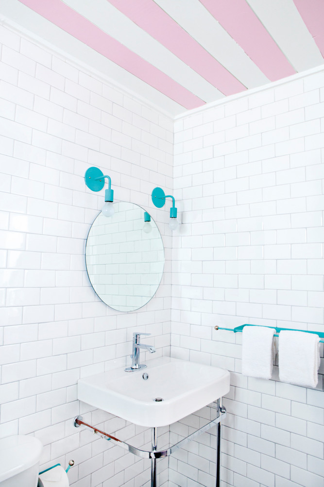
Painted ceilings make for a welcome departure from the standard whitewashed scheme most minimalist bathrooms are subjected to. Here, an ever so slightest pop of color (by way of the fixtures and striped ceiling design) add interest and character to the otherwise modestly decorated space.

Wooden accents lend a hint of warmth to the neutrally-charged palette of this boho-meets-modern bath. The concrete tub doubles as the focal point of the room complemented by a slew of similarly-toned decorative accents, ranging from the antique mirror to the woven basket and cream-colored ceramics.

From the sleek glass partition separating the tub to the streamlined details that encompass the vanity, Tyler Haney’s Austin bathroom proves that a lack of color hardly means a compromise on style. For the ever so slightest pop of color, a textured shag rug with a vibrant motif to complete the scene.

A hexagonal tile pattern that extends along the total area of this modern bath has us seriously reconsidering a redesign of our own. The concrete flooring provides a rich textural contrast, allowing the simplicity of the tiles to stand out in their own right, while the potted greens bring on a healthy dose of color with a lively element.

Minimalism comes with a touch of elegance in Leanne Ford’s converted farmhouse. Whitewashed floorboards paired with a square
complete the backdrop, while a refreshingly ornate gold shower fixture steals the show.

Sometimes, an eye-catching print and a vibrant tile design is all your bathroom really needs.

A subway tile backdrop seamlessly blends within the white and wood elements of this mod bathroom. A chic, matte black pendant completes the look.

A patterned subway tile design sets a captivating backdrop for this
while a matching wall paint for the floors and ceiling complete the space.

A graphic tile or wallpaper can go a long way when it comes to substituting for a lack of decor or furnishings. Case in point? This stunning space.

There’s hardly any need for much else – in terms of decor or furnishings – in a space as flawlessly designed as this.

The key to avoiding a snoozy finish in a minimally decked bathroom? A striking accent that can double as the room’s focal point will do – much like the matte black, steel paned windows in this spot.

Opt for a vanity in a bright paint to provide a subtle hint of contrast against the details of a whitewashed bathroom. We love the way the vanity complements the grayish blue tiles of the floor!

Complement a
scheme with a chic color block in a basic palette.

A vintage wooden vanity steals the show in this ultra mod bathroom. Note how flawlessly the wooden elements blend with the contemporary details of the space.

Proof that something as simple as a streamlined shelf can go a long way in terms of storage and design. Now that’s our idea of form and function.
This story was originally published on June 21, 2016, it has been updated with new information.
Discover more ways to elevate your bathroom:
How To Have A His-and-Hers Bathroom When You Don’t Have Room For OneTwo-Tone Bathrooms Are Having a Moment – Here Are Our FavoritesHow to Upgrade Your Bathroom Without Spending a Fortune
Learn to love your inbox again—sign up for Domino’s daily email.

