We may earn revenue from the products available on this page and participate in affiliate programs.
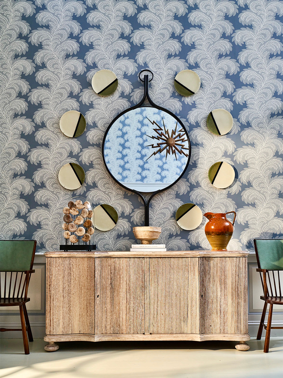
Lines of sprawling feathers crawl up the blue lobby walls, the dining room comes alive with flora and fauna, and even the reception desk has a swirly Beata Heuman marbling on its ceiling. At the recently redecorated Mayflower Inn and Spa, Auberge Resorts Collection in Washington, Connecticut, designer Celerie Kemble of Kemble Interiors put her love of colorful prints front and center. “I think of wallpaper as architecture,” says Kemble. “The shapes, color, and pattern can tell you where your focus should be.”
Nowhere is this more true than in the Mayflower’s guest rooms, where a vine-filled Paul Montgomery paper has guests sleeping in a secret garden. But Kemble says it’s the mix of other items that fill the rooms, from bamboo-inspired headboards to woven wicker lamps, that give the leafy pattern its moment in the spotlight. “People get comfortable with a design aspect they can decide on, like a color or florals,” explains the designer. But if you overdo one theme, “it becomes a screen saver and you don’t notice it anymore.” Here, Kemble spills more of her secrets for making a room pop with paper.
Choose Your Wallpaper Before Anything Else
It can be tempting to try to match a pattern to a couch you already have, but Kemble says picking your print first is the wiser move. “It’s easy to find furniture,” she says. “But there’s only one just-right wallpaper for a room.”
Go With Your Gut

Hand-drawn floral papers may be all over Instagram, and stately stripes might look good on a friend’s wall, but Kemble says you have to go with what you—and only you—like best. “You have to have that love-at-first-sight feeling,” she says. “You have to look at it and see the entire room flash before your eyes.”
More Is More

According to Kemble, you can’t overdo it. “People worry too much that wallpaper gets redundant, but I actually feel like too much wall paint does,” she says. For example, her floral Sprig pattern for Schumacher completely covers the hotel’s guest bathrooms, even around the bathtub. A little moisture and wallpaper is no big deal: A vinyl finish and good glue should keep it from peeling.
Make Your Own—No, Really

In the Garden Room at the hotel, where chef April Bloomfield is in residency until the end of the year, a custom mural by Zoë Design depicts whimsical insect-and-flower-filled eating spaces inspired by Moses Harris’s nature illustrations that only looks like wallpaper. If you’re not comfortable taking a brush to your own walls, decals can add a similar vibe without the commitment.

