We may earn revenue from the products available on this page and participate in affiliate programs.
Every piece of furniture and decor in this apartment is brand-new. And while starting entirely from scratch often runs the risk of creating a final space that feels totally impersonal, that’s definitely not the case for the Upper East Side home Lori Paranjape designed for her client.
“What I’m most proud of is that it really looks like my client,” says the Nashville-based designer. “It doesn’t look like she hired someone who just gave her things to fill up her space—it looks like this is what she would have built it to be. And that makes me feel really good.”

The client in question is a literary agent who had lived in the 850-square-foot space for nine years. Finally having tired of the old dusty blue walls and matching brown sofas, she recruited Paranjape to help transform the space. Transform it she did: While the space had great bones, like crown moldings and parquet floors, every decorative detail that could be upgraded, was.

Those original parquet floors were given a glossy dark stain to balance nicely with the white walls. The built-in bookshelf in the living room, once white, is now a chic matte black. “We had a really strong high-contrast background, so the furnishings were more about dropping in really rich, luxe textures and deep mixes of jewel tones with the red rugs and the navies and the dark greens,” explains Paranjape. “It was almost more about texture than it was about color.”

Which is great advice for any small space dwellers—particularly renters unable to bring visual interest through painted walls: Layering in an assortment of fabrics and materials is a foolproof way to make any space feel lived-in and elevated. As Paranjape points out, “with 850 square feet, every piece has to count.”
Everything was sourced from Redo Home + Design, a Nashville boutique for which Paranjape is a buyer. Vintage-looking pieces and artwork from Block Shop add character to the space; important, as the client wanted her home to feel “traveled and vibe-y”.

The biggest challenge? Figuring out how to blend a dining room with a living room in such a small space.
“She’s a huge entertainer; she loves to cook and have people over for parties. She’ll do ‘open house evenings’ because her space is small, where people come over anytime between six and midnight so they filter in and out,” says Paranjape. “We proposed turning her living room into a combined living and dining room and wanted her to be able to have dinner parties at a proper table. It ended up fitting, so we split that room in two.”

After finding the perfect narrow dining table, the space was complete. It’s an apartment that might be full of new things, but it’s perfectly suited to the owner’s style; chock-full of things that look as though they were collected over years.
In that vein, we asked Paranjape for her tips on choosing pieces for a small space that are both stylish and smart. Here’s what she had to say.

Play tricks on the eye
In a multipurpose space like the combined living/dining room, look for one item that’ll simultaneously divide the room and unite it. “The console table is the piece that did the trick for us,” explains Paranjape. “It holds the lamps that feel like they’re part of the living room, [acting] as a room divider. But when you’re on the dining room side, it’s very clearly the bar; it’s filled with bottles for when she’s using it for bar service.” Pick something with unique functions for both parts of the room that’s as multifunctional as the room itself.
Buy one big-ticket item
For this space, that would be the deep blue velvet sofa. The piece grounds the whole living-dining room—plus, despite the fact that it’s a color, it almost feels like a neutral, so it’s super versatile. “[That] gave us the foundation to build some layers of texture and color from the deep color,” says the designer.

Think outside the box
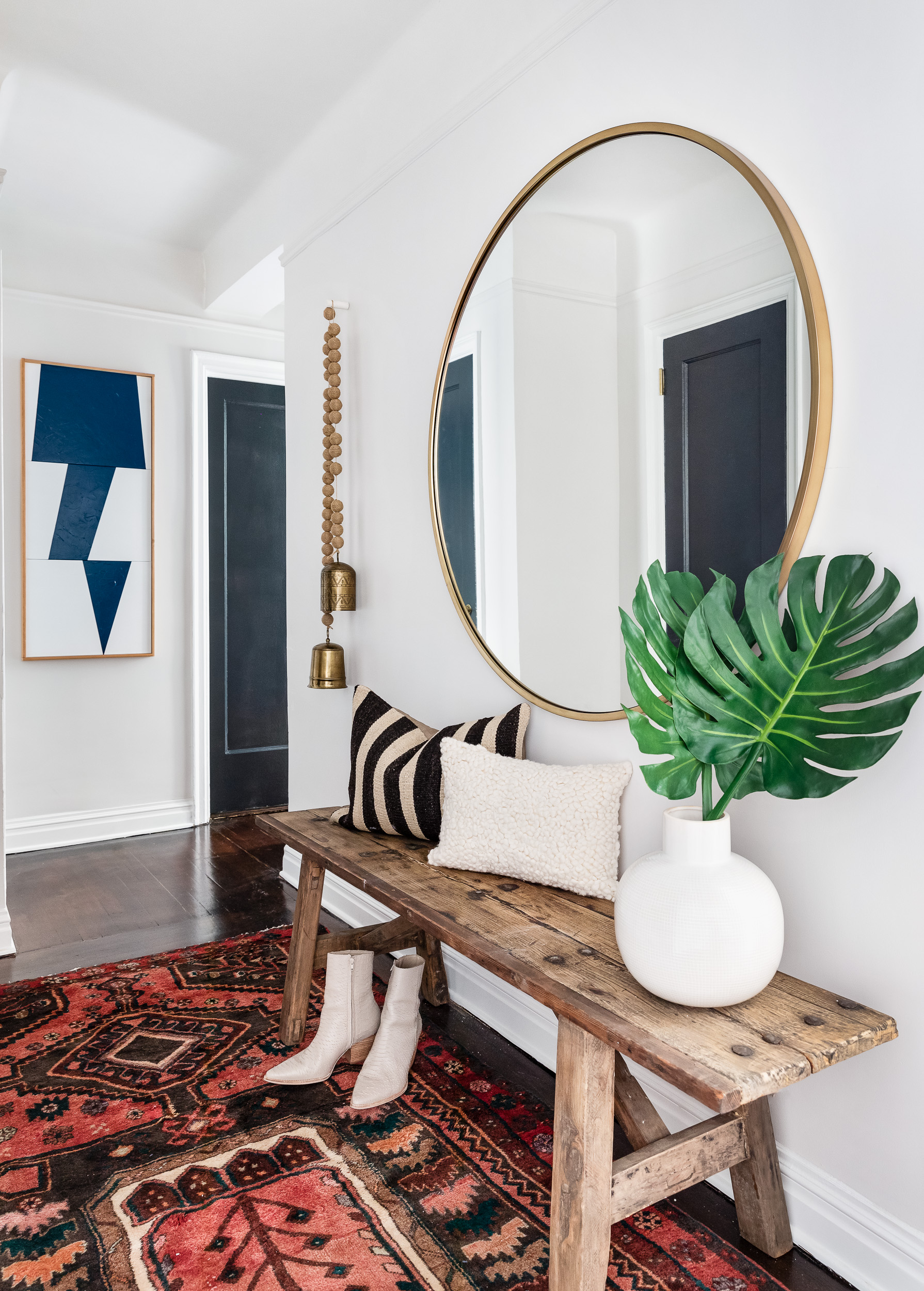
Those side tables in the bedroom? They’re actually dressers. When you’re in a tiny space, dual-function furniture is the name of the game. Another example is the rustic bench in the entryway: “We knew that she might carry [it] into the dining room to make bench seating and open up the foyer,” says Paranjape. You don’t need to sacrifice timeless style for something super functional—you just need to be more careful with the pieces you choose and be sure they can serve more than one purpose.
See more NYC homes we love: This Artist’s Studio Is Chicer Than Most Homes How a Dull Brown NYC Apartment Became a Colorful Oasis This Antique-Filled Brooklyn Apartment Throws Out the Design Rulebook


