We may earn revenue from the products available on this page and participate in affiliate programs.
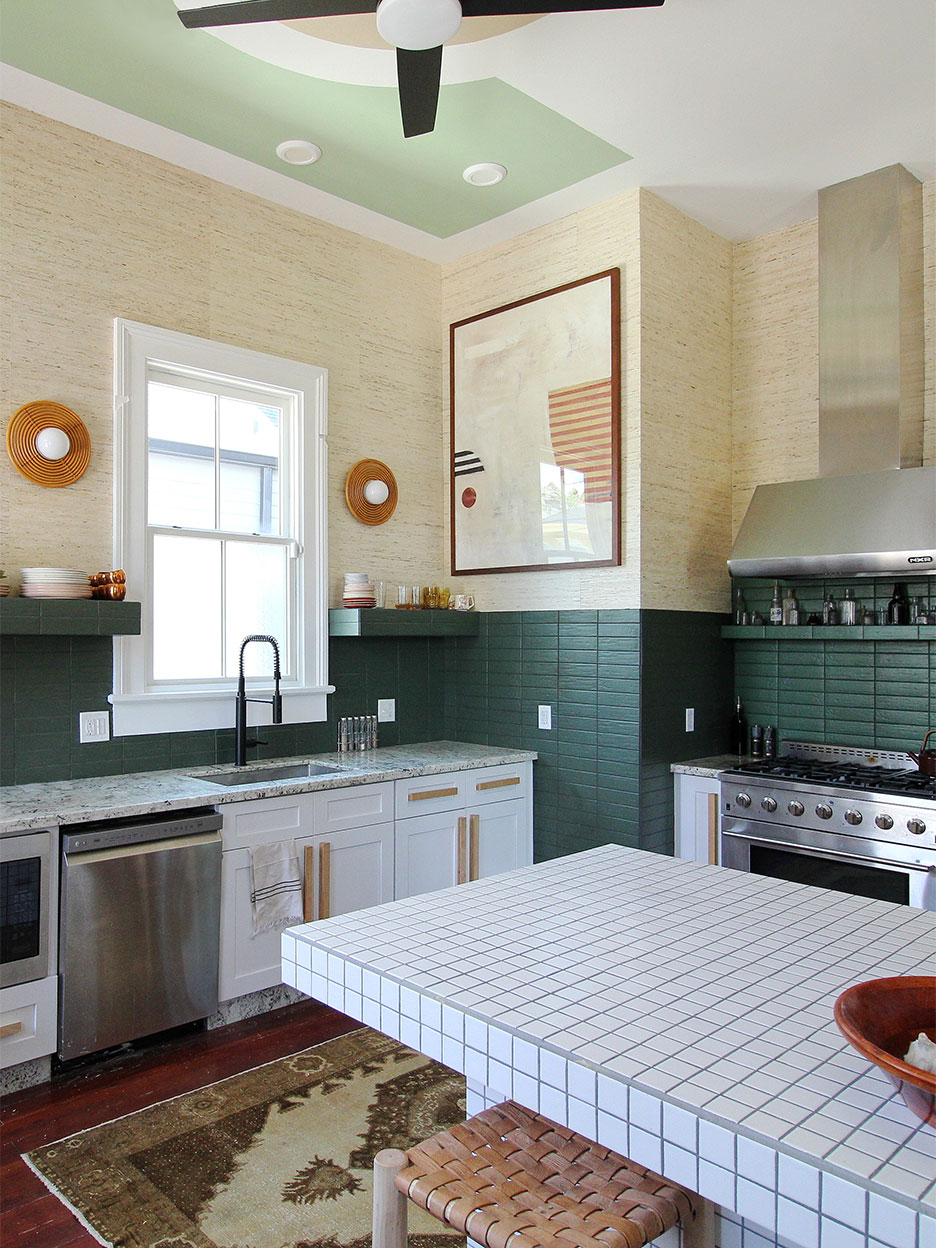
Liz Kamarul’s 1890s New Orleans home may be old, but her kitchen could not have been newer. When the designer and her husband, Tim, moved into the Central City house just over a year ago, the modern cooking space, with its white Shaker cabinets and gray granite countertops, stuck out like a sore thumb against the tall ceilings, ornate moldings, and original plasterwork. Something had to change, but still the couple hesitated.
“It was hard to justify ripping out brand-new items; it felt very wasteful,” says Kamarul. The designer gave herself a goal: Reuse as much as possible. In the end Kamarul kept everything but the faucet—which she swapped for a matte black option from Kohler—during a whirlwind six-week renovation as part of the One Room Challenge. Here’s how she brought in texture and character—and saved at least $5,000 by salvaging all those materials.
A Repurposed Pantry

Kamarul had always loved open shelving, so the first order of business was to remove the upper cupboards and design a separate custom piece to serve as extra storage. “When we took down the cabinets we realized they stacked perfectly on top of each other,” says the designer, who pivoted right then and there, creating a makeshift wall-hung pantry with the rejects. Kamarul’s father, a woodworker, designed the oversize pulls.
A Clever Kickback


The granite countertops were there to stay, but Karamul had other plans for the backsplash wall. She ripped out the existing narrow stone border and put it on the ground. Inspiration hit: “I noticed that it was the perfect size for a kickback under the cupboards,” she says.
A Textured Backdrop

With the back wall now bare, Kamarul brought in the texture she craved in the form of avocado green stacked tile from the Tile Shop, which she wrapped around a chunky floating shelf that now houses her favorite ceramics. “The walls used to be green, so using these was a great way to bring that color back to the space,” she says.
For the top half of the wall, Kamarul went with a grasscloth wallpaper from Pacific Designs and flanked the window with two rattan sconces from Corbett Lighting.
A DIY Island


“There was no island before and it was the most important need we had for the kitchen,” says Kamarul. The project’s biggest learning curve was building one from scratch against the original dusty pink plaster wall that separates the living room. The designer covered the counter-height table in small white ceramic squares. “They’re my favorite, but they’re not the most practical. Using them only on the island was the perfect compromise,” she explains.
A Ceiling Mural Gone Wrong

Just as Kamarul was putting the finishing touches on her kitchen in the form of a mint green ceiling mural, an entire gallon of paint spilled from her 12-foot ladder—all over the countertops, floors, and cabinets. “I went into complete shock,” she says. “Half of my body was covered in paint from head to toe as well as half of the kitchen.” But after the initial panic (and emergency cleanup), the designer took the hiccup in stride. She’ll be scraping specks of paint off the floors for years, signs of yet another story within the walls of this 100-year-old home.
Introducing Domino’s new podcast, Design Time, where we explore spaces with meaning. Each week, join editor-in-chief Jessica Romm Perez along with talented creatives and designers from our community to explore how to create a home that tells your story. Listen now and subscribe for new episodes every Thursday.
