We may earn revenue from the products available on this page and participate in affiliate programs.
Last year, Pantone shocked the masses by designating purple as its 2018 Color of the Year. This year, it’s back with yet another statement-worthy unveiling that’s sure to drum up the routine uproar—Living Coral was just named 2019’s COY. Something tells us the company knows just what to do to get the people talking.
Described as “an affable and animating shade,” Living Coral’s chromatic profile is distinguished by its golden undertones that lend to its fiercely spirited character. Given the abundance of reds and oranges that have made their mark in design as of late, the hue isn’t the most far-fetched selection, if you ask us.
The global paint giant’s incentive for selecting the color can be a nod toward growing environmental concerns and an attempt to call attention to the dangers of climate change and its implications. The alarming rate at which the world’s coral reefs are diminishing is certainly a cause for worry.
With sustainability marked as a major theme in design in the coming year, an increasing number of brands and designers are integrating environmentally friendly practices within their works, specifically by using sustainable materials. And if a color has the power to shed light on such an issue and implement change, we’re here for it.
Lost on how you can embrace the hue? We have you covered. Ahead are six reasons to give coral a chance.

It’s only fitting that the retro hue is embraced in a similarly retro form—and this vintage brass rolling chair is exactly what we had in mind.

It fits beautifully within an ombre installation, and given our affinity for pinks and reds, we can’t think of a better use for coral. Consider it an easy approach to dip your toes into decorating with the color.

Given the coral’s complementary nature, pairing the hue with pinks and reds comes at an ease. Take a heavily saturated approach and filter it in among a slew of warm tones, layering in pops of yellow and purple for a dynamic finish. Allow this colorful London home to serve as a source of inspiration.
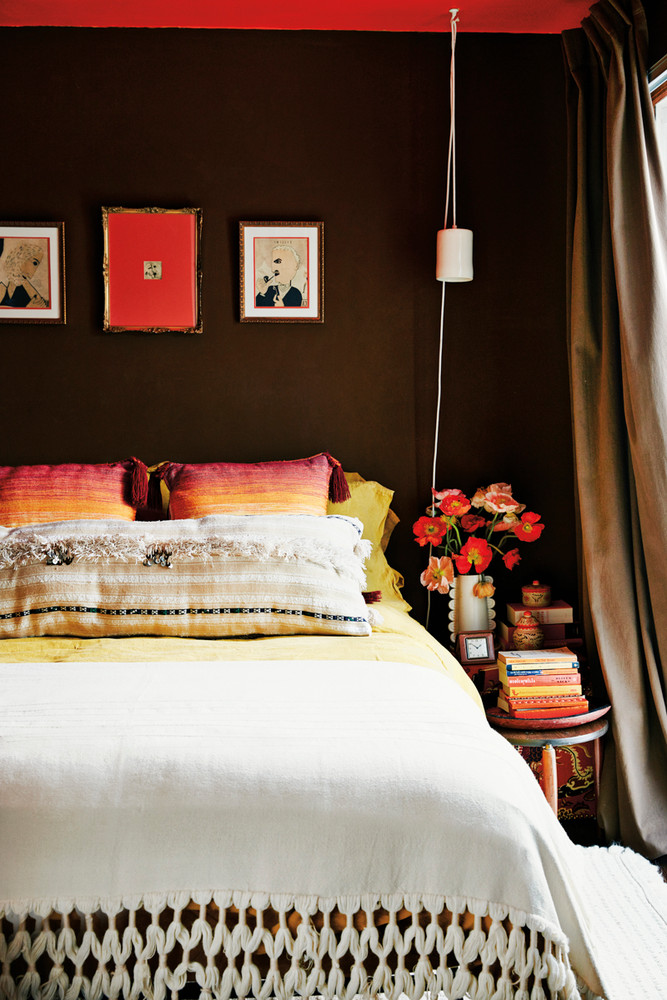
Being such a surprisingly versatile hue, coral’s vibrant properties designate it as a standout accent regardless of how or where it’s employed. In this dramatic bedroom, it manages to offset the intensity of the dark brown walls, offering a wealth of warmth and character to the scene.

The hue commands attention, even when it’s implemented by a decorative accent as simple as a rug. Take a style cue from this chromatically rich entry, where the coral-detailed landing pad provides the ultimate base for the intricately patterned objects and accents around.

If you’re still feeling reluctant, bring the hue home in a smaller dose. Wall art, decorative vases, and side tables are simple ways to decorate with coral sans running the risk of it clashing with your existing decor.

