We may earn revenue from the products available on this page and participate in affiliate programs.
Out-of-the-box thinking runs in London-based interior designer Lonika Chande’s family. Her mother, Lucy Dickens, is a celebrated artist as well as the great-great-granddaughter of Charles Dickens, and her aunt used to be a creative director for The Conran Shop and Habitat. So it’s far from surprising that Chande sidestepped trendy fare when designing a nursery for her 2-year-old son, Sasha.
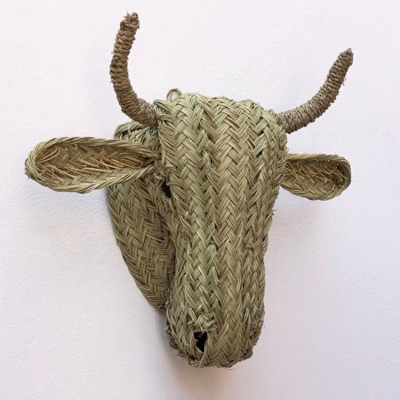
To give his room a wholly original POV, the designer rounded up a collection of vintage furnishings from some of her favorite fleas, as well as online marketplaces like Vinterior and Pamono. Her roster includes a perfectly patinaed dresser that once belonged to a painter, an antique Georgian nursing chair passed down from her mother, and a rattan cow head brought back from Morocco.
Aside from having interesting backstories and obvious visual appeal, Chande says there’s an unexpected benefit to decorating with older pieces: The love (aka wear) they show relieves parents of the pressure to keep everything in pristine condition. “Kids’ rooms are meant to be lived in,” she says, adding that she never sweats a little nick or ding. Read on to see the mom’s storied finds in action.
Make Everything Safe and Sound

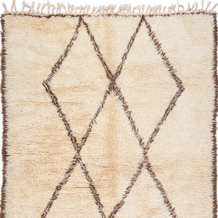
Before bringing Sasha home, Chande made child-friendly adjustments to a couple of the nursery’s older pieces. First, she had his Victorian crib re-caned to reinforce the sides. Then she bolted the antique, Chippendale-style armoire to the wall. The pine floors got a layer of not one but two rugs: A hard-wearing IKEA sisal that can withstand toddlerdom’s spills and thrills, and a checkerboard Berber with a plush playtime-ready pile.
Let the Space Tell Your Story

Chande purposefully didn’t flush out her entire design in one swoop. Instead she left gaps here and there for future travel souvenirs and meaningful gifts from family and friends. She knew that doing so would ensure any accent brought into the nursery would have a wonderful backstory, just like the room’s other vintage treasures.
Use Color and Pattern to Spark Curiosity

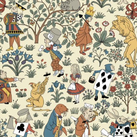
Red lacquered trim, brilliant blue curtains, and pops of yellow nod to the colors found in the Alice in Wonderland wallpaper, an accent that captivates Sasha and fosters his imagination. As he falls down the rabbit hole, Mom’s right by his side to answer all his burning questions about what the characters are up to. For Chande, these moments of togetherness are wonderfully magical, just like her son’s nursery.
The Goods
Go-to online home store: Two of my friends recently launched a Spanish homewares brand called Late Afternoon, and I’ve gone pretty mad for their beautiful handmade Andalusian ceramics.
Best tip for scoring great vintage online and at the markets: For online, it’s all about what you type into that search box. Change up the material and explore different descriptions. You never know what you might find. IRL, I recommend getting there bright and early when the markets open, so bring a flashlight. Also, don’t forget a tape measure to help you figure out right away if an item will fit in your home—and your car.
Fabric store I can’t get enough of: I love the Cloth Shop in Notting Hill for ticking fabric, antique kantha quilts, and cotton block prints.
Item in the nursery that gets the most use: The blackout curtains. Nowhere are they more important than in a nursery. They keep Sasha (and therefore me) from waking up with the sun.
Pattern in our home that is so us: The Svenskt Tenn elephant-print pillow on the nursing chair. I love yellow, and we all love elephants in our house.
Want to read about more kid-approved design tricks, creative organization ideas, and family-friendly living solutions? Sign up for our weekly newsletter!


