We may earn revenue from the products available on this page and participate in affiliate programs.
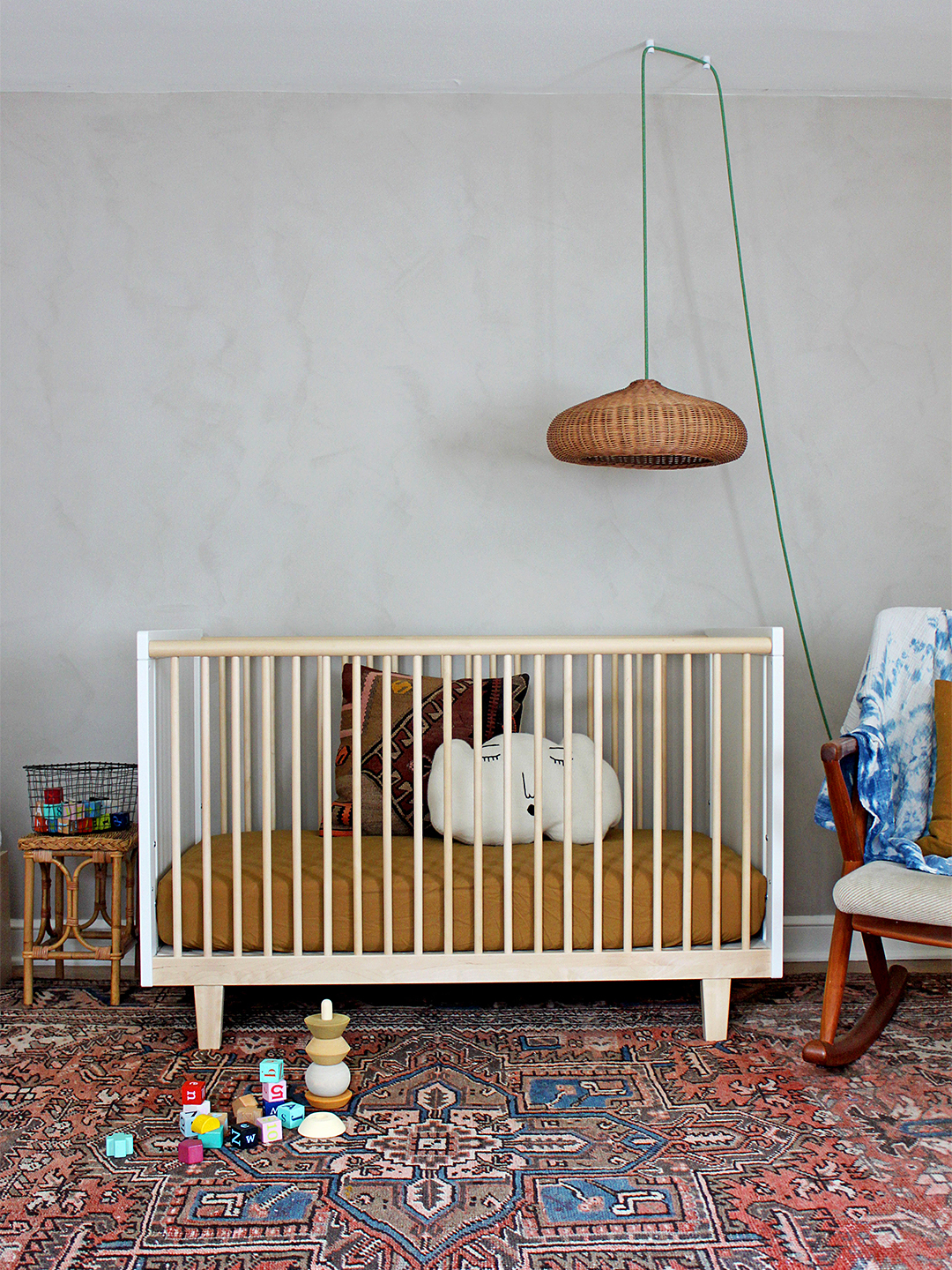
Chalky limewash walls used to bring about thoughts of brick house facades or Renaissance-era walls. However, in the past few years the versatile treatment has quickly gained traction as a softer, more nuanced alternative to standard paint. According to a study of Pinterest trend data done by WeThrift, searches for the texture have jumped 284 percent in 2021 alone. We get why—the color options are endless (you can even mix your own) and it takes the exact same amount of time to apply as normal paint.
What is limewash? A mixture of powdered (and burned) limestone mixed with water and color pigment. While the coating’s results can be compared to plaster, limewash has a subtler finish due to its high water ratio—and the application process is totally different. Here are the top three mistakes you’ll want to avoid if you plan to try this wall treatment for yourself.

Watery Is a Good Thing
Remember, limewash is just that—a wash. So the consistency of your mix should resemble that of milk rather than a glaze. This ensures that the treatment can build up correctly (texture!) and it helps you to gauge the final color (each layer makes the finish more opaque).
It’s All in the Brush
To get variation in tones, it’s important to apply the treatment with a brush with natural bristles. Homeowner Janette Yost, who recently tried Portola’s limewash paint, says that the smaller the surface area, the smaller your brush should be. “I used a 6-inch brush for an accent wall, and I could have had more texture in the end. If I’d done the whole room, that size would probably have been perfect.”
When in Doubt, Zigzag
Unlike plaster, where a thick consistency and lots of layers are key to achieving the dream texture, for limewash, less is always better. Here’s the trick: If you paint in an X pattern, texture will occur naturally at the overlap points. There’s nowhere for the strokes to hide, so working in a zigzag of sorts will limit the amount of noticeable straight lines.
