We may earn revenue from the products available on this page and participate in affiliate programs.
Christina Valencia’s ideal picture of coziness is Freemans, a rugged Colonial tavern–style restaurant tucked inside an alley on New York City’s Lower East Side. It’s the exact image she and her husband–slash–design partner, Kele Dobrinski, who together run the firm Colossus Mfg., set out to re-create when they renovated a vacation home in Lake Tahoe belonging to a young family of five. The catch: “It’s really hard to do that with 20-foot-high ceilings,” says Valencia.
While the house’s soaring, barn-wood–clad ceilings and massive windows were a huge selling point, the airy space meant the designers would have to pile on the dark paint to achieve a cocoon-like feel. Luxe textiles, like the abstract tapestry hanging in the dining room and plaid bedroom wallpaper, exude that classic cabin feel without skewing cheesy. “There are some beautifully done mountain homes that lean into taxidermy and antlers, but that was not our clients for sure,” says Valencia. “If we had doubled down on that style, it would have looked kitschy.”
Do: Paint a Really Big Room Black

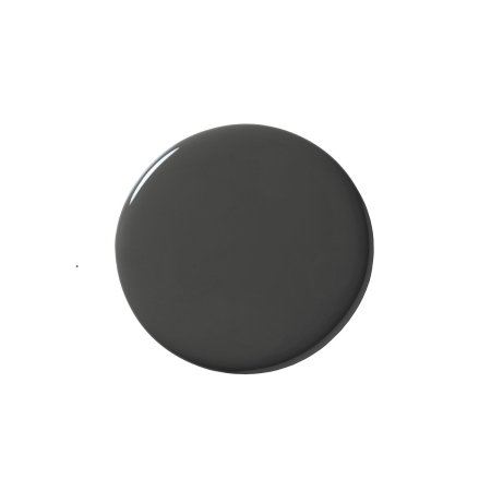
When you walk into the house you’re greeted by the massive living room, kitchen, and dining area. “It’s a gigantic space,” notes Valencia. By introducing a superrich tone to the new tongue-and-groove walls (everything is painted in Farrow & Ball’s Off-Black), the designers achieved the cozy look they were after without having to lower the ceilings.

The decision to leave the raw wood boards at the very top as is came as a request from the homeowners. “The husband grew up in a tiny cabin in Tahoe and this element touched his heart, I think,” she adds. “It’s really important to have nods within the home so you remember your surroundings.”
Don’t: Let Structural Elements Get in Your Way


“The two beams in the dining room are structural, so removing them would have been nearly impossible,” notes Dobrinski. The central lattice detailing between the support posts, however, was not—and it blocked things visually. “So we thought, how do we minimize them but make them interesting as your eye passes?” recalls Valencia. They ditched the shelving, added banding around the posts for architectural interest, and suspended a light over the dining table made of banana fiber to really draw guests over to the corner.

The mohair woven-rug wall hanging from Bofred, a female-owned shop based in South Africa, is another example of putting a 2022 spin on the rustic cabin aesthetic.
Do: Create an Even Cooking Field

Before, the 14-foot-long island had a distracting step-up that wasn’t functional and chopped off the sight lines. The designers leveled out the prep surface and topped it off with a fresh soapstone countertop that they also used on the backsplash. “It really ties into the black on the walls, but it was a minimal structural change,” says Valencia.
Don’t: Settle for Decisions People Made in the ’90s

The dated stainless steel hood got a major facelift in the form of a sleek rectangular frame, now clad in brass. Dobrinski worked with a welder to create the inlaid rivets that line the edges and the center trim. In order to instill a sense of connection between the cooking zone and the adjacent living room, they clad the fireplace in the same material. “We knew we could keep the concrete hearth and the wood mantel, but everything else was a dated disaster,” shares Valencia.
Do: Think Family-Friendly


The horizontal wood paneling continues into the front entryway, which the designers sought to make totally kidproof. “We also have three little ones and spend time in the mountains, so we channeled our inner needs,” says Valencia. The pair repurposed a piece of cabinetry that was originally separating the living room and kitchen and turned it into a bench with tons of hidden storage for the family’s snow boots and “bazillion jackets.”

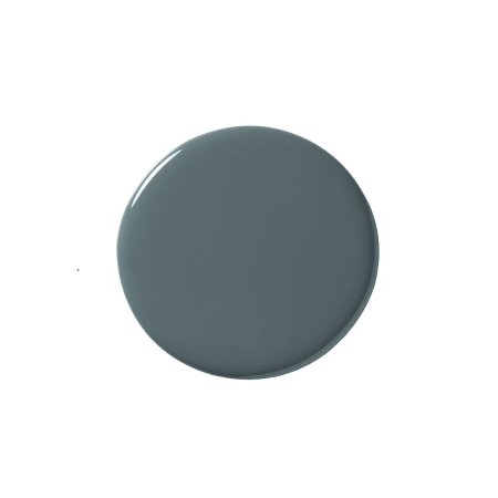
Upstairs, Inchyra Blue walls and a Room and Board sleeper sofa set the scene for a child-friendly retreat and importantly keep the kiddos from constantly lounging downstairs on the splurge-worthy Nickey Kehoe sofa in the main living room.

Figuring out how to fit two bunk beds in one room that has sloped ceilings was like playing Tetris. After removing a closet that was soaking up space in the corner, Dobrinski came up with the design for a custom hickory wood piece complete with storage niches and lighting (seen above: half of the structure). “There were so many dynamics at play to make sure a kid could sit up top without bumping their head,” he says. The two mattresses on the upper level that face each other, foot to foot, were also bespoke additions because they had to be shorter than the standard twin in order to fit.
Don’t: Knock Brown Before You Try It


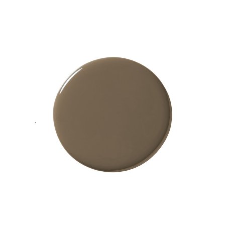
In one of the guest bedrooms, the designers took a risk with a taupe-y brown shade from Farrow & Ball. “We were working around the alderwood that’s on the windowsills, so we wanted to find colors that could balance it and help make it look fresh,” explains Valencia. Paint was especially tricky on this project because of all the snow on the ground during winter. “It bounces even more light around—stronger than a typical home with a lot of windows,” notes Dobrinski. All the hues they went with had to look good as they changed throughout the day (something that happens a lot during the colder months). “We went through a lot of iterations to get the tones and saturation right,” he adds. Funny enough, the bedroom’s swatch is called Salon Drab, but it’s anything but bleak.


