We may earn revenue from the products available on this page and participate in affiliate programs.
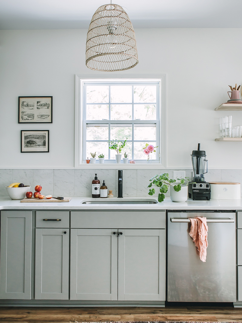
There’s a reason nearly half of designers predict L-shaped kitchens will be the leading layout of 2021: The simple arrangement is extremely functional—well, most of the time. In Rosy Alexander’s case, it didn’t start out that way. When the designer and her husband moved into their Raleigh, North Carolina, home, it looked like all the cabinets had been shoved into one corner. The countertop space was minimal and the cupboards themselves were flimsy. “It was the perfect opportunity to just revamp everything,” says Alexander.
She stuck with the same general layout (there wasn’t enough room to build an island or a peninsula) but extended her new custom cupboards in the direction of the dining room, adding around 5 feet of storage. “I wanted to gain some depth but for it to also look sleek, modern, and European,” she says of scrapping the idea of installing additional uppers and mounting two long open shelves on the wall instead. Look a little closer and you’ll find there are a few more tricks in the mix.
Hide the Hood


Alexander had an epiphany while looking at photos of Scandinavian kitchens on Pinterest: The range hood is nowhere to be found. What gives? It’s hiding in an upper cabinet. “It’s a big IKEA thing,” she says. (The Swedish home brand specializes in making cabinets that hide vents, only exposing the air duct underneath.) “Everybody was telling me it’s impossible, and when that happens, I’m going to figure out a way,” says the designer.

After nailing down the specs with her cabinetmaker, Alexander made sure she was well within the fire code requirements by raising the cabinet 24 inches above the stovetop (the standard is usually 20 inches for an electric appliance). The height doesn’t look all that extreme because the adjacent upper cabinet and the open shelves are situated at the same height. A breezy basket pendant light now hangs in the same spot as the old flush mount fixture.
Shop the Bathroom Aisle

With dreams of a marble slab backsplash but no budget to back it up, Alexander found a compromise: 12-inch-tall bathroom floor tiles from Lowe’s (they’re a larger format than standard wall tiles). In order to make the slabs look seamless, she ditched high-contrast grout for a lighter silicone adhesive and pushed the stones closer together so it looks like one solid surface when you’re standing at a distance.
Streamline the Edges

Rather than continue the marble pieces up the wall with the open shelves, Alexander spaced everything out in 1-foot increments. That way the clean white paint could shine through. “I have gray cabinets and a gray backsplash; I didn’t want everything to be gray,” she says.
Because these are floor tiles, they didn’t come with standard Schluter strips (or little pieces of metal or stone used to form the edge of an installation). So Alexander’s brother-in-law (also her contractor on the project) crafted his own border out of painted wood trim. There’s a silver lining to every kitchen, no matter how small.
Get the Look
Our Winter Renovation issue is here! Subscribe now to step inside Leanne Ford’s latest project—her own historic Pennsylvania home. Plus discover our new rules of reno.
