We may earn revenue from the products available on this page and participate in affiliate programs.
Interior designer Holli Rodrigues’s kitchen reno all started with a leaky fridge. Naturally, replacing the water-damaged floors meant uprooting the built-in island, which snowballed into getting new counters to match the upgrade. And, as these things go, that led to revamping the cabinetry. Before she knew it, she had a full-blown remodel on her hands.
With black granite counters surrounded by all-white everything else, Rodrigues’s original cookspace had a high-contrast vibe punctuated with bold, industrial accents. “I knew I wanted a fresh look without creating a new kitchen,” recalls the designer. She planned to open up the space to accommodate more people and to add vintage details. The goal was to reinvent the room with an Old World-meets-Euro-chic flair. She focused on bringing in lots of texture and organic pieces—as well as a lustrous new faucet—including her “curiosities,” which she describes as, “those pieces that start conversations, bring interest to a space and are usually one-of-a-kind.”
Ahead, the designer gives us the lowdown on how she transformed the hub of her home into a bright and happy hangout.
Surface value

For Rodrigues, the counters became the focal element that set the decorative tone of the room. Marble, with its intense upkeep, was out of the question: “I have three kids and a not-so-clean husband,” says the designer. “Taking the time to seal it, spot-treat it, and constantly worry about stains was not an option.”
Instead, she went with quartz counters that feature a seamless, marble-like finish to help lighten up the room. The best part? It doesn’t scratch or stain—in short, it’s perfect for a busy family. By opting for a waterfall edge on the island, she seamlessly bridged the gap between old and new.
Everything and the kitchen sink

Four out of Rodrigues’s five family members are vegetarian, and that means lots of home-cooked meals. Maintaining a healthy lifestyle is important to the clan, whose food-filled gatherings are a point of pride. Since cooking is a constant activity, building out a kitchen with efficiency in mind was crucial.
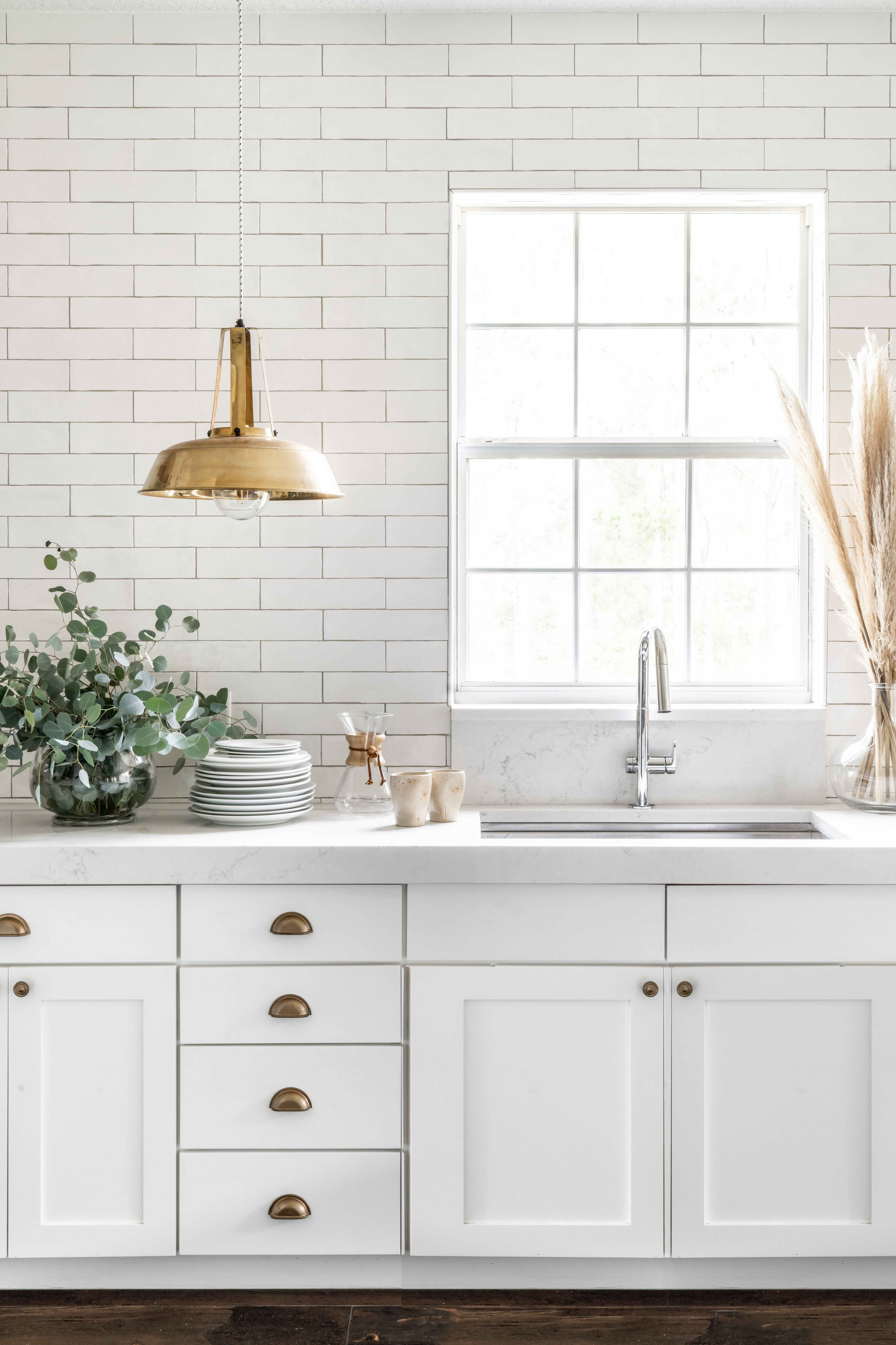
To set the tone, the designer opted for a deep Ruvati sink. The crowning piece to complete the look was the Beale MeasureFill Faucet, from American Standard, in a sleek chrome finish to complement the stainless-steel basin below. With touch functionality that can measure out a specific amount of water be it 3 cups or 40 oz, it makes cooking a breeze— think of it as a faucet with a built-in measuring cup. “I wanted something understated yet design-forward that wouldn’t clash with the oversized brass pendants hanging above,” she says.
Subway tile with a side of cool

Rodrigues had a specific vision in mind for the walls: She hoped to replicate the look and feel of a historic European building she’d seen in her travels. She selected a subtly textured, handmade subway tile with a soft gloss to run the whole way up to the ceiling. For the grout, she chose a stone-colored hue to emulate the look of an antique facade. “While I love the standard white subway tile, these organic ones add that unique, time-worn feel that I crave in our home.”
Cabinets, begone

The original units were solid maple, but they lacked style and their quality was deteriorating—the fronts began to fade and yellow over time. As a budget-friendly fix, the designer decided to give them a facelift with a fresh coat of paint. Then she got rid of the uppers to lend the space a more open feel. “Once we removed the cabinets, not only did the kitchen have more light coming in from the windows, but the countertops seemed to visually double in size as far as surface area,” she recalls.
To make access to everyday dinnerware a bit easier, Rodrigues bought a narrow ladder shelf and used it to house a tight edit of bowls, plates, and glassware. She also wallpapered the wall behind the shelves to give it an added dose of interest. As for the items she’d kept in the original cabinets? After going through the contents, Rodrigues realized the majority of it was unnecessary. Amazingly, she was left with extra cabinet space in the end.
Now that’s a downsizing success story we can definitely get behind—Marie Kondo would be proud.

