We may earn revenue from the products available on this page and participate in affiliate programs.
When one family got to trade in kitchen cabinetry that was literally falling off the walls for a sleek monochromatic space, it was a total dream. The cherry on top: The remodel was handled by none other than Shea McGee of Studio McGee. If nothing else, these homeowners have a built-in conversation starter for future cocktail hours around the updated bar. (How many people can say they had their home revamped by a design celebrity?)
With elegant accents to balance out the simple door fronts and backsplash, the room has all the hallmarks of a classic Studio McGee design. (Remember the company’s office reveal?) We chatted with the designer to find out how she squeezed everything into an unforgiving footprint. We might not all be able to recruit her for our own projects, but we can definitely harness a bit of her expertise.


Get Inventive With Strict Boundaries
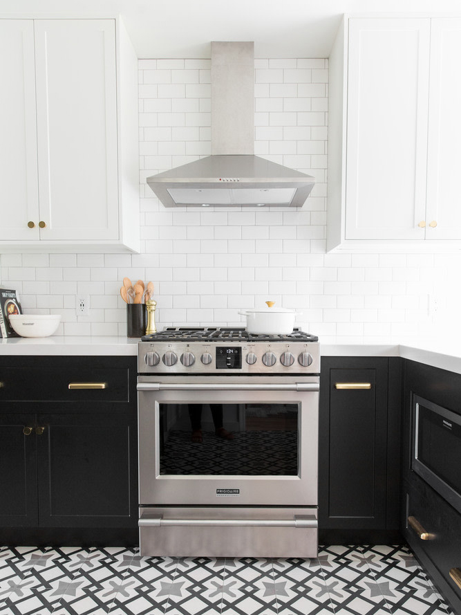
The kitchen is immediately off the entry, so there wasn’t a lot of wiggle room when it came to the floor plan. Instead of changing the layout, McGee implemented a handful of small but meaningful tweaks—chiefly, ditching some of the cabinetry to visually open up the room. She also added a hood above the range and shelving above the sink to create a bit of breathing room.

Go Monochrome Without Painting Everything White
“A high-contrast look with black lower cabinets grounds the space,” says McGee. Patterned floor tile breaks up the shades so the the juxtaposition isn’t so stark. The designer then took it one step further, opting for gray grout around the subway tile to tie everything together.


Save a Few Bucks Where It Counts
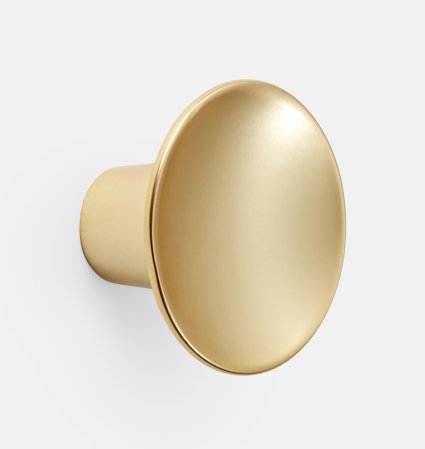
Do as McGee does and head to IKEA for your cupboards—then upgrade the whole thing with custom cabinet fronts and contemporary knobs. She went to Semihandmade for the bespoke Shaker-style covers.

Put Function First…
In a small space, practicality is always a priority—but add two young boys to the equation and you up the ante even more. One of McGee’s solutions? A quartz countertop, which is as durable as it is chic. Bring on the mini sous chefs.
…But Don’t Forget Style
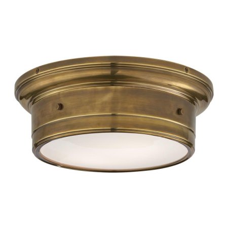
A lack of square footage doesn’t mean you’re relegated to a life of utilitarian fixtures. See: the sculptural brass pendants over the counter, contrasting hardware, and memento-filled open shelving.
See more kitchen transformations that inspire: Can You Spot the Optical Illusion in This Mint Kitchen? A Clever Layout Tweak Doubled the Storage in This 36-Square-Foot Kitchen This Green Kitchen Ended Up Smaller Than Where It Started


