We may earn revenue from the products available on this page and participate in affiliate programs.
Kim Johnson had no plan when she started designing her 80-year-old home in Ottawa, Canada. The interiors blogger doesn’t even subscribe to one style. A self-described “flying by the seat of my pants” kind of person, she simply listened to the house. The doors and windows have both stained and leaded glass, for one, leading Johnson down a more traditional (but still eclectic) design path.

What sold Johnson on the space in the first place, back in 2014, was another original architectural element: a real entrance. “Once I saw that I didn’t have to walk directly into the living room, I was sold,” she remembers. “Then I was greeted with wainscoting. I nearly wept with glee.” After living in, as she puts it, a “characterless,” narrow (only 10 feet wide) home in the city’s Little Italy neighborhood, the house, named a heritage site in 2018, was a refreshing change.

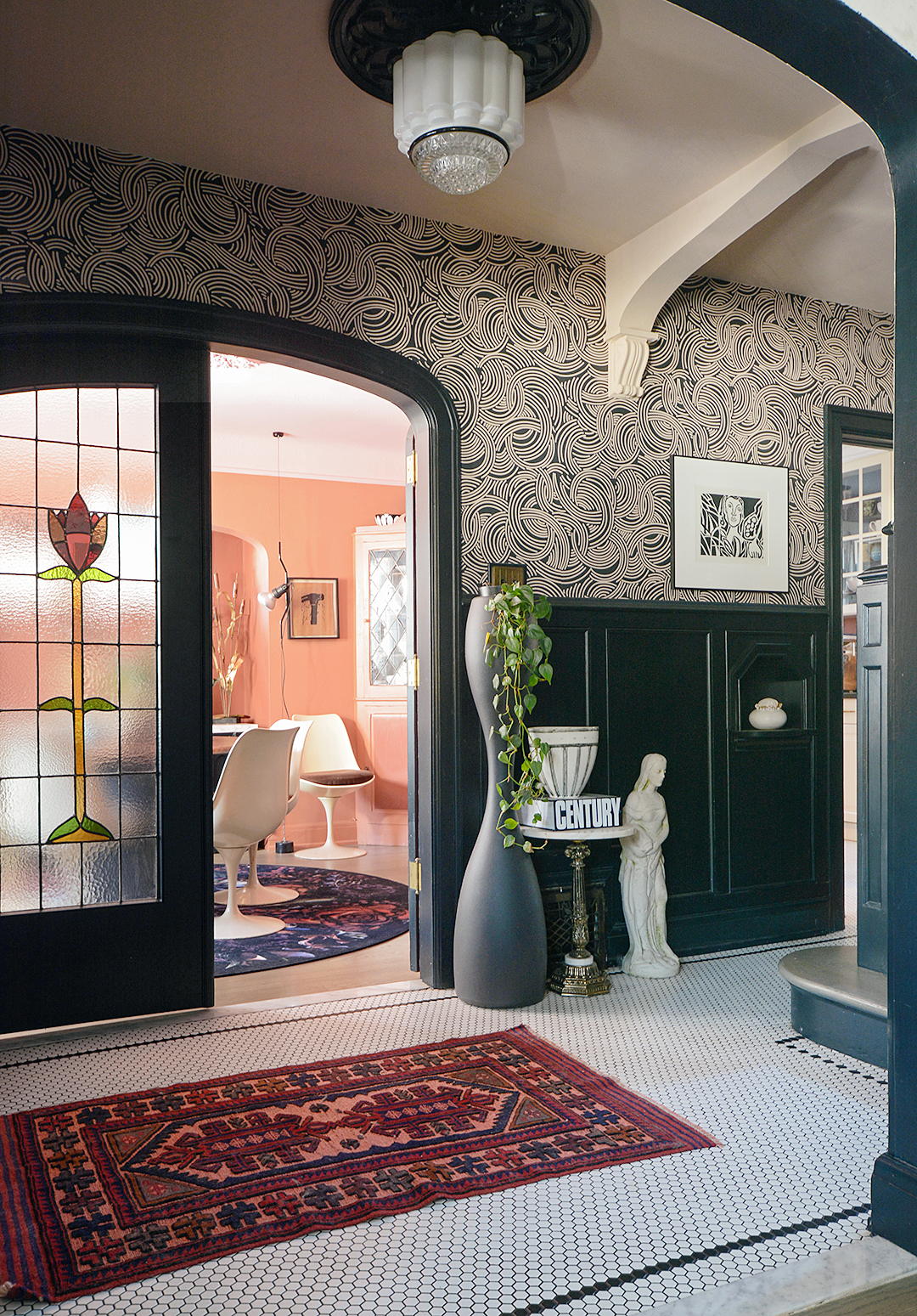
The foyer is now an even more dramatic introduction, wrapped in a swirling wallpaper, with the stairs, trim, and wainscoting painted black. Getting the balance right was key. “Frankly it was trial and error. I painted my long, narrow living room in a dark gray when we first moved in, but it was too much. I don’t want to live in a cave,” explains Johnson. By keeping the ceilings white and using a light tile on the floors, the bold paint choice elongates the entry rather than closing it in.
Another one of Johnson’s tricks for making dark spaces less gloomy? Always know where your windows are. With only east- and west-facing windows, the warm light is best in the mornings and evenings—when she’s most likely leaving or returning home.


The stained-glass windows dictated the color palette Johnson chose for each room. The kitchen is a deep red, recalling the roses on the dining room’s door, while the living space and bedroom are a cloudy gray, similar to smoked glass. Of course, she had to break her own rule a couple of times. The outdoor porch is lime green (it just makes Johnson happy), and the dining area is varying shades of peach.
The space, which Johnson cheerfully describes as “out there,” is a tone-on-tone combination of Farrow & Ball pinks—Nancy’s Blushes on the ceiling, Red Earth on the walls, and Picture Gallery Red on the trim. Mustard velvet curtains and a turquoise pendant lamp are bold exclamation points, breaking up the monochrome.

Initially all the light fixtures in the house were sleek and modern. But after living in the home (and doing more listening), Johnson has slowly been replacing each one of her purchases with antique, often Art Deco discoveries. “They’re hard to find, but it makes so much more sense to design with the history in mind,” she says.

The one place where Johnson started from scratch was the custom greenhouse in the backyard, complete with painted striped floors and cozy seating. It was a completely unnecessary build, she says, but something she and her husband have dreamed about having for ages—the couple are total plant lovers. (It also became their makeshift office when lockdown restrictions went into effect last year.)

In order to offset the hefty material costs—and save them $10,000—Johnson decided to do all of the landscaping herself—including the demo. “We had no past experience, so it was a daunting task,” she recalls of only having two days to clear out the existing greenery. But, she adds, “I was shocked at the results. Now it’s the space I spend the most time in, and I dread closing it up for the winter.”

The Goods
Favorite local home stores or source: Alteriors and The Modern Shop.
Favorite source for plants and gardening supplies: Robert Plante Greenhouses.
Go-to online decor site: Definitely Etsy.
Object in my home that gets the most use: The greenhouse; I’m out there every single day.
