We may earn revenue from the products available on this page and participate in affiliate programs.
Former book editor Oliver Haslegrave used to read stories. Now as the founder of Home Studios—the Brooklyn-based design firm behind some of New York City’s most celebrated bars and restaurants, such as Elsa, Donna, and the Spaniard—he tells them through materials. In a new kids’-slash-guest bathroom he and his team designed for a young family living in Manhattan’s NoHo neighborhood, curved tiles evoke the work of design greats Alvar Aalto, Mario Bellini, and Marcel Breuer. “It’s very impressionistic,” says Haslegrave. “It’s playful but rigorous.”
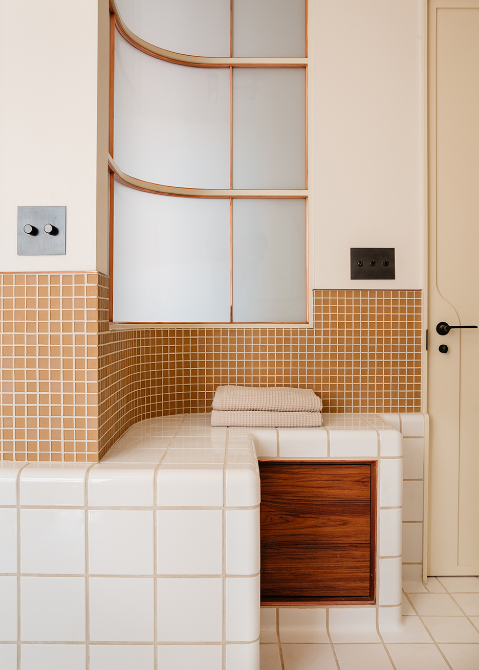
The bendy ceramic squares from Netherland-based company DTILE make up all the main surfaces in the space, including the joint tub-shower. The grid-like pattern and copper and oak railing around the glass partition help the feature “feel a little bit more bespoke,” says Haslegrave. It’s a far cry from the slick white dated type.
Pair Tiles Based on Size

Where the DTILE stops on the walls, a smaller mosaic pattern begins. Haslegrave’s thinking was that the 1-by-1-inch pieces (a more traditional bathroom tile option) make the larger squares look even more pronounced. “They also protect the walls from water,” he says. In keeping with his client’s request to keep the palette fairly neutral, he opted for terracotta-toned tiles that pick up on the warm oak, teak, and copper elements. “It’s a balance,” he says. “There’s a lot going on in this bathroom.”
Raising the bathtub’s edge slightly higher than most further elevated the design. “There’s not just one plane to the bathroom,” says Haslegrave. To ensure the little ones (ages 6 and 8) can still hop in with ease, he added a step with handrails.
Carve Storage Out of Tight Corners
With only one exterior window in the bathroom, Haslegrave aimed to bring in some of the natural light from the adjacent living room by adding a copper-trimmed interior window (the glass is fogged, so there’s still plenty of privacy). Below the window is a built-in bench swathed in the curved tiles with a teakwood nook underneath for spare towels. “It’s a guest bath but also a kids’ bath, so it has to be extra-functional,” he says.
Ward Off Germs

The idea to use copper as the main metal in the space (peep the towel hooks, Waterworks plumbing fixtures, and custom Home Studios mirror) was a purely aesthetic choice (it wears beautifully over time). But it also serves another purpose: The material is naturally antimicrobial, meaning it kills bacteria practically on contact. This space nails style and cleanliness in one fell swoop.
Photography by Brian Ferry
