We may earn revenue from the products available on this page and participate in affiliate programs.
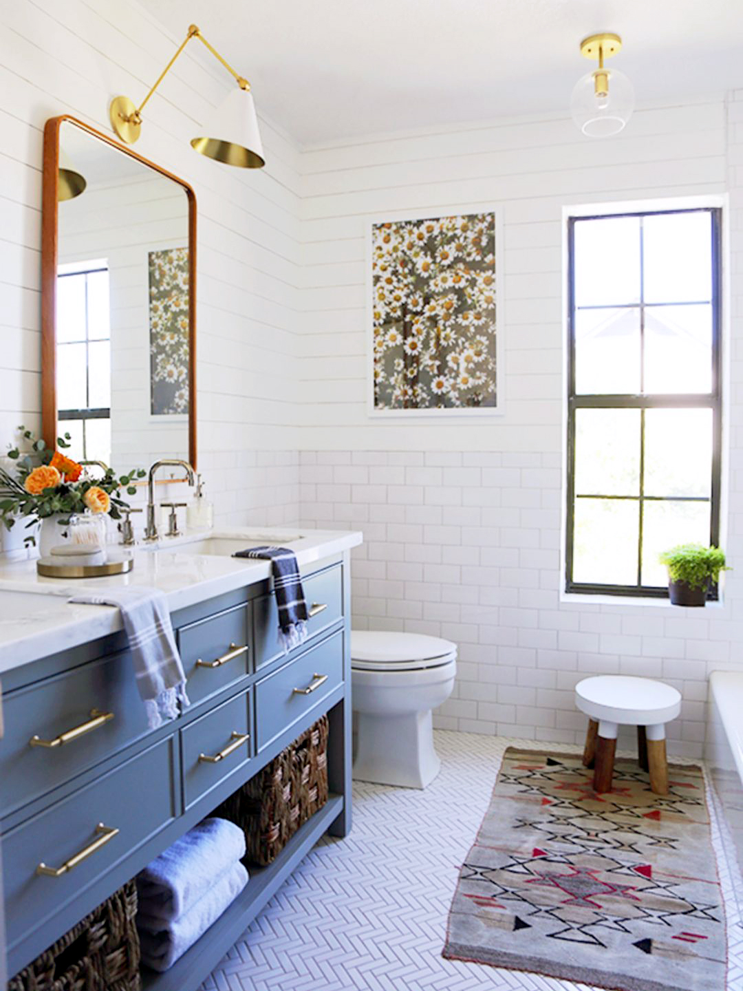
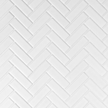
Anyone who has ever designed something with kids in mind knows one thing to be true: You will be dealing in temporalities. As little ones grow and their taste evolves, so will the way they use a space—what you need is a versatile foundation that you can tweak as the years pass. That’s the route Jenny Komenda took with creating her daughters’ bathroom. It all started with a simple white base of herringbone and subway tile.
“It’s so easy to change up the top layer of accessories going forward, because everything—no really, everything—looks great in an all-white room!” says Komenda. But before bringing in the accents, her first step was getting rid of the dated fixtures. She tore out the brick veneer floor and almond-colored counter. “There wasn’t much that could be salvaged in there,” she adds.


Now the bright room looks nothing like its “before” photos. We chatted with Komenda to see how she crafted the ultimate timeless (but still playful) area.
Make Budget a Number-One Priority
If you’re anticipating having to make more updates down the road, keep things on the inexpensive end of the spectrum. At 15 cents per tile, the subway shape seemed like the obvious choice for adding subtle pattern to the walls, nicely complemented by an equally wallet-friendly herringbone for the floors.


Amp Up the Little Things
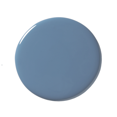
The details of the new bathroom bring everything together. A warm gray grout color contrasts nicely with all the white and complements the blue-gray cabinetry nicely. But it’s the much-loved combo of brass and wood that steals the show for Komenda. “They always play so well together,” she says of the lighting and mirror pairing.
Bring in Hints of Print
Too much might overwhelm a tiny room (and have a firm expiration date), so Komenda stuck to subdued pattern play. “I think the shiplap and tile might have been too much together if they hadn’t been the same shade,” she says. Keep everything within the same color house and experiment away!
See more bathroom makeovers that stun: Who Says Your Bathrooms Have to Look the Same? How One Couple Upgraded This 47-Square-Foot Bathroom Themselves Can You Spot the Swaps in This Drastic Vanity Before-and-After?


