We may earn revenue from the products available on this page and participate in affiliate programs.
No one summed up Kathryn Berschback’s interior design mantra better than her grandmother. “She said, ‘I’m so glad you know that color can heal,’” recalls the Tennessee native. “That’s always spoken to me: the power of color to evoke emotion.”
Color was an undeniable given in Berschback’s latest project: a 3,000-square-foot new build located in the historic 12 South neighborhood in Nashville. Known for its walkable streets and bungalow-style homes, the designer was first tasked with channeling Craftsman charm from scratch.
“My clients were coming from a very contemporary house that was a bit more isolated and remote. It had a much more serious feeling,” she explains. “Here, they wanted to keep the clean lines but bring more excitement into the space. So we built the house in keeping with the style and neighborhood and brought in those classic Craftsman details with the trim and molding to create a sense of coziness.”


Along with a serious vinyl collection, the homeowners had also scooped up a number of prints, paintings, and photographs over the years. Thus, it only seemed fitting that Berschback showcase the home’s inspired architectural character through the lens of art. With her clients soon to be empty nesters, the designer focused on cultivating a vibrant place cozy enough for two country music lovers to kick back and call home.

Benjamin Moore’s tried-and-true paint swatch, White Dove, takes on new meaning in the living room where an optical piece by artist Gina Julian doubles as a spirited focal point over the mantel.
“Most of the pieces in the house were done by friends or relatives, so the art was very personal to them. Knowing that we had these colors to work around, we wanted to keep the space clean and bring in fabrics and textures that would complement the artwork,” shares Berschback.
The only catch? “You see a lot of the home all at one time,” she suggests. “There are a lot of colors happening, so they all had to work together.”

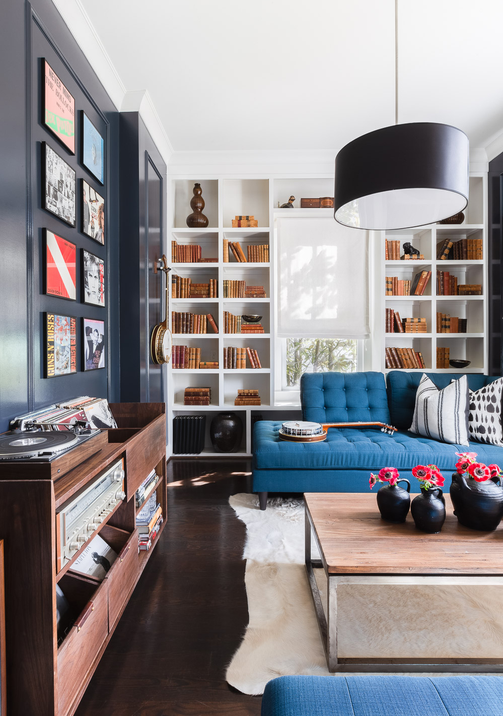
One part music lounge, one part library, and one part home bar, Berschback’s clients were most excited about having a hangout space to call their own. The rich navy blue walls (swathed in Benjamin Moore’s Racoon Fur) amp up the moodiness for whiskey drinking, while an opposing chaise lounge made it a welcoming place to relax with a good read.
With the exception of a painted British flag by Lynette Wright on one of the walls, the only pieces of art in the room are the husband’s favorite albums from high school and college, which Berschback had framed. Note: There’s not a television in sight—just good tunes.
“Both the husband and wife have a connection to country music and the music business. The husband grew up in Detroit and had been a collector and connoisseur since he was in high school. This room was kind of a nod to the merging of country music, rock music, and music that came out of Detroit,” says the designer.
To keep their vinyl collection in order, the husband commissioned woodworker Chris Munn to design a custom walnut cabinet that would re-create the feeling of sifting through albums in a record store.
“We took this room that would have traditionally been used as an office and created a space where both of them could put their feet up and listen to music just the two of them or host six or eight people if they wanted to,” she adds.
Black accents make a welcomed appearance in just about every room (all the interior doors in the house are even painted black). It’s a powerful hue Berschback swears by for a touch of luxe.
“I love to add some element of black in every space,” she says. “I think people sometimes think black will feel intimidating, but I think it creates a sense of warmth and refuge. Having some visual contrast is really appealing to the eye. To me, it adds a level of sophistication and luxury to a space.”
In the breakfast room, the designer embraced black in a not-so-serious manner by pairing it with a fun texture on the chairs: velvet. Elsewhere, a skull painting by Sarah Skupien adds a special punch over the bar cart.

In the more formal dining room, a glamorous chandelier from Jonathan Adler made up of glass hexagons presides over a round dining table. In this particular space, the designer was faced with the tricky task of making the room feel layered and alive with textures without tending toward dated.
“We wanted to maintain the clean feel but add some color and movement to the room in an updated way,” she explains. “There was a lot of geometry going on in that space, and that pink textured rug seemed to break that up a little bit while also reintroducing the orange that’s in the painting on the wall.”


A similar color scheme is played out in the master bedroom where Sherwin-Williams’ Gauntlet Gray serves as a soothing backdrop and escape from the noise. We couldn’t name a better place to relax after a late night of listening to good music if we tried.

Tour more homes:
Traditional Meets Eclectic in This Sunny Florida Home
One Couple, Polar-Opposite Styles, and How They Made It Work


