We may earn revenue from the products available on this page and participate in affiliate programs.
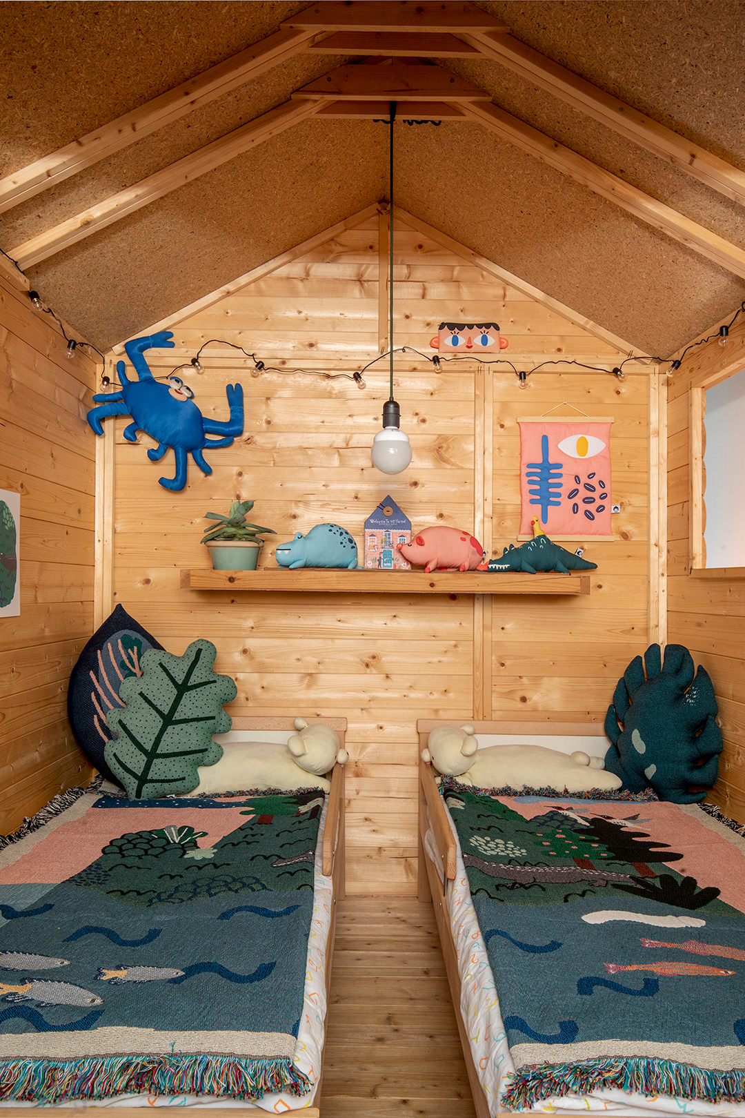
“My kids tell their kindergarten friends that they own a house, but nobody believes them,” says the co-owner of a 12th-floor 1960s apartment in Tel Aviv’s historic Jaffa neighborhood. “They feel very special and unique because of their wood home,” he adds with a laugh. He is referring to a stand-alone, timber-clad bunkhouse that sits slap-bang in the middle of the 1,000-square-foot space—which is actually a cleverly disguised bedroom for twin 4-year-old boys.

While the shed is undoubtedly a highlight, the apartment overall—where sweeping views of the Mediterranean serve as a backdrop for standout vintage pieces by Louis Poulson and Antonio Citterio, as well as contemporary finds by Norman Foster, Faye Toogood, and Tom Dixon—makes a big impact considering the modest footprint. Local architects Zohar Shavit and Irit Henkin of Henkin Shavit smartly configured the layout to create an expansive effect and still offer functional, family-friendly zones that flow together.

“The apartment originally contained three long, narrow rooms, but the clients, who are graphic designers and art lovers, wanted it to have an open loft feeling,” explains Henkin. “The 20-foot-long window [in the main living area] frames the whole scene like an art piece that changes throughout the day,” he adds.

Using the single cement column near the middle of the apartment as a “planning tool,” the design duo went about subdividing the space into two areas: The first encompasses the living room, kitchen, work nook, and kids’ “bedroom”; the second is carved up into the main bedroom, bathroom, and guest bathroom.

To help further differentiate the interior, Henkin and Shavit covered the kitchen floors with graphic concrete tiles and replaced the original terrazzo tiles elsewhere with pine planks painted a light-bouncing dove gray. The bedroom and bathroom were enclosed by 1920s doors scored at a flea market that were then retrofitted with ’40s-era “grandma glass” windows to maximize natural light.

Likewise “it was clear to us that the children must have a private room,” says Henkin. “However, with floor-to-ceiling walls we would have blocked the spectacular view that stretches across the entire space.” Instead they opted for a freestanding structure inspired by a childlike drawing of a house. “We initially thought of designing it ourselves but decided on a ready-made design that fit our needs,” explains Shavit. The team sourced an outdoor-quality pine shed, envisaging the exterior as a blank canvas. Next, the twins (then toddlers) were recruited to pick a color palette, which was brought to life by local artist Korma Dima. Kept off-site until the big reveal day, the boys “fell in love [with the structure] at first sight,” according to their dads.

As expected, the bunkhouse continues to spark all kinds of imaginative play. Often the kids close the doors and enter their own little world for hours, jumping around and propping out the cozy interior with plush leaf pillows and creatures (by Tel Aviv textile artist Na’ama Ben Moshe). On a practical level, most toys are kept in boxes adjacent to the shed, and clothing is stored alongside their parents’ clothing in the main bedroom closet, dedicating the space for fun and sleep. And when the mini inhabitants outgrow their fort? According to their parents, “We thought of sharing it with the children’s kindergarten class to make others as happy as we’ve been with it.” A gift that keeps on giving.
Want to read about more kid-approved design tricks, creative organization ideas, and family-friendly living solutions? Sign up for our weekly newsletter!
