We may earn revenue from the products available on this page and participate in affiliate programs.

British pub, Scandinavian, farmhouse, boho, California coastal: Emily Henderson alum Velinda Hellen received a tall order for her first solo design project—and a builder-grade budget, no less. But a blend of those disparate styles was exactly what Meredith and Olly, two Los Angeles–based chefs, had dreamed of for years. “Right off the bat, they were like, ‘We’re going to be a challenge,’” remembers the designer, laughing. “And they really weren’t, not in a bad way.”
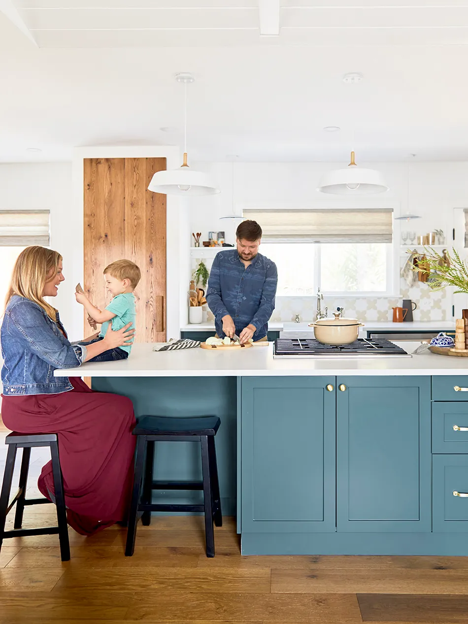
After making do with their tiny galley kitchen (which they share with their 3-year-old son, Duncan, and their one-eyed dog, Hamlet) for half a decade, the couple had scraped enough funds for a full renovation that would open up their living and dining room and create an L-shaped, open-plan kitchen made for entertaining. “The room before was a mismatched hodgepodge of bad tile and really terrible lighting design,” says Hellen of the original space. “Everything was just crowded and dark.”
Using IKEA cabinets as a base, upgraded with Semihandmade DIY Shaker fronts painted in Sherwin-Williams’s Riverway, Hellen reworked the floor plan, knocking down a load-bearing wall and adding a large central island. As chefs, the couple needed the kitchen to do more than just look good—it needed to store an unusually large amount of ingredients and cooking instruments. That’s where the designer got creative, devising a series of detail-oriented upgrades that turned the big-box blueprint into a custom-looking, restaurant-quality cook space.
Filling a Gap With Open Storage

Hellen mapped out the layout around the couple’s existing refrigerator, which was still in good shape. Instead of moving it to another location (which would’ve been pricey), the designer built cabinets on either side, created a drinks station (complete with a wine fridge), and raised the upper cupboards to the ceiling to fill out the gap that often makes for unfinished-looking kitchens. Because the cupboards were hung higher than normal, she had two wood boxes built to sit underneath. A $25 cane backing, from a chair and basket shop, is a textured backdrop for the cookbooks and champagne coupes.
Splurging on an Unusual Finish

Wanting to run natural wood across the room, Hellen commissioned a floor-to-ceiling oak door from What We Make (the same artisans that made the reclaimed dining table) and framed it with a drywall box-turned-pantry that runs up the wall next to the sink window and visually divides the eating area. “That was our splurge,” says the designer of the $2,000 expense. It took a little convincing to get the couple on board, but the anchoring effect it has was worth it.
Rethinking a Detail’s Original Purpose

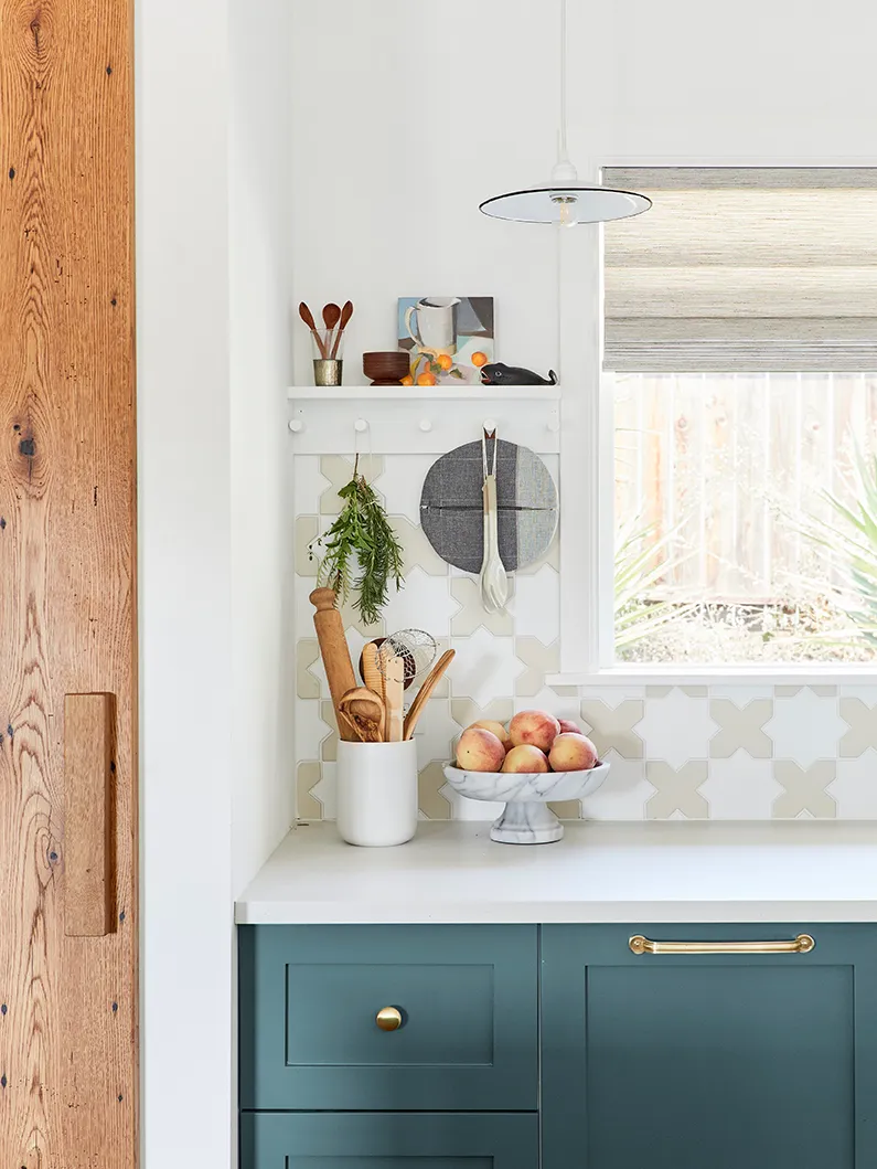
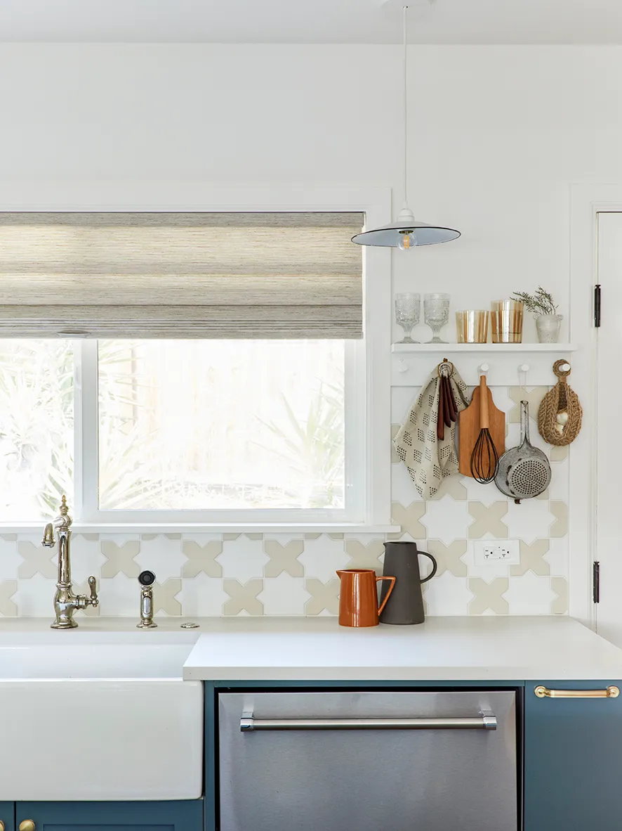
Without upper cabinets along that wall, Hellen had to get creative with storage. The winning solution: a ledge with pegs underneath, on which the couple can hang everything from fresh garden herbs and mugs to cutting boards and cooking utensils. That wasn’t its original purpose, though: “I found an Etsy seller that had styled it as a nursery shelf,” says the designer. To fit it between the windows, she cut the piece down to size and painted it to match the wall, giving the space the mismatched British charm that Olly, who grew up in England, craved. “We wanted a handmade tile, but we didn’t want to have to carry it all the way up the wall, so the shelves became our dividing line,” says Hellen, who picked a star-and-cross–shaped style from Fireclay for the backsplash.
Making Every Nook Work Harder

Because the couple hoped to look out at their guests while they rustled up a meal at the stove, the island does triple duty, acting as cooktop, storage space, and counter seating. A stainless steel vent hood hanging from the ceiling would’ve been cumbersome, so Hellen had to find a reversible downdraft that could fit in the island’s back cabinet and still leave room for the range. “It was actually one of the bigger challenges of the design, believe it or not,” she says. To install it, she had to add lower cabinets on the other side of the structure to fit the vent’s mechanism, leaving only a recessed corner nook, which luckily fits two stools.

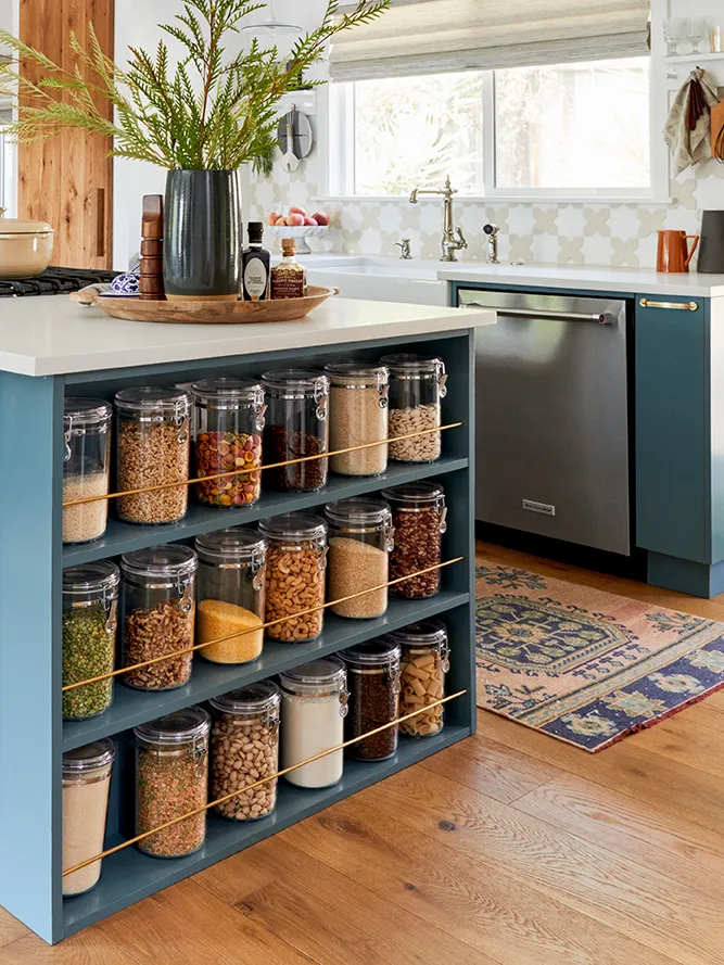
On the opposite side of the island, Hellen tucked in what is now the couple’s favorite detail: a set of narrow shelves with brass rods that keep the family’s collection of decanted dried goods in kid-friendly plastic jars in place. “We had 7 inches to play with, and I wanted to make the best use of that space,” says the designer; now Meredith and Olly give it a glance whenever they need dinner inspiration. “They just look down, pick an ingredient, and say, ‘Let’s make this tonight.’”

