We may earn revenue from the products available on this page and participate in affiliate programs.
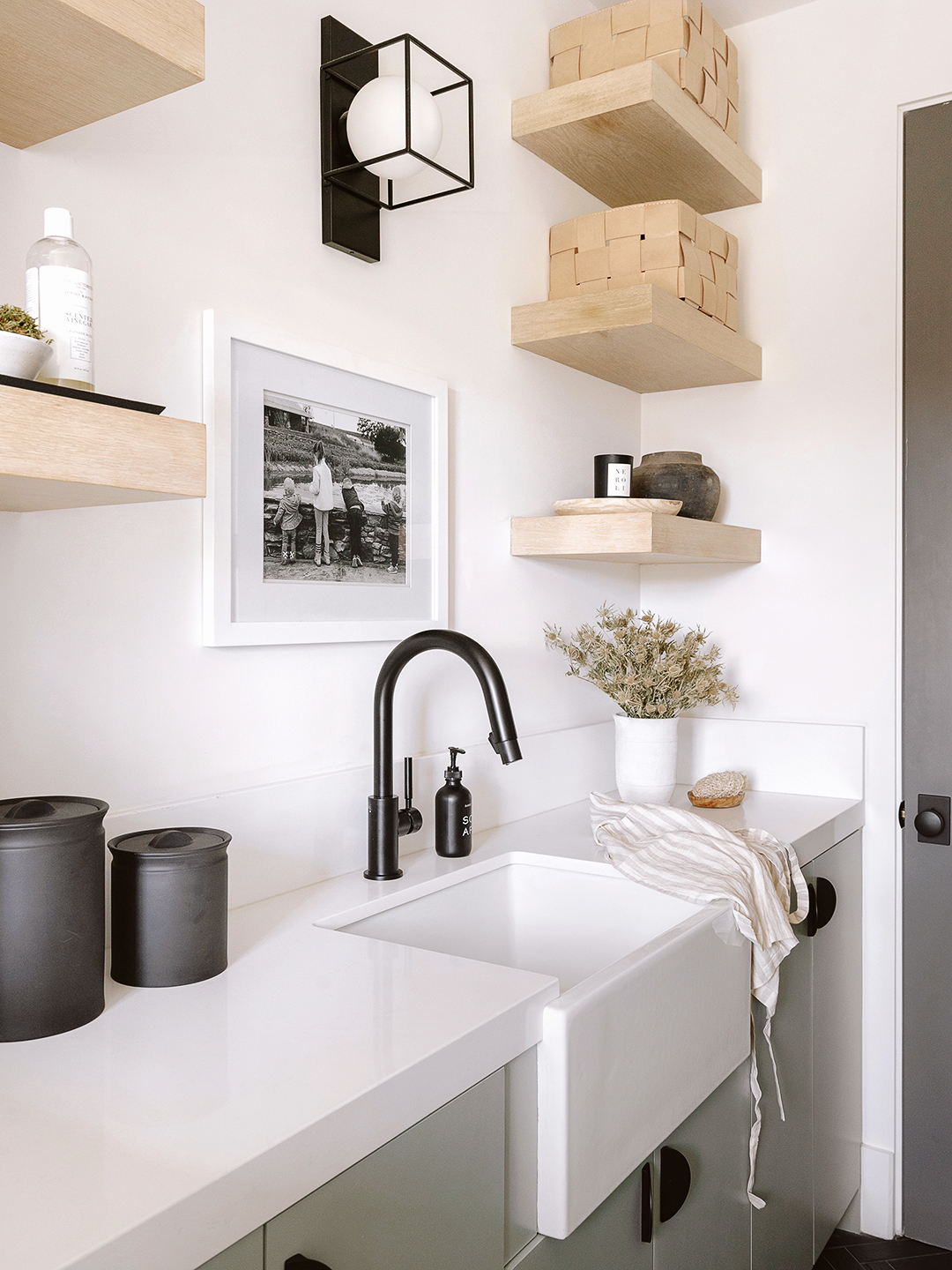
There’s plenty of reasons why potential buyers gravitate towards new-build homes—they’re move-in ready with upgraded appliances and floors that don’t slant. Personality usually isn’t on the list of pros, but when this couple called on Alisha Stuart of Honné Studio to decorate their spec home, she was happy to discover solid, stylish bones. In the laundry room, for one, JJP Construction, in partnership with designer Aja Levi, had installed modern, slab-style cabinets and kid-friendly drawers in a fresh sage hue.

The nearly two year project (they had to pause construction when Covid-19 hit) was also a team effort between the homeowners and Stuart. “It was good to be able to talk through different options, and weigh pros and cons, rather than just telling someone what the plan was,” she says. One of the trio’s priorities was decking out that laundry space with lots of functional storage so it could also flex as the kids’ after-school drop zone. Here’s how they did it:
Find Your Middle Ground

Most of the Pacific Palisades home sticks to the homeowners’ preferred color palette: neutral creams and warm browns. In the laundry room, though, Levi’s pick for the cabinets was Benjamin Moore’s Flora, a sage green. Stuart loved the direction—“it’s a step above grays in terms of the vibrancy, but it still feels calming and grounded with the cool tone running through it,” she says of the hue—but chose to strip the fronts and reapply a mellower version. Her trick: ask for the color at 75 percent, or even 65 percent, strength at the paint store. “It ends up feeling softer, and a little bit more subtle,” she explains.
Mix Up the Finishes

New builds are often all sleek everything—white walls, hardwood floors, stainless steel. In order to have some fun with an otherwise utilitarian mudroom, Levi put horizontal beadboard behind the bench (Stuart likens it to a backsplash) and slatted drawers underneath. The adjacent laundry room, however, has flat front doors; the herringbone stone floors provide the dimension there. “It was important to balance out the color, and not make the room feel harsh,” Stuart says of Levi’s choice. Changing the grout from soft gray to bright white brought even more attention to the pattern.
Another unexpected material: leather. It shows up on the mudroom hooks and the woven bins on the nearby open shelves. In fact, Stuart adored the baskets so much she was tempted to design the whole space around them. “They just make functionality feel chic,” she says.
Hide the Essentials in Plain Sight

In lieu of traditional hardware, Levi opted for grooved cut-outs in the mudroom drawers—easy for little fingers to grasp. “The two kids are super curious, so ensuring they could access their masks and shoes by themselves was a big priority,” Stuart says. Off-limits cleaning supplies are above reach in the upper cabinets or decanted into jars. “It’s accessible but concealed,” Stuart explains.
Hanging up your coat is a choose-your-own adventure. Stuart made a last-minute decision to add two extra hooks behind the door that connects the two spaces, two more than the family of four technically requires. “Especially with kids, make space for more storage than you think you need,” she notes. Sure enough, these days every single one is in use.
