We may earn revenue from the products available on this page and participate in affiliate programs.
Susan and Ben Work weren’t looking to buy a home when they stumbled on an Edwardian building while biking back from brunch one Saturday in San Francisco’s NOPA (North of the Panhandle) neighborhood. “We noticed this yellow house, and the door was wide open,” says Susan.
Founders of the architecture and interiors firm Homework, the couple immediately saw the potential to carve out a live-work space within the rambling floor plan. “It was so beat up; it had been through more than 100 years of roommates and layers of paint,” Ben explains. “But we saw incredible charm and history.”

[In the lead image: Ink Blot Print from Porter Teleo.]
The Works converted the front of the house into their office, painting the original trim and woodwork white and preserving the rest as much as possible. In the back, they took down the walls and designed an open-plan kitchen with living and dining areas, where classic and contemporary finishes could coexist.
Linking the two spaces is an impressive 40-foot-long corridor. “When you walk from the office to the other end of the house,” says Ben, “you start to notice a shift in mood and energy as you go from structure into this loose, casual space.”

[In this image: Klismos LB Chair, Scala Luxury, $6,388; Veera Collection Carpet, Stark Carpet; Matrix Sofa, Article, $1,299; Tambobamba Table by Sloan Miyasato, Jiun Ho Collection; Maxhedron in Polished Nickel, Bec Brittain; Stairway Wall Mounted Bookcase by CB2, Domino, $399.]
Before launching Homework, Susan was a health and wellness coach and continues to take a holistic approach to everything from exercise to architecture. “My training taught me to find connections in things,” she says. “In this house, we got to develop a full experience from start to finish.”

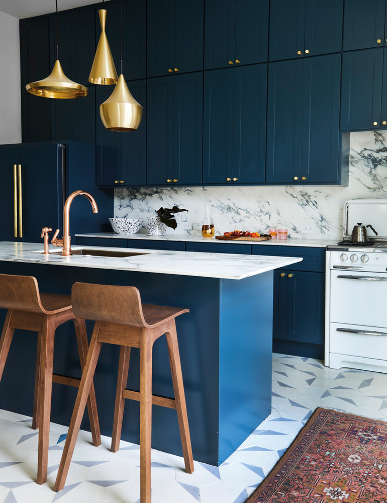
[In this image: Vintage Stools, Alameda Point Antiques Faire; Beat Lights by Tom Dixon, Y Lighting, each $550; Henry One Hole Gooseneck Kitchen Faucet, Waterworks.]
The home artfully balances contrasting elements—light and dark, vintage and modern. Century-old chairs surround a Saarinen table in the dining space. Stark white walls meet the original wood floors, now stained black, throughout. The powder room, wallpapered in a bunny sketch by artist Hunt Slonem, departs from the rest of the house, greeting guests with a happy wink.

[In this image: A black-rimmed arch mirror adds intrigue in the dining room. Saarinen Coated Marble Dining Table from Knoll, Y Living, $6,101; White Dove paint, Benjamin Moore; Arch Mirror,
, $3,300.]
The Works also integrated material, craft, and inspirations from their travels. On a recent trip to the Saint-Ouen Flea Market in Paris, they scouted vintage pieces for a few client projects.
The couple makes annual pilgrimages to visit family in San Miguel de Allende, Mexico, where ideas appear at every turn. “We saw two different scales of cobblestone collide, and that inspired us to take two very standard square tiles and blend them together,” says Ben of their master bathroom, where they used two styles of ceramic tile squares from Home Depot. (A great personalization-on-a-budget tip!)
Of course, not everything had a seamless fit. “The renovation was definitely an experiment, and we had moments when things went wrong,” Susan says, laughing. As the Works perfected each room, their three-month project extended into a year.
One hiccup along the way included the original plan for the main bath having a double vanity with storage cabinets across from a Japanese soaking tub, but when the cabinets arrived they weighed down the room. “We’d forgotten one of the key principles of interior design,” says Susan. “Always balance heavy with light.”
The couple swapped in pedestal sinks, and the space regained its equilibrium. The lesson? Always strive for a happy medium.

[In this image: Oval Bulkhead Light by Davey Lighting, Design Within Reach, $359; Bistro Mirror, Restoration Hardware, $695; Universal Rain Shower Head, Waterworks, $211.]

[In this image: Hutch Cream Wallpaper by Hunt Slonem for Groundworks, Decorators Best; 1930 Corner Handrinse Basin, Duravit; Mirage Hex Corner Shelf, Ladies and Gentlemen Studio, $2,100.]
Susan & Ben’s Renovation Tips:
Mix it up.
Who says you can’t do both copper and brass, or vary the size of a tile? We love bringing different elements together.
Start with a clean canvas.
White walls and wood floors provide the perfect backdrop, letting other things take priority.
Older tools are better made.
We love the history, handiwork, and finishes of age-old things.
Knock down walls.
Old homes are chopped up, so when you remove walls in one area, it creates an unexpected transition from structure to looseness.
Be true to yourself.
It’s the only way to execute whatever lives inside your brain.

[In this image: In the kitchen, the hardwood floors transition into encaustic cement tiles. “We love the hexagon shape, and it was so fun to be free-form with it,” says Susan. Hex Clip Cement Tile, Cle Tile, $5.85.]

[In this image: Moments of darkness mixed with softer tones create a space that feels luxurious. Blush and black layers make a well-appointed bed. Avery Upholstered Headboard, Room and Board, from $1,499; Celeste Collection Sheets, Sferra, from $240; Throw Pillow by Chelsea Victoria, Domino, $39; Pillar Table Lamp by West Elm, Domino, $199; Shag Area Rug, Domino, from $79.99.]

[In this image: A vintage bench from an Italian cinema gives guests a spot to take off their shoes in the entryway. The artwork is Pink Wall, 2014, by George Byrne.]
Get more inspiration from the fall issue:
Madewell’s Lead Designer Brings the Cool-Girl Look HomeHow One Photographer’s Travels Inspire Her HomeInside the Unexpected, Expertly Crafted World of Designer Faye Toogood

