We may earn revenue from the products available on this page and participate in affiliate programs.
Peeling linoleum floors, musty carpeting, chipping bathroom tile—there are a million reasons why it might be time to renovate. The challenge: making design decisions that will be functional for you, are a little different from everyone else, and that you’ll love for decades to come. And though it can be tempting to go to Pinterest, you won’t want to rip up your countertops every five years (trust us), so scrolling through trends might not always be the best way to look for inspiration.
The team at Gestalten, an art and design publishing house, understood this with the release of their latest book, The Home Upgrade, out this month. They searched the world over for architects and designers with a unique point of view and a wealth of experience. Then they showcased some of the experts’ best projects and tips, from how to choose materials that will stand the test of time, to clever space-saving solutions, to tricks on making colorful statements. If you’re planning a renovation of your own, these six ideas are a good place to start.
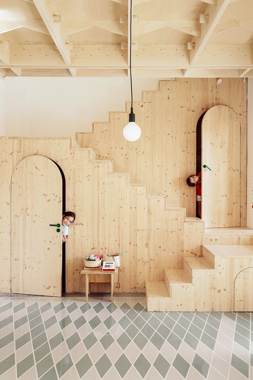
Use Plywood (Not Just as a Construction Material)

In this Majorca home, SMS Arquitectos kept much of the structure of this traditional Spanish house intact but managed to add partitions and a second story with clever use of plywood. The material, which is typically used behind walls and under floorboards, shines against the antique doors and traditional tiles.
Move Floor Tiles to Your Countertops

When the founders of Barcelona firm Arquitectura-G find a material they like, they run with it. In this case, a rustic farmhouse in Emporda, Spain, received a minimalistic transformation thanks to stucco walls and terracotta tiles. You’ll find both throughout the house, from down on the floors to up flights of stairs, on countertops, and even around the rooftop swimming pool.
Let Your Home’s History Shine

Archiplan Studio likes to respect a building’s heritage, so when it was tasked with renovating a small apartment in a 1500s building in Mantua, Italy, it peeled back the walls to reveal ancient frescoes instead of painting over them. The space was then finished with contemporary custom furniture that plays with the contrast between old and new.
Add Another Layer of Kitchen Cupboards

This London eat-in kitchen may not have been generous in size, but Tsuruta Architects was able to maximize storage by making use of the extra-high ceilings. A higher, deeper layer of cabinets sits on top of a slimmer layer, while making space for lesser-used (but large) items like small appliances, vases, and serving pieces.
Mount Everything to the Wall

The same building’s narrow frame meant that every square inch needed to be optimized. In a small powder room, Tsuruta made the space feel intimate with bold floral wallpaper, all the while keeping everything off the ground. The vanity and faucet are mounted right into the wall to make the most of the tiny space.
Rethink an Accent Wall

When Raul Sanchez Architects was tasked with combining two neglected Barcelona apartments, it kept all the walls (and floors) white, save for the central walls (which house a staircase), which it covered in a shiny golden yellow paint. By rethinking a traditional feature wall to accentuate an architectural detail instead of picking a surface at random, it made the space shine.
Read more on The Home Upgrade:
Discover more renovation tips we love: Can You Spot the Optical Illusion in This Mint Green Kitchen? 4 Lessons We Learned From Leanne Ford’s Best Before-and-After Projects It Cost Us $25K to Turn an Old A-Frame Into a Scandi-Inspired Getaway
