We may earn revenue from the products available on this page and participate in affiliate programs.
Black and white typically isn’t the first color palette that comes to mind for a kid’s space, but when interior designer Hilary Matt began planning a pair of rooms for her two young sons—Jones (4) and Miller (2)—in her Manhattan apartment, it was the only option. “I don’t really design babyish rooms,” explains Matt, and embracing New York City’s go-to colors plus adult-worthy furnishings is a surefire recipe for not-your-average preschoolers’ hideaways.

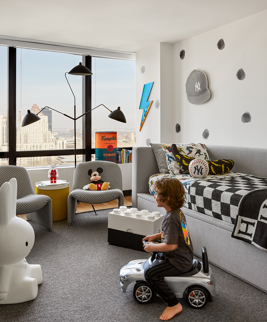
But that doesn’t mean the spaces are serious. See: the Andy Warhol banana prints, the black lacquer basketball hoop, and the lightning bolt mirror in Jones’s space; on the bed, an Hermès coverlet plays off Justice League superhero sheets. “I like a room to grow with a child, so to me this decor makes sense—it lasts longer,” says Matt. Case in point: When Jones graduated from a crib to the custom daybed that now occupies the space, all that was needed was a simple furniture swap. “Everything else stayed exactly the same,” Matt points out.
Though Jones and Miller weren’t involved in any of the design decisions—“They got what they got, but they like it!” says their stylish mom with a laugh—it’s clear they’re enjoying the sophisticated canvas that will easily adapt as their tastes evolve. Ahead, Matt reveals how she put a contemporary spin on their rooms while ensuring the results weren’t two-dimensional.

Sharing Is Caring
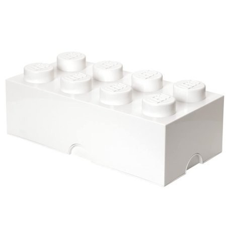
Since big brother Jones got the larger bedroom, Matt had to be “minimalist” about what she put in Miller’s tiny space. In the end, she settled on a crib, a bear-shaped armchair for late-night feedings and cuddles, and a custom dresser. But as a compromise, Jones’s room doubles up as a play area complete with wheelie toy bins and Lego storage boxes, which Matt sourced to tie in with the monochromatic aesthetic. There is even a seating area for two, with a tray-topped ottoman and vintage chairs that Matt had reupholstered in a coordinating checked fabric. “I know I can have them re-covered and use them elsewhere if ever we move,” she explains.

Sleepy Storage
“There’s never enough storage in the city,” attests Matt. Her solution in Jones’s room? An upholstered bed with a pull-out drawer. Although it looks like it might house a trundle for sleepovers, it’s actually chock-full with sweaters, spare blankets, and puzzles. And the fabric (a wipeable polyester blend that looks far more luxe than it sounds) can withstand the wear and tear of small hands, of course.

Same-Same, But Different
Working within the tight color scheme, Matt differentiated the rooms with wall art: Jones’s white walls are adorned with splodgy decals by Kerri Rosenthal, while Miller’s are clad with geometric wallpaper (which is also removable, making it easy to ditch should he grow tired of it). Textured and natural elements, such as Miller’s wood crib and the mattress-quilted Hey artwork by Stephanie Patton above it, keep the room from feeling stark. Another way Matt brought in color and personalization? Accessories based on the boys’ interests. In Miller’s room, that means Mickey Mouse figurines. She indulged Jones’s affection for the New York Yankees with baseball paraphernalia. “These low-commitment touches make it more fun and young,” says Matt. Who said black and white were boring?


