We may earn revenue from the products available on this page and participate in affiliate programs.
There’s a fine line between coastal-cool and downright nautical. Heidi Lachapelle and Katie Judkins, the duo behind Heidi Lachapelle Interiors, are experts at navigating murky waters. The Portland-based pair’s latest project—a waterfront home in the small boating community of Yarmouth, Maine—captures their balanced mix of North East soul and modern style.
“Our client has a modern sensibility, so we really wanted to feel coastal, but we never wanted to go nautical,” explains Lachapelle, co-founder and principal designer. After purchasing the property from their grandparents, the homeowners tasked Lachapelle with giving the family summer home a refined facelift.
“We wanted to bring elements of the ocean through color and texture and material, so it’s influenced by the ocean…” adds Lachapelle.
“But it doesn’t hit you over the head with it!” laughs Judkins.

While devoid of anchors, oars, and obvious maritime decor, the property’s sweeping views of Casco Bay played a pivotal role in the design. Choosing their color palette and materials wisely, the pair pays homage to coastal living without going overboard.

Knowing that this was a second home for the family of five, Lachapelle and Judkins kept the big splurges to a minimum. Smaller cosmetic swaps made room in the budget for priority upgrades, like replacing all the floor-to-ceiling windows that frame the main living space.
“They had these typical, ’90s double-sliding doors and these old plantation-like shutters that were creating so much linear distraction,” recalls Lachapelle.
“Our goal was to use the water as the backdrop and open up that view for them. That’s what makes this property so stunning,” adds Judkins.

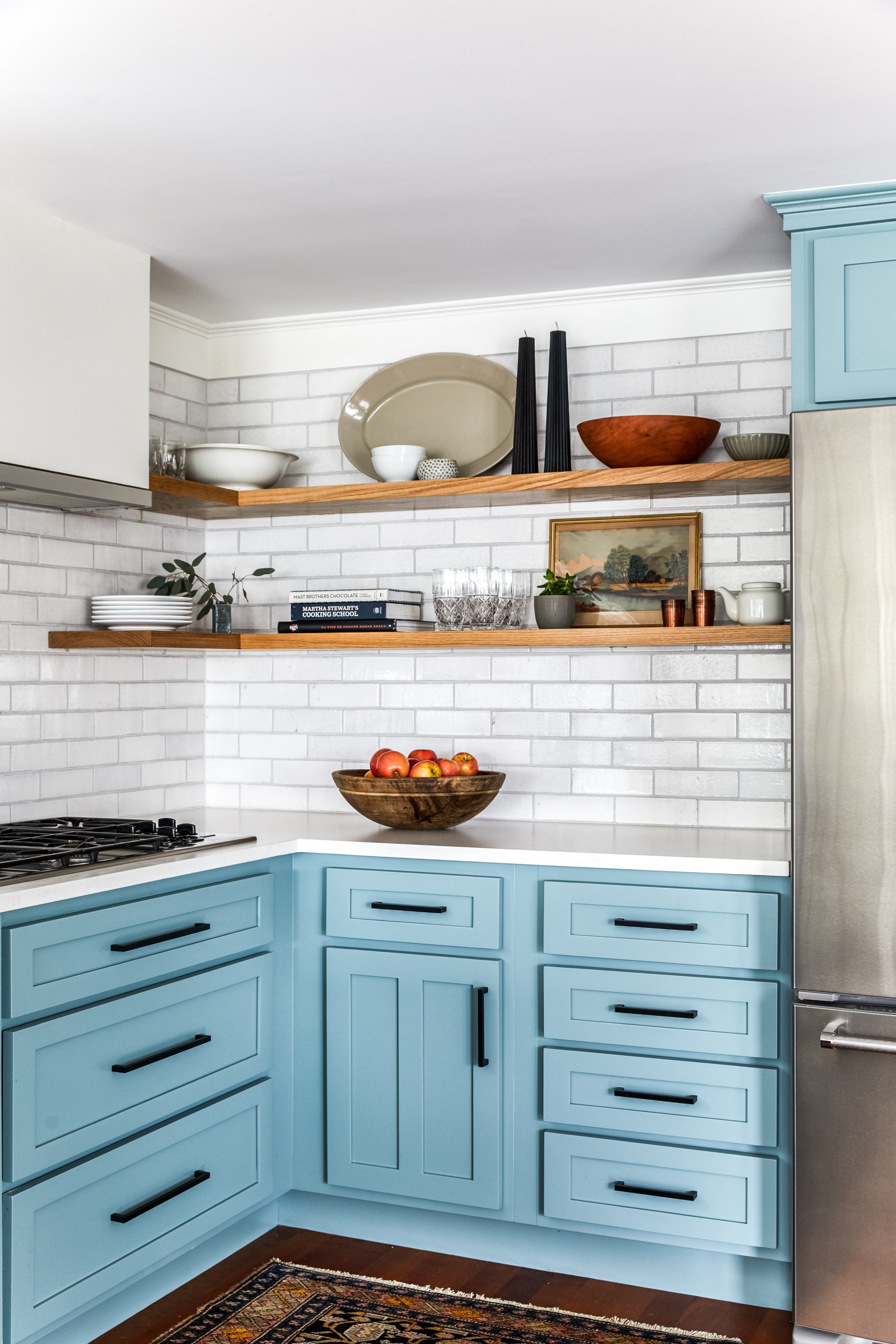
The only obvious reference to oceanic blues comes in the kitchen, where Lachapelle landed on Farrow and Ball’s Oval Room Blue for the cabinetry. The choice was largely inspired by the balanced blue tones in the large oil painting that sits between the custom built-ins across from the dining table.

“I think the starting point came from the cabinet color,” suggests Judkins. “Heidi selected that color and it was so special and impactful that everything kind of fell around that.”
While there’s certainly nothing groundbreaking about a blue kitchen, this subtly aged hue strikes the perfect tone for a family seaside home inspired by its own heirlooms.

“I feel like the safe option would have been to do a true navy, but we just wanted to lighten it up a bit,” suggests Lachapelle. “Because the ceilings are so low (they’re around eight feet), we wanted to keep it as open and airy as possible. This was a color we naturally gravitated toward for that reason.”
In addition to a fresh coat of paint, the designer swapped in quartz countertops, matte light fixtures from Schoolhouse Electric, and new appliances. By sticking with the original footprint and cabinetry, the pair were able to splurge on white oak shelves and Fire Clay backsplash—bigger-ticket finishes that ultimately tied the contemporary coastal aesthetic together.


Similar cosmetic swaps were made in each of the bathrooms. In the powder room, for example, the pair upgraded the plumbing fixtures and added new wallpaper and lighting. “The bones were good, so we spent money on the prettier things,” shares Judkins.
Instead of rethinking the vanities in the master bath, the pair allocated money for eye-catching finishes and fixtures, including the printed Fire Clay floor tile.


While the existing open-concept layout saved the duo the pain of knocking down walls, the original floor plan proved to be trickier in more ways than one. “The entrance of the home cuts right through the kitchen and the living room,” explains Judkins.
Without interrupting the waterfront views they had worked so hard to show off, the pair had to get clever about how they divided the various living spaces.
“The addition of new lighting, specifically over the dining table, helped to create visual barriers. Then, we just had to be smart about where we placed our furniture,” shares Lachapelle.

For the living room, Judkins and Lachapelle had a custom rug created to optimize the room’s odd, square shape. A spacious sectional acts as a barrier of sorts between the sitting room and kitchen. Printed textiles, cool-toned ceramics, and abstract art tied the final palette together. While Judkins takes pride in the finishing touches, Lachapelle saves all her love for the lighting.
“I really love the sconces in the living room. I feel like they embody everything we were hoping to achieve—they’re the perfect mix of modern and traditional,” she says. “For me, they represent everything I loved about this project.”

Tour more homes like this:
Inside a 600-Square-Foot Coastal Maine Home

