We may earn revenue from the products available on this page and participate in affiliate programs.
For hands-on advice from designers and pro DIYers, plus more scrappy before-and-after transformations, subscribe to Reno. Let your in-box do all the hard work—for now.
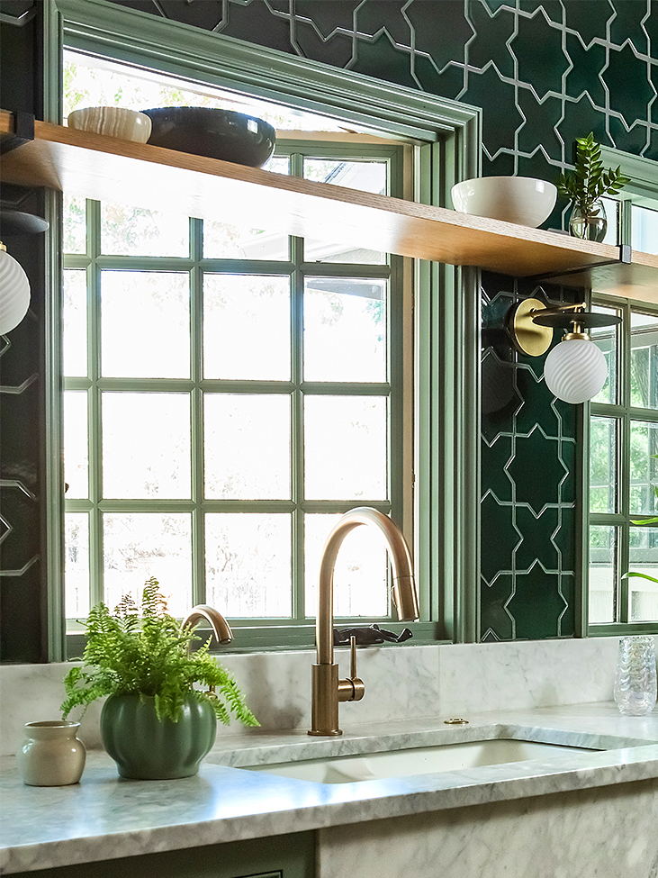
“I envisioned saturated colors layered on top of one another,” says Abilene, Texas–based designer Rebecca Gibbs, recalling the moment she came up with the inspiration for her latest kitchen remodel. The end result is as dreamy as she describes, so when we posted a photo of the space on @reno_notebook—Domino’s feed for all things renovation and DIY—we noticed it got a lot of love. In fact, it’s our most popular kitchen to date, and we’ve got a hunch as to why.
The room’s walls are covered in Fireclay’s star-and-cross tiles in Evergreen. The emerald hue was decidedly a bold choice, but extending the backsplash up to the ceiling isn’t anything new. The thing is, after choosing this statement element, Gibbs did something unusual: She more or less matched all of the cabinets in the space to the backsplash.

“I wanted a low-contrast, tone-on-tone look that was a bit more grounded,” she explains. After her husband, Lucas, built all the cupboards, she painted them in Retreat by Sherwin-Williams, a gray-green that’s one shade off from the backsplash. They left the all-over tiling job up to a professional (tip: tap HomeAdvisor to find a tradesperson in your area). Unlike a crisp white or cream, this pairing gives the space that wow factor, but more important, it instantly ties the room together.
So green isn’t your spirit hue? Take this idea and run with it using any color in the rainbow. A saturated backsplash plus subdued cabinets equals absolute eye candy.
Our Winter Renovation issue is here! Subscribe now to step inside Leanne Ford’s latest project—her own historic Pennsylvania home. Plus discover our new rules of reno.

