We may earn revenue from the products available on this page and participate in affiliate programs.
If Claudia Beiler could have a word with the homeowners who installed the bright orange picnic-themed wallpaper in her latest fixer-upper’s kitchen, she would thank them. “When we discovered it, I was absolutely convinced we had to keep as much as possible,” she says. Claudia and her husband, Chris, who together run the Chris and Claude Co., a renovation and real-estate company, gutted just about everything else. The only other exception was the wood floors, which they sanded down and resealed with a water-based polyurethane coating to bring out the color. “What was once a dull and dreary room turned out bright and cheerful,” says Claudia.
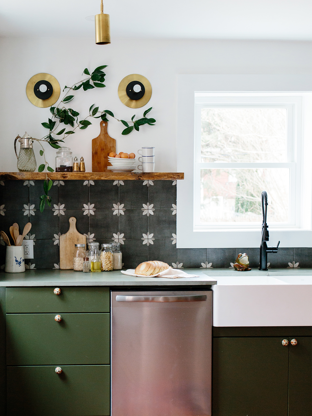
Transforming the kitchen was just one to-do on their punch list—the couple was remodeling the entire Lancaster, Pennsylvania, townhome with the intention to sell—but it took up a good chunk of their budget, totaling $15,000. They turned the small space around with army green concrete counters, a porcelain tile backsplash, and brass ceiling pendants, all without losing its retro roots. “With houses like this, I want to pay homage to the original owners: what their style and taste would have been as they lovingly designed the home,” says Claudia. We went behind the scenes of the storied refresh.
The Cupboards
The couple tasked a local painter with covering flat-paneled cabinets from Home Depot in Behr’s Fig Tree. Since the house is close to restaurants downtown, the storage was designed with light-to-medium cooking in mind—open shelving was practical in this case. “You can grab stuff without having to open up 30 doors to find what you’re looking for,” says Claudia.
Whenever the pair creates a space with little or no upper millwork, they compensate with a larger, taller pantry. This one, which enjoys a prime spot next to the sliver of the decades-old wallpaper, is spacious enough that the home’s current resident, Chris’s brother, stores noncooking essentials in it, such as board games.
The Counters

Claudia opted for her go-to surface: concrete. This time around, however, she went beyond basic gray. “You can spill your avocado-spinach smoothie on there and no one will see it,” she says. Don’t let the hue fool you into thinking it’s fancy. The green material was just as affordable as mid-grade quartz or low-grade granite.
The Backsplash
Claudia had first used the chalky black porcelain tiles for another project, where she installed them as a bathroom floor. All that to say, she knew they could take a beating in this space. “They were strangely affordable,” she recalls. “I had to run it past the team to make sure something wasn’t wrong with them.”
The Floors
When the crew ripped out the old floors to reveal the original hardwoods from the 1800s, they discovered that someone, at some point, had replaced a section with concrete. Instead of tracking down matching planks so everything was cohesive, the couple left it as is. “It seemed to tell a story about the home,” says Claudia. On DIY-er’s mistake is another’s treasure.
See more stories like this: The Tile for Our Entryway Reno Was $500—The Front Door Was $60 Two Design Pros Always Notice This Kitchen Cabinet Lighting Mistake You’ll Barely Recognize the Wood Paneling in This Den Makeover


