We may earn revenue from the products available on this page and participate in affiliate programs.
With our New Year’s resolutions freshly penned, January at Domino is all about change—the demo and construction kind. Welcome to Reno Month, in which we pull back the curtain on the highs (mood-boarding!) and lows (finessing the budget—again) that come with creating the home you’ve always wanted, whether that involves a top-to-bottom remodel or a rental kitchen facelift. Sign up for our newsletter so you don’t miss a thing.Creative couple Luke and Joanne Bartels had lived in their 1907 cottage in San Francisco’s Outer Sunset neighborhood for 10 years before they dove into an extensive renovation project. Their intention was to add much-needed square footage for their growing family of four and use their formidable skills with color (Joanne is a wardrobe stylist) and form (Luke is a skilled woodworker) to build the warm, inviting home of their dreams. Living in a house for a decade before you start to tear it apart means that you have time to figure out how to improve the flow of the space. That’s one for the pro column. It can also create obstacles, as they faced with their kitchen. Because the Bartels had renovated a bathroom that shares a wall with their small kitchen, they were faced with a choice: Tear out a perfectly lovely, newish bathroom to provide more room, or work with the existing footprint of the kitchen and make it the best it could be.
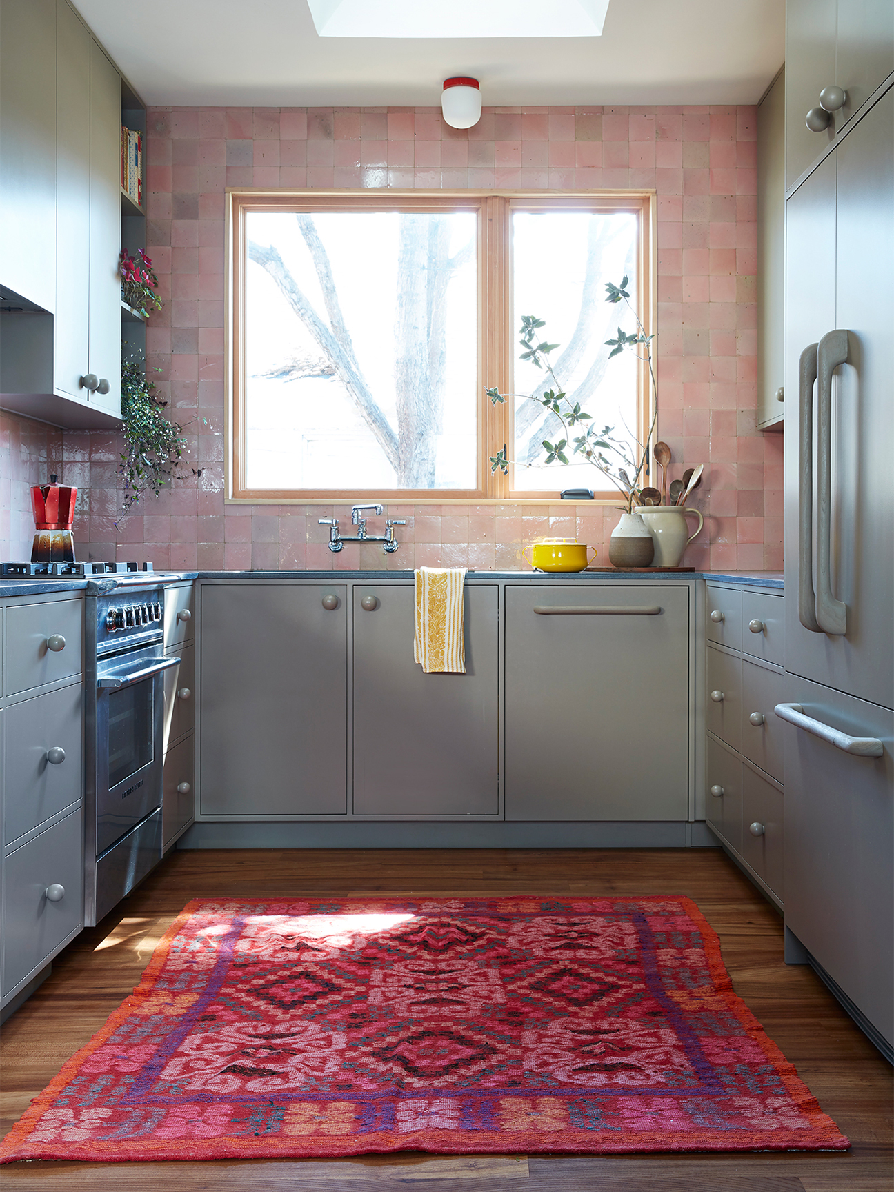
Lucky for us, they chose the latter. And they reimagined the small galley space to incorporate broad strokes of soothing color, a game-changing skylight, fine materials like soapstone and handmade zellige tile, and impossibly clever touches such as hand-carved handles for a refrigerator and a dishwasher. Here, Luke explains the couple’s process of transforming a cute but generic black and white cooking space into a little masterpiece.

Extend the Backsplash
“Jo really wanted to get away from that tabula rasa, white kitchen with bleached wood floors,” Luke explains. “The pink Clé tile was the first decision we made.” Because of his trade, crafting beautifully made furniture from rare materials in his nearby workshop, the couple knew they would be incorporating a lot of wood in the kitchen. To keep it from looking too “cabin-y” they needed to add a different texture and a little shine. The translucent glaze on these square, handmade zellige tiles, which were extended to the ceiling for more impact, adds sheen—not bling—reflecting light without calling too much attention to itself. Tiling the entire wall, not just an abbreviated backsplash, creates a large swath of space-expanding, uninterrupted color. A bonus: It practically glows. “The pink seemed so earthy and just right. The more you’re around it, the more neutral it becomes,” explains Luke.
Try Monochromatic Cabinetry
Between Jo, Luke, and their designer and good friend Timothy Balon, nearly every decision was seriously deliberated—including the choice of cabinet hardware. “We played around with a bunch of ideas and thought we might use some pullsfrom a local artist who casts bronze. But once we realized we were working with these large swaths of color, the pulls just seemed too distracting.” Their genius and affordable solution was to make them from wood and then paint them in the same shade as the cabinetry. The effect is calming and (like extending the tiled backsplash) may even make the area feel larger than it is. They were so pleased with the result that they extended the color to a custom-finished dishwasher and fridge, with their own Luke Bartels custom handles.
Find Your Light
On a list of small-space solutions, you almost always get advice to paint a space white in order to brighten it up. That was the opposite of what Joanne had in mind. “We knew we wanted to have a homier-feeling wood floor, something that felt rich and unique,” says Luke. The issue is that, with only one window above the sink, it read dark. After some conversations with Balon, they decided to take advantage of the sloped roof above the kitchen and build a skylight, which he admits was a “bizarrely complicated” task but worth the effort. Another, simpler way they opened up the room was to install a larger window and leave the trim (made from a rare cedar) unpainted, inviting that natural wood into the interior space and avoiding complicated and potentially distracting trim.
Keep an Open Mind
“We never imagined a rug would work in a kitchen,” Luke admits. “We thought, there’s so much foot traffic and liquid that it wouldn’t be feasible.” Then, when the Domino team arrived to photograph the pair’s home for a story in the magazine, it was suggested that a colorful rug might make the photo more interesting. Joanne sorted through a pile of vintage rugs that they hadn’t found a spot for and discovered this bold pink kilim—which happened to be the optimum size and the perfect complement to the gray of the oiled soapstone countertops, the muted green paint on the cabinetry, and the luminous pinks of the tile. The shoot ended, but the rug remained in place.
See more before-and-afters: Courtney Adamo Made a Backyard Shed the Hardest-Working Space in Her Home These Are the 17 Best Before-and-After Transformations We’ve Seen A Breezy Bathroom Before-and-After That’s 10 Years in the Making
