We may earn revenue from the products available on this page and participate in affiliate programs.
When Tola Akinbiyi comes across a good frame at a thrift store, she always buys it—she knows the art will come. “Right now, under my bed, I probably have 20 frames,” she says, laughing. As the founder of the online shop Bon Femmes, which features art prints by female artists, she’s constantly getting new art and cycling it in and out of her Chicago apartment.
Currently she has 27 different artworks on display, with even more stowed under her bed right alongside all those extra frames. “I never like things to stay the same for too long,” she explains. It’s a good thing she’s long since perfected the art of the gallery wall.
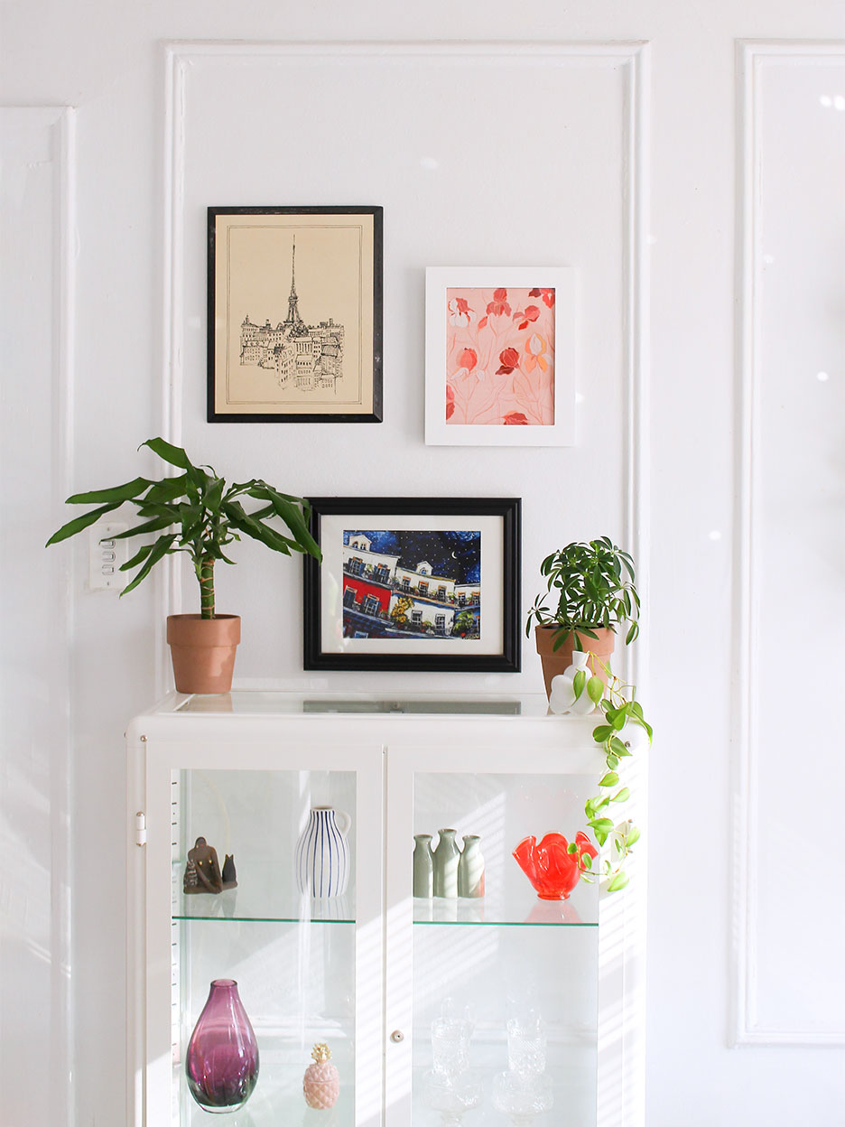
Akinbiyi has devised her own tips and tricks for making sure her beloved artworks look their best, starting by arranging her frames directly on her wall until she’s satisfied with their balance and then picking the prints that she’ll put in them—which she rotates frequently. Here, she shares her best advice for arranging a gallery wall that always stands out.
Focus on Frames
“I like paying attention to the shape and size of frames, and the negative spaces in between them,” says Akinbiyi. She starts each gallery wall with a focal piece—usually one larger frame or canvas—and then adds in more, nailing each one to the wall at a time, rather than going through the fuss of mapping it out with paper beforehand. She assesses the wall frame by frame before adding a new element—patience is key.
Akinbiyi snags most of her frames at the thrift store and spray-paints them to better suit her style, and hangs most with nails (with the permission of her landlord). For heavier pieces, she uses Command strips designed specifically for hanging frames.
Fine-Tune Your Formula

Every gallery wall varies, but Akinbiyi does have one foolproof formula for arranging art when you’re just not sure how to place it: “You can’t go wrong with one superlarge canvas or framed piece, and then two smaller prints next to it that fit perfectly within the size of the large frame.”
Cover Up Mistakes
Admittedly, when you’re nailing frames to the wall, you’re bound to make a mistake at some point or other—or maybe you’ll just want to change things up. Akinbiyi has developed her perfect cover-up strategy. When she moved into her apartment, she painted the walls a pure white (it had previously been yellow-toned). She covers nail holes with DAP spackling paste, sands them down once the paste is dry, and covers them back up with leftover paint. “A lot of people don’t want to put holes in the walls because they’re worried about filling them, but it takes no time,” she says.
Mix Things Up

When it comes to deciding which print goes where, Akinbiyi is less concerned with color coordination or contrast and more interested in the variety of her art. “If I hang up a portrait, I won’t put another portrait next to it—I’ll choose a piece with a different subject matter,” she says. “It’s more about each having a varied story.”
Grow Your Collection
Akinbiyi sometimes tests out prints from her shop on her wall and switches them out once they sell, but most of the works on display in her apartment are part of her ever-growing permanent collection. She never buys them with a specific spot in mind—especially when one of her favorite artists has a limited-edition sale and she needs to act fast. “The exciting part for me is getting it and then figuring it out where it’s going to go.”
Introducing Domino’s new podcast, Design Time, where we explore spaces with meaning. Each week, join editor-in-chief Jessica Romm Perez along with talented creatives and designers from our community to explore how to create a home that tells your story. Listen now and subscribe for new episodes every Thursday.
