We may earn revenue from the products available on this page and participate in affiliate programs.
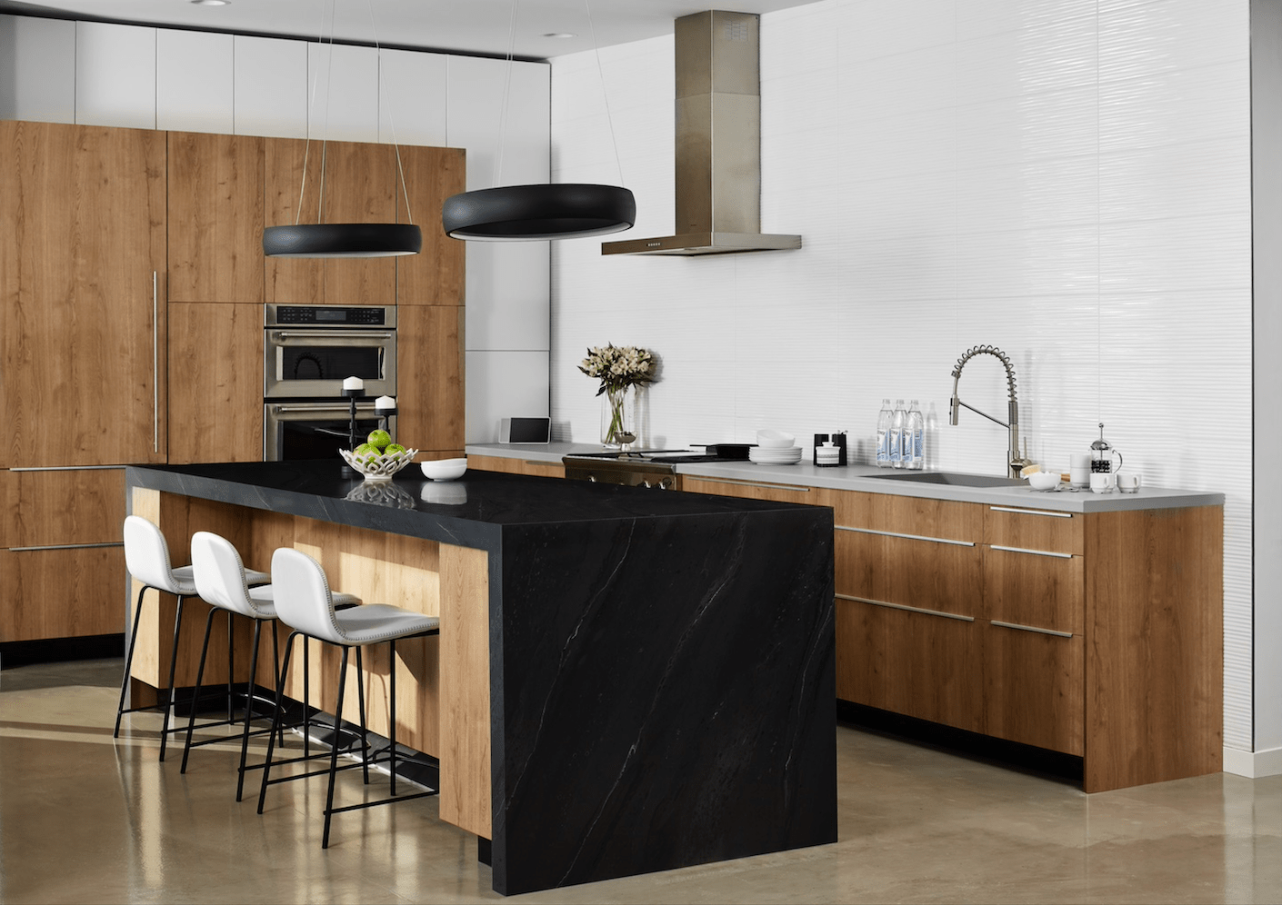
For years, popular laminate brand Formica Corporation has been the secret to tackling DIYs and home renovations on a budget. But beyond its affordability and easy maintenance, the material’s versatility means it can be added to almost every room of the house, including on less expected pieces (hello, black marble-inspired coffee table!).
From integrating wood elements for a natural touch to contrasting statement colors for some serious style moments, five design experts share the trends they’re loving right now and how to achieve them using the 2020 Living Impressions™ Collection by Formica Group. If you’re looking to make a change in your space, try some of the pro tips, below.
Lean Into the Curve
According to Los Angeles–based interior designer Natalie Myers of Veneer Designs, “Curves make a strong impact with archways, arched niches, and rounded edges.” To bring that softness to your home, try installing a curved kitchen island in White Painted Marble laminate. The handcrafted detailing (a first for the brand) gives the illusion that you splurged on the real thing. “To accentuate the roundness of the counter,” Myers suggests styling with a large, low bowl and a tall vase filled with branches. Grouped together on one end of the island, the items create “high-low drama.”
Celebrate the Great Outdoors
Want to feel more grounded at home? “This year is all about bringing nature inside,” shares Cathy Poshusta of The Grit and Polish. She suggests adding elements that emit “peace and warmth,” including stone surfaces and wood detailing. To lend a “wood” touch to your home office, install a desk in Black Birchply Formica ® Laminate—it looks as good as the real thing but is way easier to clean.
Go Chromatic
Interior designer Hannah Crowell of Crowell & Co. Interiors says unexpected colors and patterns on countertops is one of the top trends she’s been seeing and hopes to see more of. For a kitchen upgrade, Crowell cites terrazzo and rose quartz—as well as similar iterations, like this Bottle Glass Quartz—as materials she’s used that make a statement and serve as a nice departure from the classic gray or black granite.
Embrace the New Neutrals
Neutral countertops are a great way to balance out a colorful backsplash. As seen in these kitchen design ideas, simple surfaces add contrast and create a better flow to the room by drawing the eye forward and giving the illusion of more space. Santa Monica–based interior designer Christine Markatos suggests opting for pink-hued Moroccan-style zellige tiles, which are “stealing the spotlight right now, from bathrooms to fireplaces—and using them as a kitchen backsplash is no exception.” Pair with a white stone countertop, such as this Calacatta Cava option from Formica Corporation, for maximum impact.
Strike an Eye-Catching Balance
Chicago-based interior designer Donna Mondi is all for “using mixed marble in a high-contrast fashion to create drama”—like pairing Thassos and Nero Marquina. To achieve the same effect, style a vanity in Black Painted Marble with a laminate washroom countertop in a distinctly different hue (white is forever cool). The best part? This elevated look can be achieved for a fraction of the cost of the real thing.
