We may earn revenue from the products available on this page and participate in affiliate programs.
Dead Salmon. Mouse’s Back. Elephant’s Breath. No, these are not the names of indie bands; they’re just some of the titles Farrow & Ball has given its array of paint over the years. Where other brands stick to traditional monikers, the British company is refreshingly not afraid to get experimental and even a little eccentric. So we tracked down the people behind the process—or rather, the woman. Her name is Joa Studholme and she creates the saturated hues right from the kitchen table in her English countryside home.
“It’s radically low-tech,” says Studholme, Farrow & Ball’s color curator, of the process. She pulls inspiration from a mix of trends, travel, and nature, usually resulting in about nine or 12 fresh tints every couple of years. Then she sends them to the creative team for approval and production. The naming usually happens in tandem with the design. “There isn’t an exact science to it in any way. It comes pretty much straight out of my head,” she adds.
Studholme has been at Farrow & Ball for about 24 years, joining the brand as it was seeping into public consciousness in the U.K. in the ’90s. “Every dinner party I went to, people were talking about it, and I just thought it sounded so exciting,” she says. Before that, she was a TV producer, and similarly, the rest of the paint company’s creative team members don’t have art school degrees; they come from a range of backgrounds, so everyone has their own reference point when dreaming up ideas.
“To me, naming a paint can be as important as the color itself,” says Studholme. We chatted with the colorist to get the inside scoop on a few of our favorite names. If you’ve got one of F&B’s quirkier shades adorning your walls, keep reading to learn its origin story (and pick up some virtual dinner party conversation starters in the process).
The One That Came Together in Seconds
“Right when the mania of grays was just beginning, I went fishing with my mother-in-law. She had a lead weight at the end of her rod that was the exact color I knew we needed to make—I asked her what that thing was called, and she said, ‘It’s a plummet.’ We had both color and name done in 10 seconds.”
The One That Caused Some Disagreement
“There’s a color in the last set I did that I very much wanted to call ‘workwear,’ because it had been inspired by the denim of the hipsters in East London. In the end, we called it De Nimes: The word denim is bastardized from sergé de Nîmes, the fabric from the city of Nîmes that the material came from. I had it in my head that it was this gritty shade, but when I saw it in larger quantities, it almost felt Georgian. It can work in either a historic house or an industrial warehouse.”
The One With Notoriety
“Dead Salmon has a terrible connotation, but it’s derived from an old painter’s invoice that the team found at a historic hall in England. It’s from 1805. Salmon is the color, and dead refers to the matte paint finish; it has nothing to do with the fish being dead, but put together, it’s amusing.”
The One With the Heritage Backing
“Possibly the most revered Farrow & Ball paint is called Elephant’s Breath. It was named by John Fowler, probably the greatest colorist of his generation, about 50 years ago. Very often we think about complementary names for two hues that match—for example, String and Cord will always work well together chromatically, and they’re both things you can tie. Mole’s Breath is a darker version of Elephant’s Breath. I looked at the deeper color and thought about what animal would match it and came up with a mole.”
The One That Was a Real Head-Scratcher
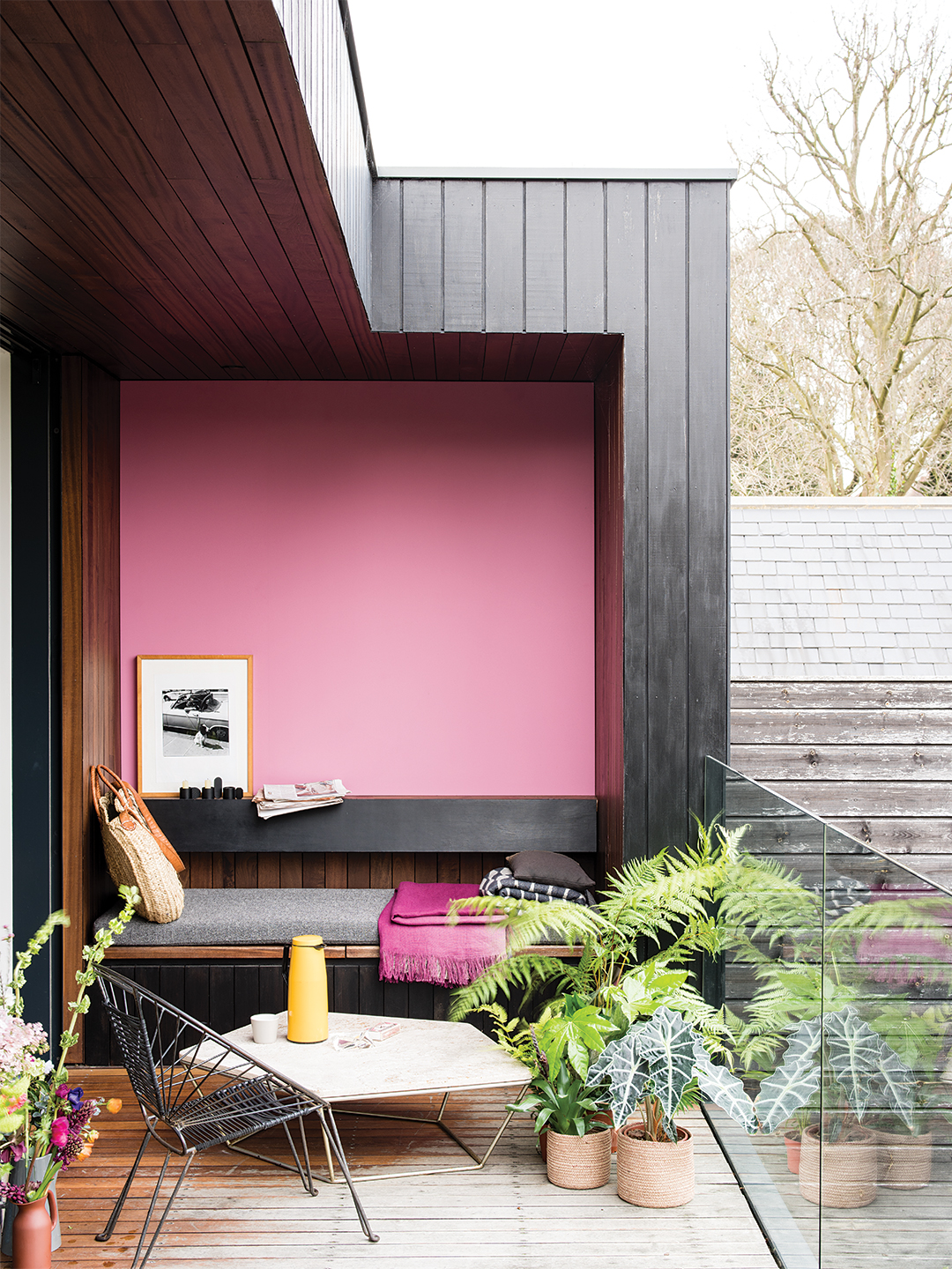
“In my head, I had it as the pink you’d find on an old kitchen dresser from the 1920s, but when I showed it to our head of creative, she said, ‘Oh, it’s a sort of boudoir color.’ However, ‘boudoir pink’ is definitely not a Farrow & Ball name, so we tossed it around for quite some time, finally looking into why a boudoir was called a boudoir. It’s from the French bouder, meaning ‘to sulk.’”
The One With a Not-so-Macabre Origin Story
“It’s a bit grim sounding, isn’t it? But it’s just making reference to the pigment that was historically used in green wallpapers. Though there is a theory that Napoleon may have been poisoned by the decoration in his bathroom, when he was in exile.”
The One That’s a Travel Memento
“Inspiration for that came to me in 1990. My husband and I were in India, and we got caught up in the Hindu festival of Holi, where people exuberantly throw different-colored powders around. At the end of the day, when we got back to the youth hostel we were staying in, he was covered head to toe in various colors. It really stuck in my mind. Rangwali is the name of the pink powder that denotes happiness, and it’s a lovely color.”
The One That’s Intentionally Tricky
“I like to make names that are difficult to say or have an intrigue to them, like Inchyra Blue, because it sticks in people’s minds. For example, Stiffkey Blue: Everyone pronounces it ‘stiff key,’ but it’s actually ‘stew key.’ It’s titled after a beach in Norfolk that I took my children to when they were little.”
See more paint stories: 7 Hotel Designers Pick Your Next Bedroom Paint Color Two Hues Is Better Than One: The Case for Color-Blocking Your Walls Shea McGee’s Trick for Getting the Perfect Paint Is a Game Changer
