We may earn revenue from the products available on this page and participate in affiliate programs.
When Austin-based designer Liz MacPhail got a call from her clients, telling her that they were moving to Houston, it was a bittersweet moment. On one hand, she would be involved with helping the family pick a new home; on the other, it would be almost three hours away. The news was also surprising: With 145 new inhabitants moving to Austin every single day, it’s far more unusual to hear of people moving away.
“It’s rare that we hear of someone leaving Austin, and I think the immediate reaction from most of us in the neighborhood was, ‘Houston?’ So I was really determined to help them make the move by creating a beautiful and personal home for them,” says MacPhail.
The young couple and their two sons, ages 7 and 5, picked up their former life for new work opportunities and a 5,500-square-foot 1930s house in Houston’s Southampton Place neighborhood. The historic home had it all—beautiful period details and plenty of room for the kids—but it fell short in one aspect: the pitch-black floors, which the couple wasn’t prepared to replace.
Instead, they infused the house with airy and light finishes, pattern, and color to breathe new life and add layers to the otherwise dark interior. Most of all, it needed to be family-friendly. Ahead, we asked MacPhail to share her top tips for designing a space that feels fresh and modern, but is also respectful of history and—above all else—kid-friendly!
If You Don’t Hate It, Keep It

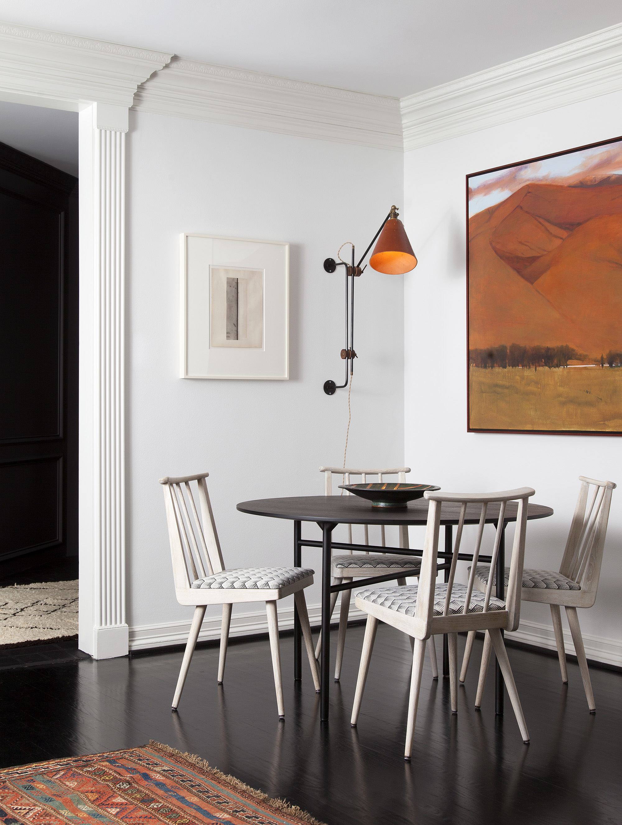
Pitch-black flooring is a divisive topic—just ask any designer or homeowner. Some embrace the dramatic, glossy black look, while others decry the constant marks and grim vibes. “Initially, we weren’t thrilled about the dark floors throughout the house, which felt a bit old and heavy,” says MacPhail. “However, none of us wanted to cut into the renovation budget or make the wasteful decision to replace perfectly good floors because of a color choice.”
Instead, the team set out to brighten other elements in the home to lighten the space, repainting all the walls in Benjamin Moore’s Decorator’s White. Then they selected a neutral color palette injected with light oak woods, dusty pinks, terracotta hues, and pops of turquoise on a light cream rug. “It honors the tradition of the home but couples that with a fun, bespoke, and artisan vibe that really brings this house out of stuffy and into happy and light,” notes MacPhail.
Brighten a Historic Home With Wallpaper


Decorator’s White may have helped brighten up the house, but the space needed soft patterns, textures, and layers to keep it from feeling like a scene from Beetlejuice. “We knew we wanted to wallpaper key areas to inject a delicate, refined touch and add personality and pattern,” explains MacPhail. “The entry had these wonderful steel doors and two small, more formal rooms off either side, and we decided to embrace that formality.”
The dining room was brightened up from its original avocado green hue, and the center hall received a fun but delicate Pointillist-style wallpaper by Rebecca Atwood that played off the soft dining room shades. In the children’s bedrooms, bold, graphic wallpaper was installed alongside colorful furnishings to add character and vibrancy.
Breathe New Life Into Family Heirlooms

The couple selected most of their furniture from scratch, but they brought along a few family heirlooms to give the home a sense of place and history. “I took [the owner’s] grandmother’s dining chairs to one of my go-to wood refinishers in Austin and had him secure, sand, and restain them, as well as give them a matte finish,” says MacPhail, who also re-covered the seat cushions in a Holland & Sherry hide. “When I loved the pieces [the client] had inherited from her family, it helped her to love and appreciate them even more.”
Other family heirlooms brought over from the owners’ previous life included old family oil portraits, an antique dresser, and a 1970s love seat that had belonged to the owner’s grandmother: “The love seat had the ’70s orange fabric still on it that the husband grew up napping on as a kid at his grandmother’s house,” says MacPhail. “I had it fully reupholstered in a Zak + Fox fabric; restuffed all the cushions; and then added a thin tufted down cushion all the way across to give it some added dimension and extra bounce for the kids to launch off of.” If there is a way to blend past and present in a family-friendly way, this is it.
Discover more homes we love: Tropical Modernism Takes Center Stage in This Venice Beach Home This Hamptons Home Starts With a Pink Sofa and Only Gets Better Desert ’70s Glam Steals the Show Inside This Airy Scottsdale Home
