We may earn revenue from the products available on this page and participate in affiliate programs.
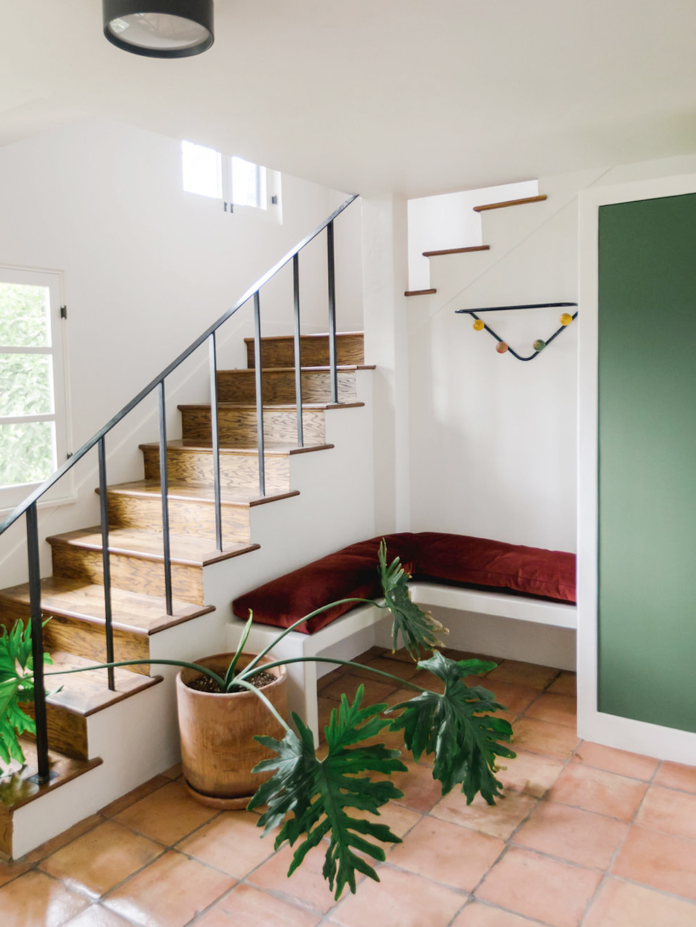
Jonathan and Jess Taylor stumbled across the perfect green door within the pages of Annie Kelly’s Casa Mexico. The book, which is all about design in Mérida and the Yucatán, was packed with inspiration for their renovation of a 1920s Spanish Colonial in Los Angeles’s Mount Washington neighborhood, but the designers went to extra lengths to bring that exact shade of pine into the space—specifically, the new entryway cabinets. They met up with their local color-matching guru and spent half an hour holding the page up to a digital scanner, a tool that would help them turn it into a real product. “The computer only gets you 95 percent of the way,” says Jonathan. “Then, you have to hand-tint it.”
The custom color, which the couple cleverly dubbed “Mexican Door,” set the tone for the foyer’s facelift. With no garage or surplus closets elsewhere in the small hillside home, storage was a top priority. Jonathan walks us through the entryway makeover and how they designed those dreamy cupboards, which now house everything from coats and shoes to brooms and art supplies.
Save the Floors

The Saltillo tile floors, while characteristic of the home’s architecture, had been coated with a glossy finish by a previous owner. The shiny layer took away from the earthy texture of the peach-toned slabs. “It starts to look really cheap when you do that,” says Jonathan. Instead of tearing it all out and wasting the material, the designers brought in someone to strip and sand the floors. “We had to really work to get them clean,” he recalls.
Plaster the Cupboards

In order to get the most out of the 85-square-foot area, they opted for chunkier cabinets. The two largest cupboards are two feet deep (ideal for storing boots) and seven feet high. The designers decided to coat the plywood boxes in plaster as a nod to Georgia O’Keeffe’s house in Abiquiú, New Mexico, tasking their cabinetmaker with attaching and installing the framework. “We wanted them to feel more like an integrated wardrobe than a closet,” says Jonathan. The textured treatment makes the entry feel less formal. Matching green acrylic handles complete the look.
The designers almost kept the built-in theme going with an integrated desk but landed on an antique table instead to help offset the newness of the cupboards. “We had to have enough cabinets in the space to make it a substantial element, but we also didn’t want to go overkill,” says Jonathan of mixing in the flea market find.
Carve Out a Spot to Sit

A shoe-free household calls for an entryway bench that’s comfy to rest on and high enough to slip things under. The four-by-four-and-a-half-foot one in this space is topped with a single, L-shaped cushion made out of a wine-colored mohair fabric from Schumacher. The Taylors had the upholsterer secure the pad to the plastered bench with metal clips so it doesn’t slide around. Now, the cozy corner is so inviting, no one will be rushing out the door.
Get the Look
Introducing Domino’s new podcast, Design Time, where we explore spaces with meaning. Each week, join editor-in-chief Jessica Romm Perez along with talented creatives and designers from our community to explore how to create a home that tells your story. Listen now and subscribe for new episodes on Thursdays.


