We may earn revenue from the products available on this page and participate in affiliate programs.
[noads]You would never guess it judging from its rainbow-hued contents, but this now-vibrant apartment in Brooklyn’s Bed-Stuy neighborhood was originally a dull gray.
“We knew we wanted to find ways to make minimal, but impactful changes as we weren’t sure how long we would be staying here,” says the stunning apartment’s resident, Emily Simms. “A paint job was first on our list: easy, affordable, and maximum impact.”
[/noads]


[noads]Colorful touches define this 900-square-foot two-bedroom: bright, graphic magazines propped up on the chalkboard behind the desk, gradient blue kitchen cabinets, a rack of technicolor clothing in Simms’ bedroom.
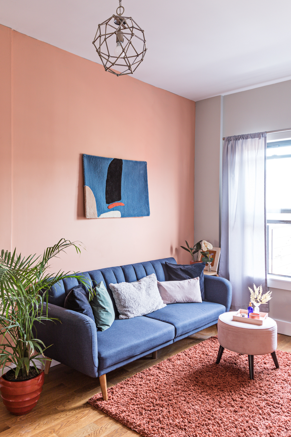
But the most eye-catching aspect of the apartment has to be the stunning pink walls. Trendy yet timeless, playful though not juvenile, it pulls the whole space (which Simms shares with her roommate, Aimee) together.[/noads]


[noads]“I think it started with the pink dishes I had bought—my first apartment purchase. We joked about making the whole place monochromatically pink; Aimee, of course, objected to this absurdity, but we managed to land on the perfect terra-cotta pink shade. [It’s] a perfect harmony of both our styles,” says Simms, a graphic designer and photographer who currently works at fashion brand Loeffler Randall.
They started from scratch, gradually adding little touches here and there over the course of a year. “We would buy one thing, that would lead to another… eventually, we were out of mini ceramic pieces to buy from Home of the Brave,” jokes Simms.
And while both roommates agree that from a structural standpoint, the home isn’t the most ideal space—it suffers from the same lack of square footage plaguing most NYC apartments—they’re more than happy with it for now. [/noads]


[noads]“After months of love, this space feels like home and we are very proud to call it ours,” says Simms.
Read on to see how she and her roommate worked to create a vibrant, thoughtfully curated home in under 1,000 square feet.[/noads]


[noads]Stylistically, what was your inspiration? Do you find yourself drawn to one aesthetic in particular?
Cliché and unoriginal, but put a stamp that says “Scandinavian” on it, and I’m sold.
Working as a “creative” in fashion, I’m exposed to a large roster of amazing photographers and set designers that really inspire the different textures and palettes I tend to be drawn to. Harley Weir’s Balenciaga campaign and David Abrahams’s styling are two examples of this.
Is design something you’ve always been interested in?
Nope, had every plan to become a forensic scientist up until my junior year in high school. I quickly realized I had no capabilities [to fulfill] that plan, and design sort of just happened. I got my first internship as a designer in the art department of Opening Ceremony, which I am forever grateful for as it opened my eyes to so many things—they even gave me my first Group Partner pot as a parting gift (thank you, Jason!). I hopped on the Sight Unseen bandwagon, and here we are.[/noads]


[noads]What were some of the bigger changes you made to the space?
Given that this was both of our first apartment in NYC, for us it wasn’t so much about changing the architecture or design as much as it was about making smart, affordable choices in the things we put in the space. Painting felt like an easy way to elevate the look and feel and provided the foundation for the rest of the space.
That being said, Aimee and I would LOVE to re-tile the bathroom and give that room a major facelift. And remove the random chalkboard they installed that sits behind our desk space.[/noads]


[noads]How did you navigate balancing your style with Aimee’s—any challenges?
Aimee and I have been friends for years now, and I think going to university together where we would work closely on our personal projects helped us understand each other’s style, which made it very easy for us to work together to build this space. Aimee is clay and I am resin; [her] style is a lot more organic than mine in the textures she wears, colors she’s drawn to, even in our preferred candle scents. Whereas I tend to be drawn towards more geometric shapes, “riskier” colors, and symmetry… but I think we managed the perfect balance.
The living room is probably our biggest feat. We decided no rules when it came to the different shades of wood, landed on the perfect palette, and struck a balance between organic/geometric with the shapes and textures of the accessories. [/noads]

[noads]We’re so obsessed with the kitchen… especially the cabinets! What was your thought process behind that space?
Completely subconsciously, like most things in my life, it became monochromatic. When we signed the lease, we were under the impression that the cabinets were clear and the blue was a protective sheet. We just rolled with it when it came to the appliances.
I think it helped that we have two clear color stories in the open space that makes up our kitchen/living area: There’s the blue team, and the warm, earthy team. [/noads]

[noads]What’s the story behind your favorite piece in your home?
Without question, the Cold Picnic rug that’s hanging above our sofa. It was something I purchased while I was in college and [it] felt like such a luxury item in my run-down, hideous apartment rental off-campus in Syracuse. Having it hang in the center of our home feels like a reminder of how hard we’ve worked to be here.
And, it’s pretty. [/noads]


See more color-filled homes we’re lusting after: Inside Our Social Media Editor’s Primary-Colored, 650-Square-Foot Apartment Inside an Artist’s Bold, Rebellious Georgia Home A Sweet California Bungalow Filled With Storied Treasures
Learn to love your inbox again—sign up for Domino’s daily email.
