We may earn revenue from the products available on this page and participate in affiliate programs.
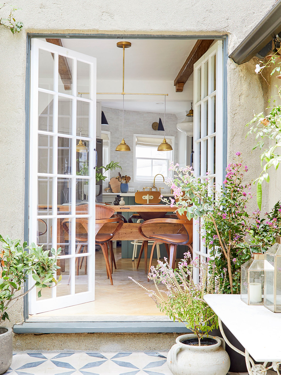
Like many of us, Emily Henderson is ready to begin a new chapter. The designer and author recently put her 1926 Tudor-style home in Los Angeles’s Los Feliz neighborhood on the market for $2.6 million with Nourmand and Associates. Henderson’s fans and followers will have seen the space’s soaring ceiling beams and dreamy tiled patio on her blog and Instagram over the years. And while you’d assume it wouldn’t take much to get an already perfectly styled space in shape to sell, the designer had to make a few key updates, from painting to landscaping. “We did a huge touch-up, inside and out,” she says.
Planning a move in the near future? We asked Henderson how she got her charming place listing-ready.
Be Prepared to Paint Complete Walls

It doesn’t take long for walls and trim to look faded (in Henderson’s case it was four years). The problem is little touch-ups here and there weren’t going to fix her problem (any new paint likely won’t match the aged sheen), so she had to repaint some of the rooms in the home from scratch. Then she went into other spaces that didn’t need as much work and took care of any small nicks.
Beef Up Your Curb Appeal With Bushes

Clad in verdant vines, the exterior of Henderson’s home already had the storybook appeal going for it, but knowing that the property will likely sell to a buyer who is in love with the yard, she took the landscaping a step further. “I amped up the back and front with more bushes, fresh sod, and flowering plants that attracted butterflies and hummingbirds,” she says. “Of course, it looks better than it ever did right as we are leaving.”
Don’t Rearrange the Furniture—Get Rid of Some of It

Henderson’s staging rule: Cut the furniture in a room down by 20 percent. “It looked so much better and bigger once we did that,” she recalls of removing some accents out of the house. This also makes it easier for visitors to move around during in-person showings.
Lean Into Character

“This was a huge debate,” says the designer. “We realized that the people who will buy this house want a storied home. So we embraced it instead of trying to make it feel like a new build.” In the kids’ room, Henderson could have removed the large canopy that hangs over the twin beds to simplify the space, but she felt it was appropriate for the style of the house. “It shows the level of creativity that you can have in this house,” she says. The impressive textile sold us on the space.
Introducing Domino’s new podcast, Design Time, where we explore spaces with meaning. Each week, join editor-in-chief Jessica Romm Perez along with talented creatives and designers from our community to explore how to create a home that tells your story. Listen now and subscribe for new episodes every Thursday.

