We may earn revenue from the products available on this page and participate in affiliate programs.
Designer Elizabeth Stamos had a classic case of “the cobbler’s children have no shoes” when she first moved into her 1980s townhouse in Chicago’s Lincoln Park neighborhood. She and her husband, John (not the actor), bought the house with a 1-year-old in tow and a baby on the way, so no matter how badly she wanted to get rid of her cherrywood cabinets and granite counters, she didn’t have the bandwidth to plan a reno on top of diaper duties and client projects. “I was just a tad underwater the first few years,” she remembers.
Fast-forward to 2019, and Stamos found herself faced with a different challenge: She was having a hard time narrowing down the endless possibilities before her. “I was my own worst client,” she says of the kitchen overhaul they’d finally decided to embark on. The designer envisioned custom cupboards, a new pantry, a built-in banquette, and a statement range hood. But when the couple saw the bottom line, they nixed the idea of a gut remodel in favor of a budget-friendly spruce-up. “The cupboards were Shaker-style and in great shape,” Stamos explains, “so I knew I could get the look I wished for with some paint and a few key updates.”
In the end, Stamos saved $35,000 by altering her initial plan—and ended up with a total bill of $15,000. Here’s how she shaved off thousands of dollars and still got the space of her dreams.
Repaint the Cabinetry (and Add a Custom Touch)

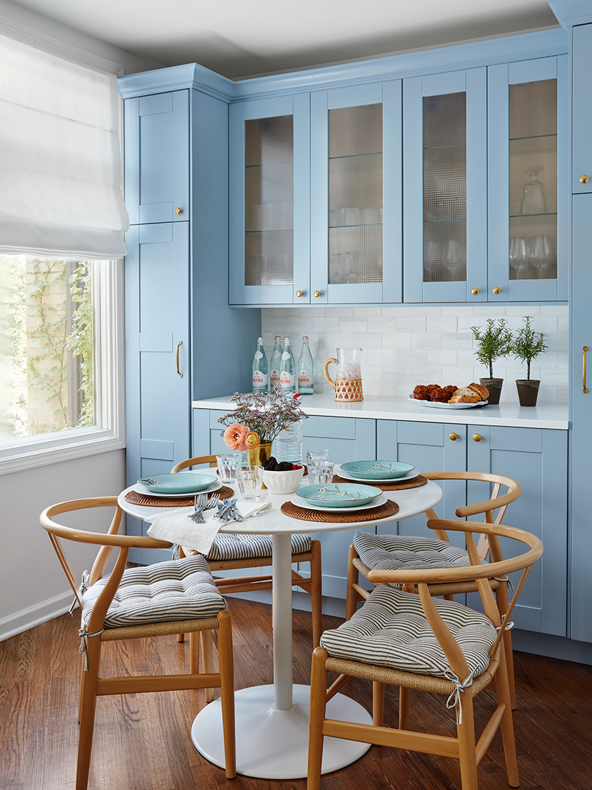
Stamos knew she could save $20,000 to $30,000 by keeping the cabinets she already had—but first they badly needed a makeover. She covered up the orange-hued cherrywood with several coats of Benjamin Moore’s Solitude, a shade inspired by a trip to Paris, where she saw multiple front doors in the blue-gray hue. Then she faked the bespoke look by adding trim to the top of the cupboards. “It’s a small detail that’s often overlooked in builder-grade homes, and it made a huge difference,” she says. The finishing touch: unlacquered brass hardware from Rejuvenation.
Use Marble (but Only in Small Doses)


What Stamos really dreamed of was Calacatta Gold marble on every surface—a signature style she turns to in many client projects. But because she had a limited budget and toddlers at home, she knocked a few additional thousands off the budget by opting for durable quartz countertops by MSI Stone instead. “They can take a beating and be cleaned up easily,” she says. Still, her heart was set on natural stone somewhere, so Stamos elevated the backsplash with Dolomite marble tiles from Daltile, which offer a similar style to Carrara without the high price tag.
Tuck the Microwave Away

In her old space, the microwave dominated a corner of the counter. “It ate up a ton of room and looked terrible,” Stamos remembers. Because the designer didn’t have the luxury of hiding it within the cabinetry without gutting the whole room, she decided to mount it above the stove to double as a range hood. “Is it my favorite thing to look at? No. But it’s functional and adds a bit of breathing room,” she says. One day she hopes to check every last box on her kitchen wish list. But for now she has a hardworking space that will last her until—and likely long after—the kids are grown.
Introducing Domino’s new podcast, Design Time, where we explore spaces with meaning. Each week, join editor-in-chief Jessica Romm Perez along with talented creatives and designers from our community to explore how to create a home that tells your story. Listen now and subscribe for new episodes every Thursday.
