We may earn revenue from the products available on this page and participate in affiliate programs.
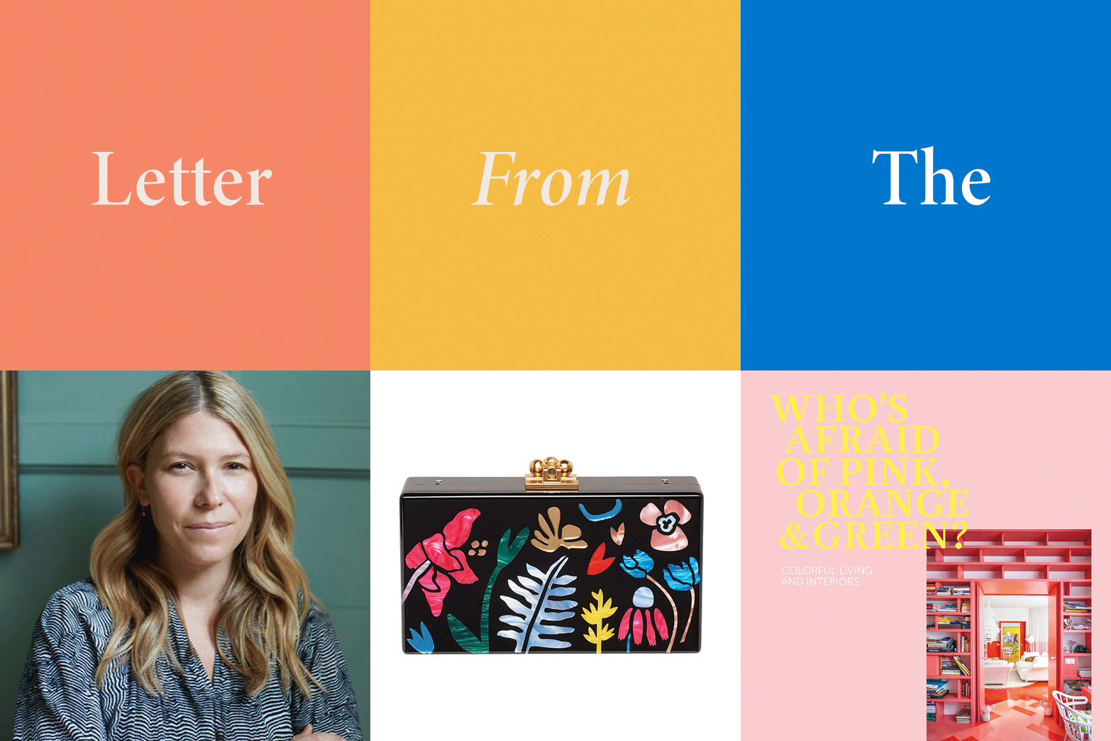
Each spring, I get the itch to push outside the boundaries of my color comfort zone. I’m always game to try a shoe in a new hue (I’m obsessing over lavender and icy blue right now) or swap out my bedding for a palette that feels more on point with my current mood. Just like having more daylight can boost your mood—hello, sunshine!—your well-being is closely connected to the colors around you. How you decorate your space reflects what makes you happy.
With that in mind, this year’s Color Issue covers the full spectrum and is all about powerful color combos: Cover star Garance Doré’s new home in L.A. is all calming neutrals with pops of cobalt, bold primaries meet cool graphic details at the Long Island cottage of textile designer Aelfie Oudghiri, and a modern palette of black and blush with poppy brass accents hold court in the London home of designer Jo Sampson.


Beyond interiors, we explored the ways color can transform any experience—from food to travel to weddings. Revamp a wild salad in bold monochrome, choose your next trip based on the best color story (for us, it’s a tie between Cuba and Stockholm), or set a rainbow-themed dress code to channel true party vibes.
In other words, color is our feel-good answer to spring. If you’re craving a refresh, try out that new wallpaper, slip on some tinted shades, or rock a neon-hued essential.
Here’s to looking on the bright side.

See more letters from our editor:
Editor’s Letter: Our Fall 2017 Issue is All About Chic Style
Editor’s Letter: The Inspiration Behind the Summer 2017 Issue

