We may earn revenue from the products available on this page and participate in affiliate programs.
Walls somewhere in between white and gray, mysteriously stiff chairs, maybe a singular plant sitting in the corner: Historically, medical offices have rarely been inspiring places. Stuffy design paired with a good case of general jitters make them dread-worthy. Suddenly, though, doctor’s offices are starting to look very different.
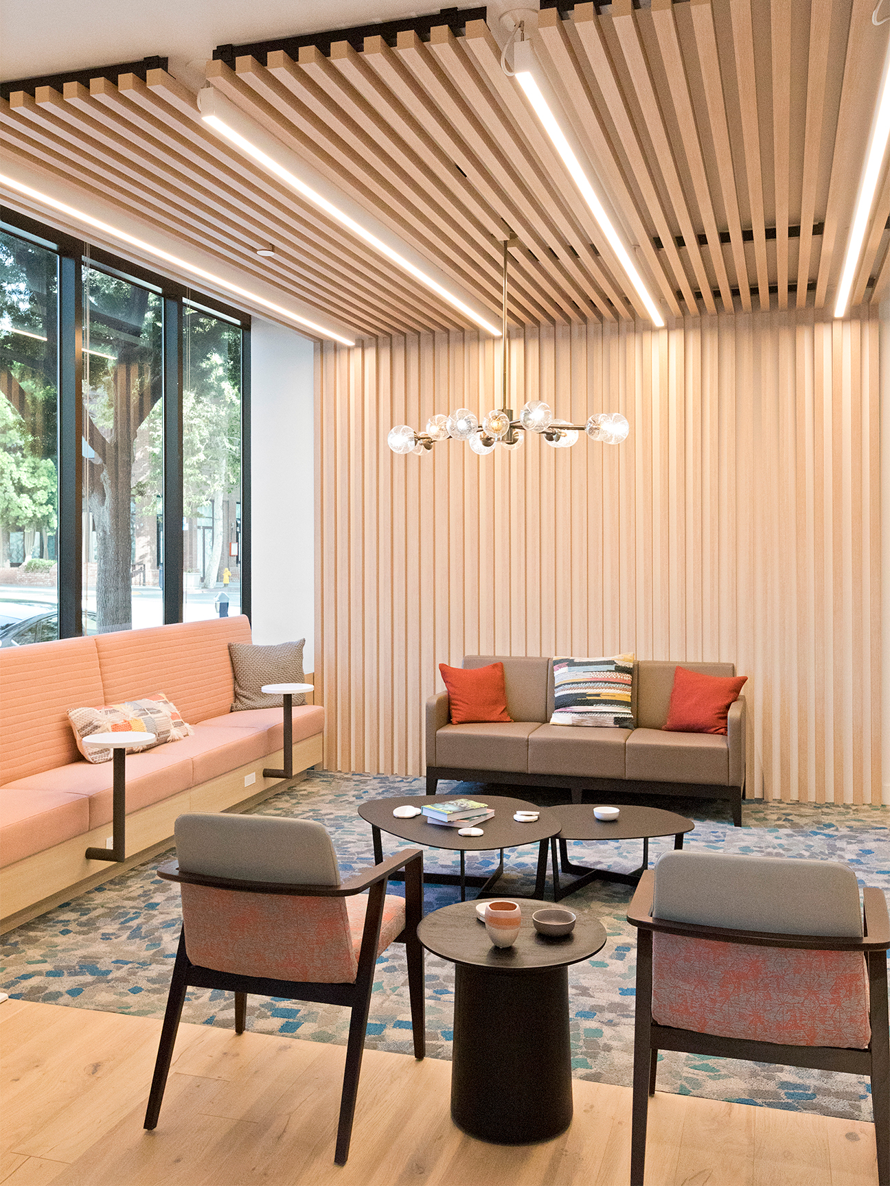
If you’re a city dweller, you’ve surely noticed the change, at least on Instagram: sad benches and plastic chairs replaced with cushy, colorful sofas; orangey chestnut wood exchanged for bright oak and maple; and harsh fluorescents swapped with calming pendants. It’s enough to make your checkup something to look forward to—and that’s the whole point. Good aesthetics can put you at ease.
It’s not an art, it’s a science. These spaces largely abide by the rules of biophilic design, a concept that’s been around for millennia. Basically, the idea is that people want to connect with nature, and supporting that innate desire in any environment can dramatically impact their health and well-being, explains Lauren Spear, director of design at New York mental health clinic Alma.

That doesn’t mean a room that resembles the Rainforest Cafe. “We selected pieces that evoke a connection to nature either through their surfaces, the materials they’re built from, or because their pattern reflects something you might encounter on a hike,” says Alda Ly, the design architect behind primary-care provider Parsley Health’s three locations in New York, Los Angeles, and San Francisco. Actual plants are the most obvious choice, but there are other, less obvious (but just as important) factors at play.
First, the color palette. In this new era of doctor’s offices, you’re far more likely to find soft blushes and vibrant greens, but that doesn’t mean creams and whites are totally out of the question. “Neutral palettes can be calming and nonoffensive, but you have to be careful to balance the neutrality with something to contrast it so it doesn’t begin feeling antiseptic,” explains Laura Harsch, director of design at nationwide primary-care provider One Medical, founded in 2007. A good way to balance this is by diversifying not just tones and hues but also the textures in a space.

In Parsley’s Los Angeles office, you’ll find cane chairs. In One Medical, plush rugs. In Alma, linen upholstery. All work to make patients calm. “Real wood flooring is warm and comfortable with a nice sound when walked upon. Soft, nubby fabrics feel cozy and provide subtle comfort when you’re not feeling well,” continues Harsch. “Cleanability is critical, but you don’t want a fabric that looks or feels like you can just hose it off.”
And we can’t forget one of the biggest sources of doctor’s office dullness: those overhead lights. The solution is pretty simple—bringing in both sconces and lamps rather than just relying on one source. Natural daylight is important, but beyond that, layering sources of light to evoke what you’d find in nature is a bigger goal, according to Spear.

The tone of the light is key, too. “During the day, it’s best to use bright, white bulbs that tend to be a bit bluish, but in the evening, it’s helpful to change to a softer, warmer light,” says Ly. That way, you can maintain your circadian rhythm and actually fall asleep when you want to fall asleep.
Clearly, these doctor’s offices are doing something right—and plenty of others are following suit, too. Fertility clinic KindBody, dental offices DNTL Bar and Tend, and “wellness ecosystem” The Well all promise sleek, soothing waiting areas and treatment rooms that are surprisingly chic.
All of these updates can make a world of difference at home, too. “Your environment is the most accurate predictor of your behavior,” says Spear. “So if you’re looking to shift the dynamic you have with your interiors, or even just create new habits, making some simple changes to your space can work wonders.” That’s right, design inspiration can be found in the same place you get your blood pressure taken.
See more stories like this: The Best Place to Find Design Inspiration Might Be the Gym The Newest Crop of Social Clubs Is All About Self-Care This Is What a Sleep Expert Does When She Can’t Fall Asleep
