We may earn revenue from the products available on this page and participate in affiliate programs.
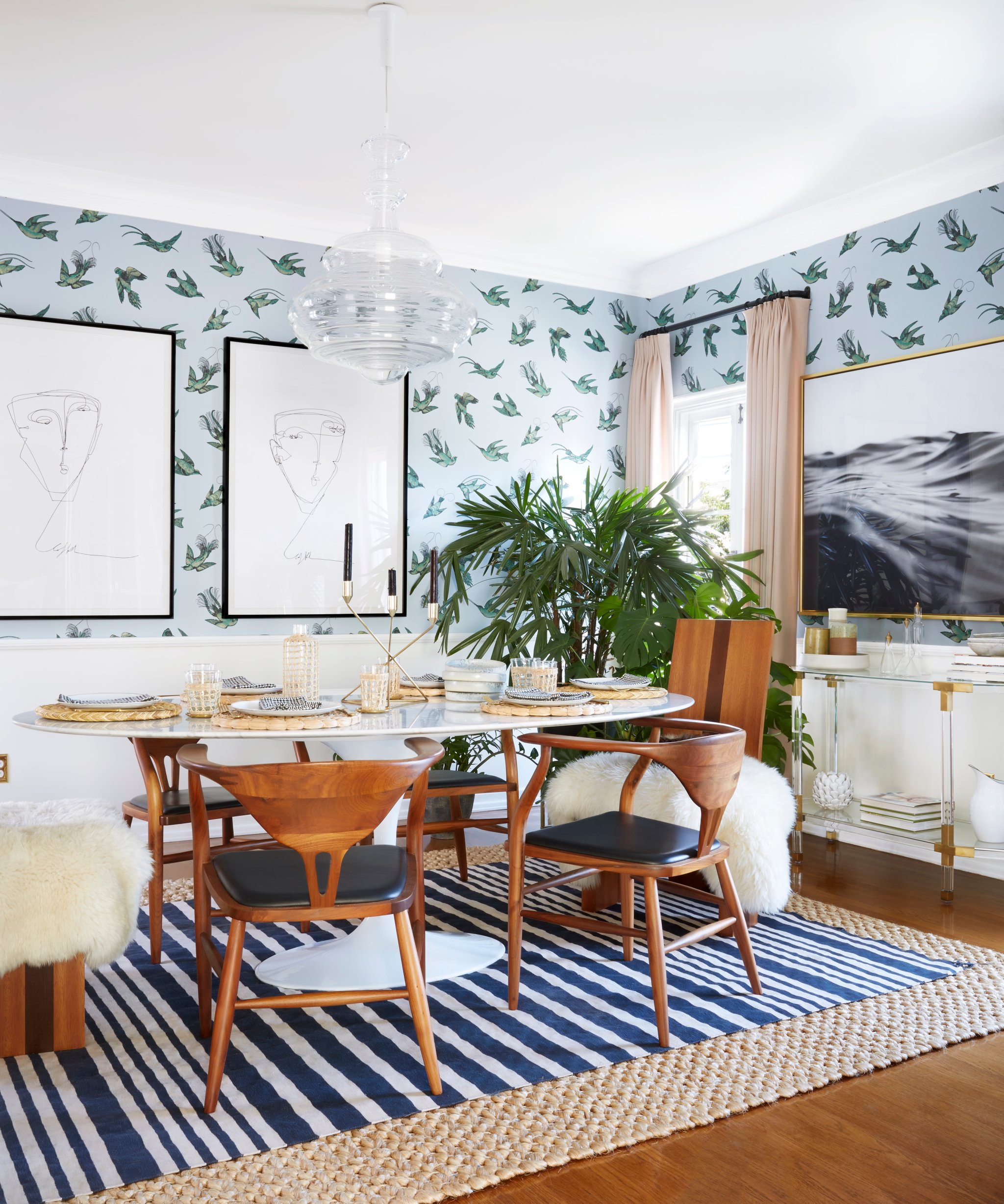
It takes a well-groomed eye to be able to layer lucite accents and an antique-inspired gilded mirror with bird-emblazoned wallpaper in 190 square feet, and Dee Murphy pulled it off with aplomb.
The LA-based designer’s style is a mix of modern and vintage, which results in her creating the type of effortlessly collected spaces you imagine might exist in only the coolest of California homes. But while her aesthetic is typically an ode to her beloved home state, Murphy pulled inspiration from a different geographical enclave when decorating her dining room: Paris.

“Our house feels like a European apartment, so I really used the structure of the building and its age as my inspiration,” she explains, referencing the 1920-era home. “You could call it ‘modern vintage Parisian eclectic.’”
Murphy aimed to create a whimsical, warm space that straddled the line between fancy (it’s a formal dining room, after all) and livable (it’s also where her family of four eats every meal). Emboldened to try color to contrast the neutral spaces that encircle the dining room, she pulled in pops of color from everywhere. Shades of blue, reflected from the adjacent living room, serve as the base for the dining room. Unexpected pops of blush pink in the curtains bring a softer edge.

Aside from her home’s architecture, the wallpaper was another great source of inspiration for Murphy, who knew from the get-go that she wanted to install paper on her walls, and when it came to the pattern that would inhabit the wallpaper, she had a specific vision. “If you follow my work, you will see a common theme in my wallpaper choices: birds,” she says. “My grandmother had an affinity toward them, and I think she passed it along to me. This pattern from Cole & Son hit all the right notes, and I was delighted the moment it went up.”

The wallpaper sets the tone for the dining room perfectly. Eclectic yet not dysfunctional and playful yet not juvenile, it anchors a space that’s all about juxtaposition.
Most notably, there’s a big mix of vintage items and contemporary pieces in the room. You’ll find a sleek acrylic console inches away from mid-century modern wooden chairs. Underneath the aforementioned Parisian-inspired gilded mirror sits a vintage geometric Italian lamp that contrasts nicely with the other light fixture in the space—a modern glass chandelier.

According to Murphy, the key to effortlessly mixing old and new lies in taking the time to understand what you already have in a space and how the incoming items will play off it. “I really pay attention to the materials and textures that are either already in the space or that could be an important missing piece of the aesthetic puzzle,” she explains.
For example, the dining chairs may be a mix of old and new, but similar wood tones keep them feeling cohesive. The acrylic console and chandelier were new and deliberately chosen to bring boldness to the room without detracting from the more pattern-heavy pieces in the space. “Lucite and glass are easy ways to add some drama but in a minimal and noncompetitive way,” she recommends.

While Murphy is hard-pressed to pick a favorite part of the space (“It’s the only room that I haven’t gone back to and restyled,” she admits), one final detail sticks out: The layered rugs. Neatly situated in the middle of the room, they tie everything together with one finishing touch of juxtaposition.
“It’s one of the first things people notice when they visit my house,” says Murphy, sharing that one of her most-asked design questions involves how to expertly layer rugs.
The solution? Go natural. “I absolutely love a textured, somewhat chunky, natural fiber rug underneath any other style—it adds instant warmth and softness. Just make sure it’s large enough so that you have enough of a border around the top piece to make a statement,” she says. “For the dining room, make sure the top rug is a flat weave so you can easily vacuum crumbs and clean up any mess from the amount of traffic.”

Layered rugs, layered colors, and layered aesthetics: Murphy’s space has to be one of the coolest dining rooms we’ve ever seen.
See more on blending old and new: A 1925 Colonial Home Gets an Uber-Modern Face-Lift Unexpected Pops of Color and Vintage Treasures Complete This Chicago Home How One UK Blogger Expertly Blends Old and New
