We may earn revenue from the products available on this page and participate in affiliate programs.
Once the decorating bug hits, it gains momentum quickly, and for Dee Eke, the mom behind Dee Diary, last year brought out her inner designer in a big way. Staying at home instead of traveling for work meant Eke finally had time to finish the projects she’d been pulling together in her head. First, she tackled the most pressing room: a space she uses as both a home office and a bedroom for her two sons. Next on the list? Updating her bland kitchen.
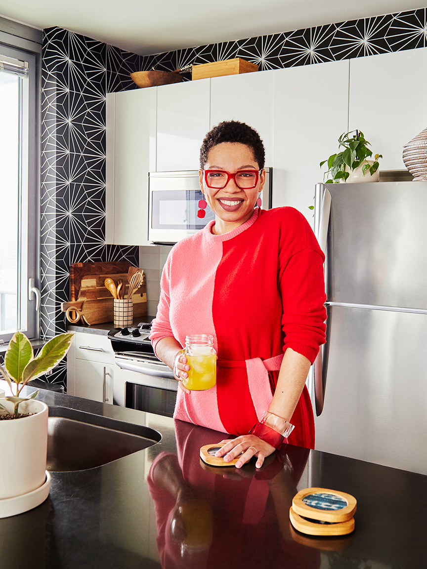
“It was just white walls, builder grade: There was nothing inspiring in there,” says Eke of the open-concept design. Relying entirely on things she could purchase online (including paint and plants!), she proved that a rental kitchen makeover is totally doable and well worth the effort. “I think there’s a popular misconception that just because you live in a rental you can’t make a kitchen feel like home,” says Eke. “But why not enjoy where you are right now?”
She chronicled the whole makeover in real time on Instagram under a highlight she affectionately named Kitchengate, from her wins (painting the peninsula in under an hour!) to the setbacks (discovering she really didn’t like the barstools she and her husband had compromised on). Here are the lessons she learned along the way.
Don’t Fear Dark Paint


When Eke shared her plans to paint her island black on Instagram, her DMs exploded with people telling her not to do it. “I was surprised at how many people feel polarized by black,” she says, laughing. “It was very intentional. The sun rises on this side of the apartment—it’s bathed in light every day. I actually wanted some of that light to be absorbed.” A moody hue also helped to visually separate the space from the living room across the way. Rather than dissuade her, people’s fears about Eke losing her security deposit only inspired her to share more. “If you put a good primer on top, you can easily just paint it back to a white,” she notes.
Uneven Walls Can Get the Wallpaper Treatment


After installing removable wallpaper in her office/kids’ room, Eke knew that she wanted to use the material to add personality to her kitchen, too. “You see the kitchen when you first walk into our apartment,” she explains. However, her husband balked at the fabric-inspired designs she was drawn to. The couple found a happy compromise in a starburst tile look-alike from Chasing Paper.
While the finished result is a convincing fake (the covering peels right off), Eke had to work hard to get it to look good because the apartment’s walls aren’t straight. Instead of starting at a corner (what wallpaper manufacturers recommend), she began where the wallpaper would meet the floor and aligned the pattern with the grout lines of the tile. While it was painstaking, she managed to completely transform the room in just one day.
Warm It Up With Wood

Eke strategically put her wood cutting board, spoons, and other tools on display to cozy up the white cabinets and stainless steel appliances. Likewise, she opted for barstools with solid wood backs that almost look like sculptures against the black peninsula.
Smooth the Transition Between Zones

In Eke’s compact living space, the kitchen butts right up to the living room. To ease the transition—and sneak in extra storage—she positioned a leaning shelf on the wall next to the peninsula. The furniture serves both areas: Extra vases live there to save space in the cupboards, while also pulling the black and wood palette into the living room. On the top ledge, a trailing philodendron adds a touch of green without taking up precious countertop real estate.
Incorporate Moments of Surprise

“I like organizing, and my husband likes cooking,” says Eke. The storage had to be pretty and functional to make them both happy. Eke decanted their spice collections into labeled clamp-top canisters and tricked out the drawers with dividers to achieve that satisfying feeling of everything in its place. Then she upped the visual appeal. The back of the spice cabinet and bottom of the cutlery drawer are lined in leftover wallpaper, a tiny upgrade that makes her smile every time she grabs a fork.
The Goods:
Splurge-worthy kid’s chair: Stokke’s endlessly adjustable Tripp Trapp.
Secret to no-fear painting in a rental: A good primer can cover up anything.
Favorite kitchen item: The Breville espresso machine. I recently upgraded from a pod machine and I don’t know why I waited so long!
DIY detail: I upgraded a plain white utensil holder by drawing on a grid pattern with a Sharpie.
Visualization tool: I recently discovered Canva, and it’s been a game changer for making mood boards. It’s super user-friendly.


