We may earn revenue from the products available on this page and participate in affiliate programs.
When it comes to a set of past-their-prime leather chairs, it’s no big deal—donate them and move on. But ditching dated cabinets or hauling out a chandelier, well, that’s not so easy, practical, or affordable. Shower curbs, waterfall countertops, formal dining rooms—at the beginning of 2020, these were just some of the tempting design decisions designers told us to ditch. And over the course of the past 12 months, they’ve come up with a few other trends we should all steer clear of, especially as we adjust to our new normal. “Now that we are spending almost 100 percent of our time at home, durability and functionality matter most,” says Sarah A. Abdallah, founder and CEO of Functional Creative Design.
Before you buy that Pinterest-perfect ’70s wood paneling or embark on a floor plan that looked foolproof on a tiny Instagram square, hear eight pros out, below, as they reveal the reno trends that are feeling dated and what to replace them with.
Solid Colors That Fall Flat

Cold neutrals are out—rich greens and blues are key for 2021. Embrace patterns that reflect the traveler in you; geometrics that remind you of where you have been and where you want to go. —Sarah A. Abdallah
White Oak Floors
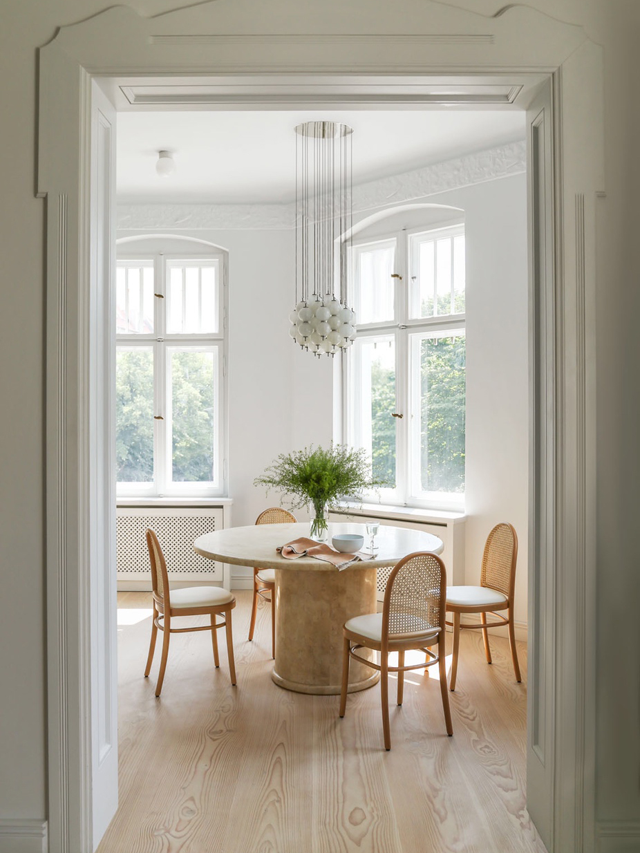
There are so many cool options in flooring other than wide plank oak. I’d love to see people branch out into natural Douglas fir, reclaimed pine, and my new favorite: bleached walnut. —Raili Clasen
Stenciling

Stenciled floors and walls feel dated, are unnecessarily time-consuming, and tend to be less durable. Instead try some great alternatives like temporary or peel-and-stick wallpaper, luxury vinyl plank flooring, permanent wallpaper (which has made a major comeback), or ceramic or porcelain tiles. —Rasheeda Gray
Faux Woods and Stones
Tiles that look like wood and surfaces imitating marble will never stand up to the rich textures and durability of the real deal. Timeless, classic, and honest materials will stand the test of time and not date as soon as current trends are out of fashion. —Liani Douglas
Too Much of Any One Type of Lighting

We’re often brought in to renovate cookie-cutter apartments where there will be dozens of random recessed lights with no aesthetic consideration regarding how they relate to smoke detectors, sprinklers, speaker systems, or the room at large. I much prefer strategically placed flush mounts and pendants (with dimmers!) that can operate as jewelry in a room. They delineate focal points and seating areas and provide much more nuanced lighting. —Keren Richter
Recessed lights are useful in illuminating spaces, but too many can make a room feel very harsh. A mix of sconces, task lights, and lamps provides a better option for creating different moods in spaces. —Nina Blair
I would urge homeowners to keep pendant selections minimal, subtle, and suitably scaled. —Simone Haag
Glossy Flooring
“As we embrace a more romantic notion of home, living with the raw, natural, and unvarnished is a macro trend. Our flooring choices are in step with this and we’re opting for a less manipulated, engineered, polished look and turning to tactile alternatives like rough-hewn wood, imperfectly refinished subfloors, concrete, and plywood.” —Cynthia Zamaria
Choppy Floor Plans

The traditional separation of common areas in the home are null and void for online courses or working from home. Designing integrated offices is key, along with creative solutions for play and mindfulness. —Sarah A. Abdallah
I see a lot of renovations still prioritizing exquisite (but never used) formal dining rooms. I hope that, as we move forward, we focus more on multifunctional, livable spaces. —Nina Blair
Farmhouse in a Non-Farmhouse Setting
The farmhouse trend is on its way out, at least when applied to homes that aren’t really farmhouses (which, ironically, is where it’s been used over the years). There are still practical uses for shiplap and tongue-and-groove paneling, but they’re being reimagined in more modern ways. —Catherine Williamson
The problem is inserting a distinct style in an opposing architectural context, like going heavy on farmhouse elements in a Craftsman home. Avoid barn doors, massive islands with cantilever countertops, and faux distressing anything. —Beatriz Rose
Window Trim That Matches the Wall

Window trim in a remodel usually gets the same old paint as the wall, but covering it in a contrasting color adds a hit of personality to a room, and it’s not a huge investment. —Raili Clasen
Our Fall Style issue has arrived! Subscribe now to get an exclusive first look at Ayesha Curry’s Bay Area home—and discover how design can shape our world.

