We may earn revenue from the products available on this page and participate in affiliate programs.
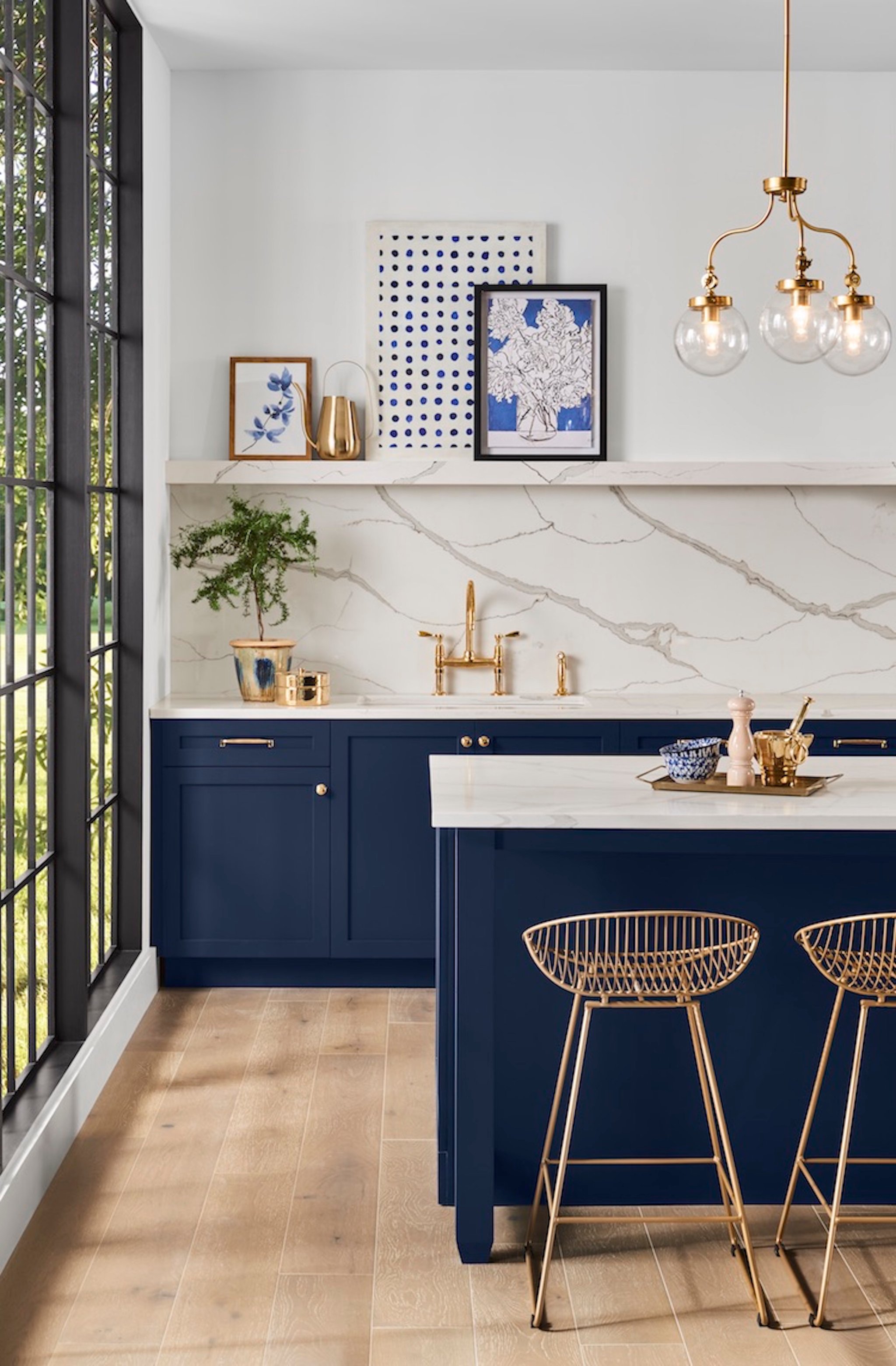
Here’s the good news: Sherwin-Williams’s 2020 color of the year is super-versatile. Here’s the bad news: It’s so versatile that you may end up overwhelmed with ideas. The paint brand has just announced Naval as its pick, and the deep blue is one that everyone can get behind.
Inspired by the 1920s and the rich details of the Art Deco years, it definitely brings the drama. The shade is meant to facilitate bold choices in decor—if you’ve been tiptoeing around making a statement, use Naval as your backdrop and permission to go wild with patterns and materials. “As we slide into 2020, paint and design are headed in the direction of ‘do what makes you feel good,’” explains Sue Wadden, Sherwin-Williams’s director of color marketing.
She’s not the only one who thinks so; you may remember PPG Paints making a similar reveal earlier this summer. It’s safe to say that, for the foreseeable future, navy is the new neutral. Which means that, just like with white or gray, there’s no end to how to decorate with this hue. We asked a few of our favorite designers how they would make Naval feel fresh in their own spaces.
Young Huh’s Tip: Think Beyond the Walls
The designer behind our favorite Kips Bay Show House room loves using the classic choice for refurbishing old furniture. Most recently, Huh applied navy to her bedroom fixtures for a monochrome look; her walls, curtains, and velvet bed frame are all coated in the dark shade. “The effect is masculine, sleek, and fun all at once,” she says.
Anita Yokota’s Tip: Use It in a Tight Space
Yokota added interest to her walk-in closet by coating her ceiling in a similarly moody blue and finishing it off with a cool pendant lamp. “The light reflection highlights the dark, sexy ceiling,” says the designer. “It’s a very unexpected way to visually awaken an otherwise mundane space.”
Brady Tolbert’s Tip: Up the Contrast
“People get scared of dark colors, but they can bring so much warmth—yes, I said warmth—to a room when you do it right,” says Tolbert. His tip: Balance the hue with wood and camel accents. Set against the cooler walls, the combination feels fresh. Seriously, what can’t Naval do?
See more colors of the year: We Already Know the First Big Color Trend of 2020 Your Official Guide to Every 2020 Color of the Year Behr’s 2020 Color of the Year Was Inspired by Nature
