We may earn revenue from the products available on this page and participate in affiliate programs.
Let’s be real: No one (except possibly a Rockefeller) has the time or funds to repaint their entire house with the release of each new batch of colors of the year. Instead of looking at these trend reports as prescriptive, we’re choosing to think of them as inspirational. Or at the very least, a way to indulge in a bit of voyeurism—it’s fun to see the most popular hues start to pop up in people’s homes.
So far, 2020 is looking pretty cool, and we mean this in the most literal sense of the word. Between the soft grays and the nature-inspired greens, it appears everyone is itching for a bit of relaxation in their space. That said, the season is not over yet. With paint companies and mega-brands like Pantone announcing their predictions for the next big hue seemingly every other week, there’s still a lot to look forward to. In the spirit of streamlining, we’re putting it all here: Consider this your comprehensive guide to every color of the year.
We’ll be updating this story as new reveals are made—watch this space.
Minty Fresh
This über-bright mint is apparently a nod to 1950s style, according to Dunn-Edwards. Modernize it by pitting it against darker, more dramatic shades, like navy blue or deep berry.
Romance
HGTV Home by Sherwin-Williams would like you to consider an apricot-tinted rose next year. A solid wash of color isn’t your only option—all of these hues are a great opportunity to go abstract with some fun geometric shapes.
Tranquil Dawn
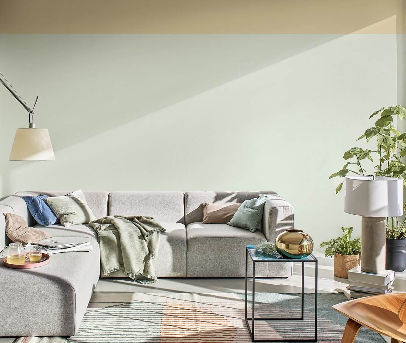
British brand Dulux was inspired by the morning sky when picking this pale green tone. If nothing else, it’s a great way to get in on ice cream pastels if you’ve been waiting to take the plunge. Since the sage is so subtle, play it up with contrast—think: a two-tone wall or door trim against a darker hue, like navy.
Whirlwind
If you’ve pledged to never surrender your minimalist decor, Glidden’s blue-tinged gray is one update you won’t regret. It’s timeless, versatile, and, above all, simple—a color that has serious legs. Swap out bright white surfaces for the slightly warmer tone, which would look great in a bedroom.
Chinese Porcelain
PPG Paints’s pick is the perfect foundation for a number of vibrant pairings, proving that classic navy is anything but boring. Usher guests in with a bang by decking out your entryway in this dramatic shade and balancing it with contemporary, bright accents. Dare we suggest a millennial pink? Psst: The rich blue is also meant to make you feel more relaxed.
Back to Nature
Greens are sweeping 2020. Behr’s Back to Nature is grassy and cheerful, a slightly bolder version of Dulux’s Seafoam, if you’re not one to shy away from a statement. Transform your kitchen cabinets with a coat of this hue (it can act as a neutral!) and some new knobs.
Naval
Evidently, everyone has navy blue on the brain: It’s also Sherwin-Williams’s choice. Take a page from blogger Anita Yokota’s playbook and use this near-neutral on your ceiling instead of the walls.
So tell us—which is your favorite?
See more color trends: 7 Design Insiders Predict the Biggest Color Trends for Fall Pantone’s NYFW-Inspired Color Palette Will Cure Your Post-Summer Blues Blue-Green Rooms Are Having a Moment, and You Shouldn’t Miss Out
